https://wilkox.org/gggenes/
gggenes
是
ggplot2
的扩展包,用于
绘制基因结构图
、
多物种基因比较图
的很好玩的工具。

安装
一种是安装稳定版本的gggene
install.packages("gggenes")另一种是从github上安装开发版
devtools::install_github("wilkox/gggenes")下面是用的数据内容如下:
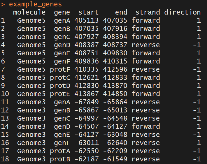
example_genes
包括118行和6个变量。每一行代表一个基因或一个区域;列分别是:
-
molecule:基因组名字
-
gene: 基因名字 the name of the gene
-
start: 基因在基因组开始位置 (如果在负链,注意起始位置的写法跟
bed
文件不同了) -
end: 基因结束位置 (负链的基因起始位置绝对值大于结束位置)
-
strand: 基因属于哪条链 (可选)
如果想显示基因的子区域,如外显子、或翻译为特定功能域的区域等。
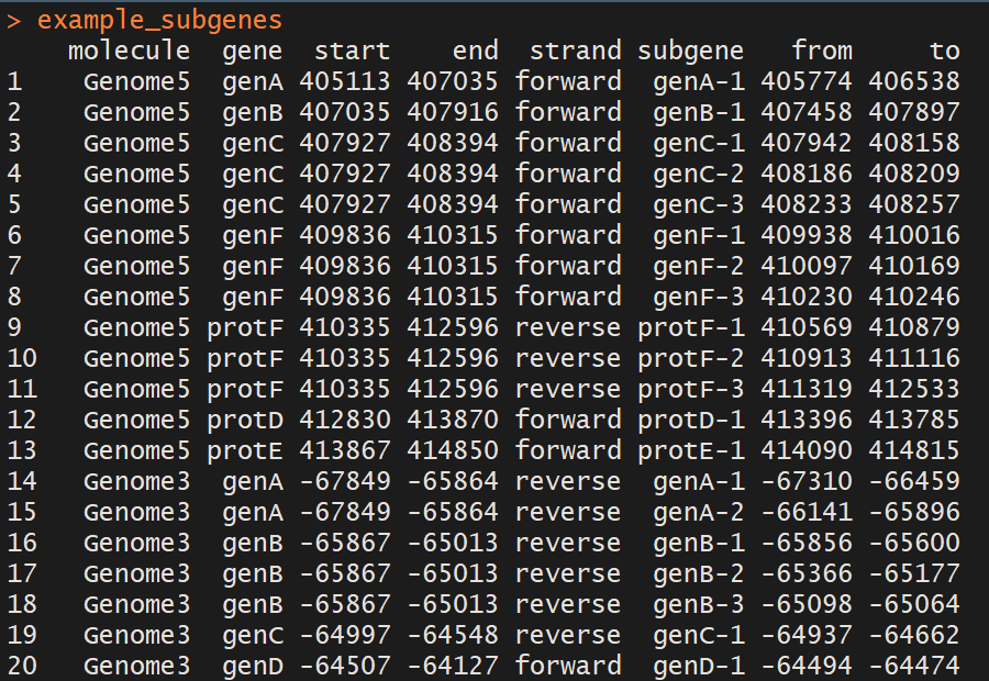
example_subgenes
多了三列信息:
-
subgeme: 子片段名字
-
from: 子片段开始位置
-
to: 子片段结束位置
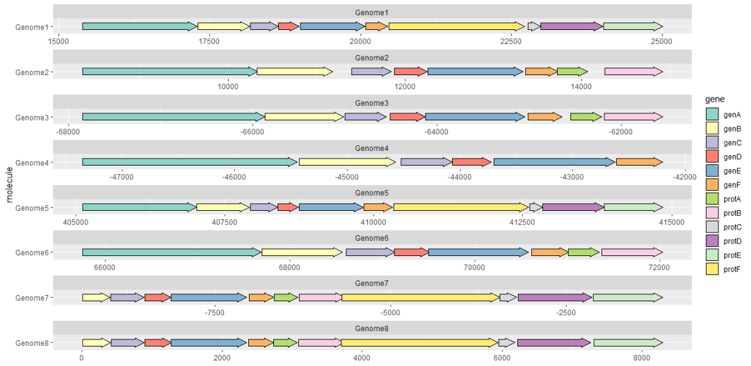
用geom_gene_arrow()画基因箭头
geom_gene_arrow()
是一个
ggplot2
几何性状,它用箭头表示基因。基因在分子内的起始和结束位置分别映射到
xmin
和
xmax
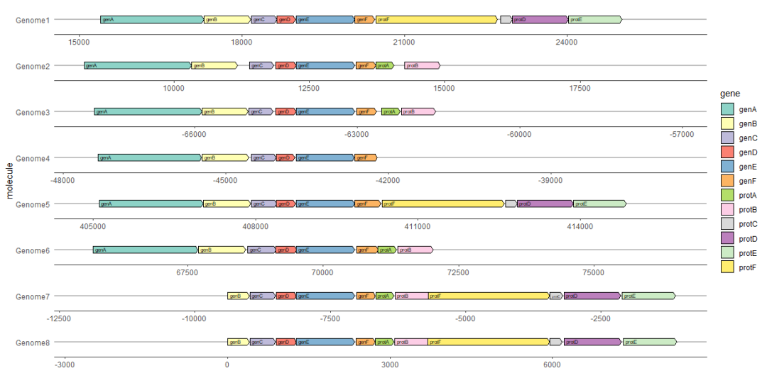
。这些开始和结束位置用于确定箭头指向的方向。基因组信息
molecule
映射到
y
轴。如果绘制的基因来自不同基因组的位置的数值相差很大,一般指定
scale =“free”
来调整横轴的坐标展示,以避免部分数字太大压缩了小基因组的基因的展示。
library(ggplot2)
library(gggenes)

ggplot(example_genes, aes(xmin = start, xmax = end, y = molecule, fill = gene)) +
  geom_gene_arrow() +
  facet_wrap(~ molecule, scales = "free", ncol = 1) +
  scale_fill_brewer(palette = "Set3")
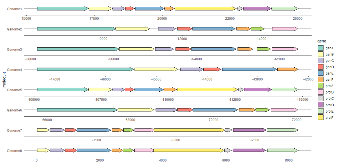
用theme_genes美化图形
由于生成的图可能看起来很混乱,因此
ggplot2
主题
theme_genes
提供了一些合理的缺省值美化结果。
ggplot(example_genes, aes(xmin = start, xmax = end, y = molecule, fill = gene)) +
  geom_gene_arrow() +
  facet_wrap(~ molecule, scales = "free", ncol = 1) +
  scale_fill_brewer(palette = "Set3") +
  theme_genes()
使用make_alignment_dummies()跨面对齐基因
通常我们会想要所有物种按某一个指定的基因对齐,比如下面例子中的
geneE
。
make_alignment_dummies()
会根据给定的数据和待对齐的基因,生成一组空基因;再使用
geom_blank()
将这些空基因添加到绘图中,就可以填充两侧的空白,以在图上直观地对齐所选的基因。
dummies <- make_alignment_dummies(
  example_genes,
  aes(xmin = start, xmax = end, y = molecule, id = gene),
  on = "genE"
)

ggplot(example_genes, aes(xmin = start, xmax = end, y = molecule, fill = gene)) +
  geom_gene_arrow() +
  geom_blank(data = dummies) +
  facet_wrap(~ molecule, scales = "free", ncol = 1) +
  scale_fill_brewer(palette = "Set3") +
  theme_genes()

用geom_gene_label()标记基因
把基因名字所在的列名字映射到
label
属性可以在图上标记每个基因的名字。
geom_gene_label()
使用
ggfittext
包将标签文本放入基因箭头内。
ggplot(
    example_genes,
    aes(xmin = start, xmax = end, y = molecule, fill = gene, label = gene)
  ) +
  geom_gene_arrow(arrowhead_height = unit(3, "mm"), arrowhead_width = unit(1, "mm")) +
  geom_gene_label(align = "left") +
  geom_blank(data = dummies) +
  facet_wrap(~ molecule, scales = "free", ncol = 1) +
  scale_fill_brewer(palette = "Set3") +
  theme_genes()
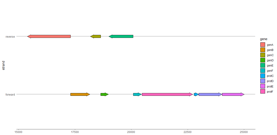
正负链基因分开展示
forward
属性可以用于在同一张图分开正负链基因的展示。如果
forward
为
TRUE
(默认值),或者任何强制为TRUE的值(如
1
),则该基因将被绘制为指向正常方向,即
xmin
和
xmax
所暗指的方向。如果
forward
为
FALSE
,或者任何强制为假的值(如
-1
),则该基因将按暗指方向的相反方向绘制。
在下面的例子中,
forward
被用来反转所有反链上所有的基因方向,与
xmin
和
xmax
暗指的方向相反。
example_genes$direction <- ifelse(example_genes$strand == "forward", 1, -1)
ggplot(subset(example_genes, molecule == "Genome1"),
  aes(xmin = start, xmax = end, y = strand, fill = gene, forward = direction)) +
  geom_gene_arrow() +
  theme_genes()
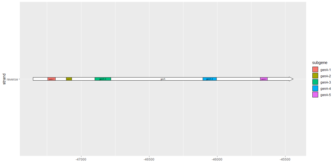
查看子基因(subgene)片段
我们可以使用
geom_subgene_arrow()
突出显示子基因片段,例如蛋白功能域或局部比对区域。
这与
geom_gene_arrow()
类似,但是除了
xmin
和
xmax
(确定基因边界)之外,我们还需要
xsubmin
和
xsubmax
来确定子区域的边界。如果子区域的边界超出了基因区域,则跳过该子区域,并弹出警告。配合
geom_gene_arrow()
不给基因上色,而只标记子区域。
ggplot(example_genes, aes(xmin = start, xmax = end, y = molecule)) +
  facet_wrap(~ molecule, scales = "free", ncol = 1) +
  geom_gene_arrow(fill = "white") +
  geom_subgene_arrow(data = example_subgenes,
    aes(xmin = start, xmax = end, y = molecule, fill = gene,
        xsubmin = from, xsubmax = to), color="black", alpha=.7) +
  theme_genes()

使用
geom_subgene_label()
给子区域在图上加标签,它的工作原理类似于
geom_gene_label()
,但主要的区别是它需要
xsubmin
和
xsubmax
属性 (而不是
xmin
和
xmax
)。
ggplot(subset(example_genes, molecule == "Genome4" & gene == "genA"),
       aes(xmin = start, xmax = end, y = strand)
  ) +
  geom_gene_arrow() +
  geom_gene_label(aes(label = gene)) +
  geom_subgene_arrow(
    data = subset(example_subgenes, molecule == "Genome4" & gene == "genA"),
    aes(xsubmin = from, xsubmax = to, fill = subgene)
  ) +
  geom_subgene_label(
    data = subset(example_subgenes, molecule == "Genome4" & gene == "genA"),
    aes(xsubmin = from, xsubmax = to, label = subgene),
    min.size = 0
  )
高颜值免费在线绘图
R统计和作图
-
随机森林randomForest
分类Classification
回归Regression
往期精品
生信学习
视频
PPT
EXCEL
文章写作
ggplot2
后台回复“生信宝典福利第一波”或点击阅读原文获取教程合集