1、按钮边框
border: 粗细 虚实 颜色
border-radius: 圆角大小
2、字体
font-size: 字体大小
font-family: 字体样式
font-weight: 字体粗细
3、阴影效果
文字阴影
text-shadow: x轴阴影长度 y轴阴影长度 模糊度 颜色
边框阴影
box-shadow: 和 text-shadow 用法一致
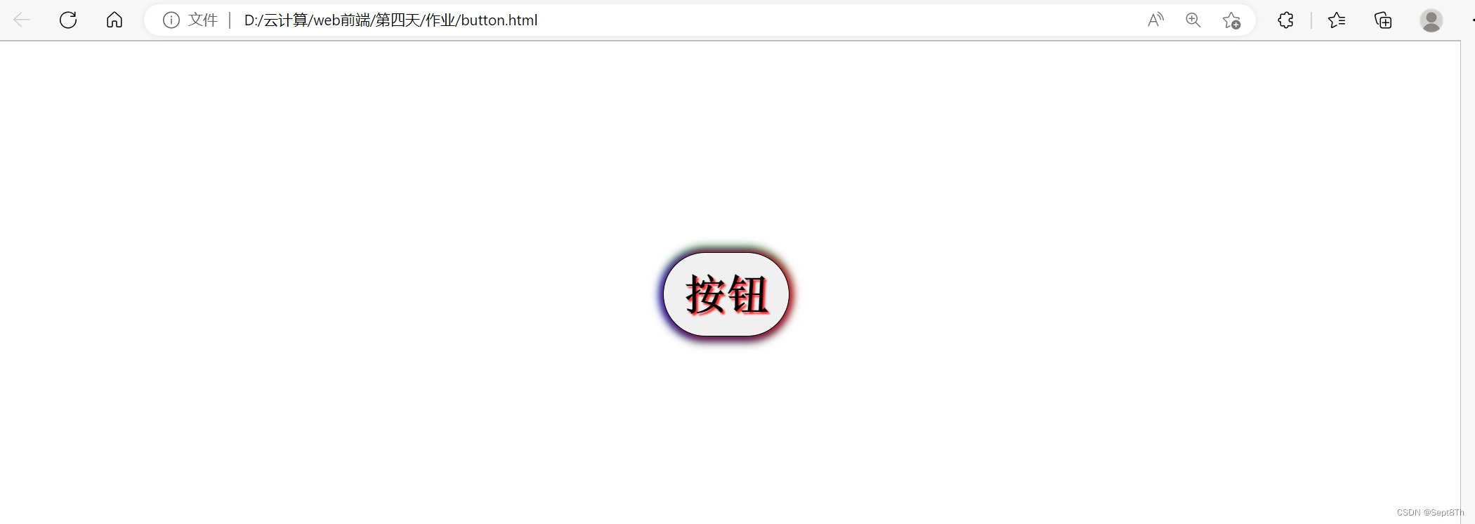
4、具体效果
代码:
<!DOCTYPE html>
<html lang="en">
<head>
	<meta charset="UTF-8">
	<title>Document</title>
	<style type="text/css">
	div{
		width: 120px;
		height: 80px;
		line-height: 80px;
		margin:200px auto;
	}
	input{
		width: 120px;
		height: 80px;
		border: 1px solid black;
		font-size: 40px;
		font-family: "宋体";
		font-weight: bold;
		border-radius: 40px;
	}
	input:hover{
		text-shadow: 2px 2px 2px red;
		box-shadow: 3px 0px 10px red,
		-3px 0px 10px blue,
		0px -5px 10px green,
		0px 5px 10px black;
	}
	</style>
</head>
<body>
	<div id="test">
		<input type="button" name="Button" value="按钮">
	</div>

</body>
</html>
效果:
版权声明:本文为xt2106119337原创文章,遵循 CC 4.0 BY-SA 版权协议,转载请附上原文出处链接和本声明。