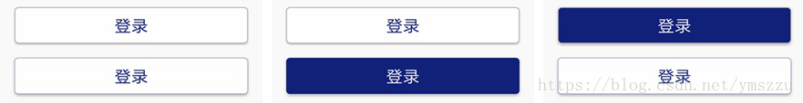
实现圆角按钮,点击的时候背景和字体的颜色都改变,这里的实现效果如下:原状态背景为白色,字体为蓝色,当点击的时候背景为蓝色,字体为白色。介绍两种实现方式。1、使用button。2、实现自定义TextView。
1.使用Button首先在drawable下建一个Button背景的btn_bg_round_click.xml文件。在这里面设置Button原状态和按下的时候,背景的颜色、圆角半径、边框宽度和颜色。
<?xml version="1.0" encoding="utf-8"?>
<selector xmlns:android="http://schemas.android.com/apk/res/android">
    <item android:state_pressed="false">
        <shape android:shape="rectangle" >
            <solid android:color="@color/color_white" />
            <corners android:radius="5dp" />
            <stroke android:width="1dp" android:color="#acacac" />
        </shape>
    </item>

    <item android:state_pressed="true" >
        <shape android:shape="rectangle">
            <solid android:color="@color/color_blue" />
            <corners android:radius="5dp" />
            <stroke android:width="1dp" android:color="#acacac" />
        </shape>
    </item>
</selector>
再建一个改变字体颜色的btn_click_text_color.xml文件。
<?xml version="1.0" encoding="utf-8"?>
<selector xmlns:android="http://schemas.android.com/apk/res/android">
    <item android:state_pressed="false" android:color="@color/color_blue"/>
    <item android:state_pressed="true" android:color="@color/color_white"/>
</selector>
最后在Button的background和textColor属性中引用。
<Button
        android:layout_width="match_parent"
        android:layout_height="50dp"
        android:background="@drawable/btn_bg_round_click"
        android:textColor="@drawable/selector_btn_click_text_color"
        android:text="登录"
        android:textSize="23sp"
        android:gravity="center" />
2. 实现自定义TextView
首先在values文件夹下建一个attrs.xml
<?xml version="1.0" encoding="utf-8"?>
<resources>
    <declare-styleable name="ButtonTextView">
        <attr name="pressTxtColor" format="color"></attr>
        <attr name="pressBgc" format="color"></attr>
        <attr name="stroke" format="dimension"></attr>
        <attr name="corner" format="dimension|fraction"></attr>
    </declare-styleable>
</resources>
再建一个ButtonTextView类,让它继承AppCompatTextView类
public class ButtonTextView extends AppCompatTextView {

    private final String NAME_SPACE = "http://schemas.android.com/apk/res/android";
    private final String ATTR_BGC = "background";
    private final String ATTR_TXTC = "textColor";

    private final int DEFAULT_TEXT_COLOR = 0x8a000000;
    //文字演策
    private int txtC = DEFAULT_TEXT_COLOR;
    private int pressTxtC = DEFAULT_TEXT_COLOR;
    //背景色
    private int bgc;
    private int pressBgc;
    //圆角
    private float corner;
    private float cornerPercent;
    //边框
    private int stroke;

    /* 通过代码创建对象时,不检索自定义属性*/
    public ButtonTextView(Context context) {
        super(context);
        /*默认颜色*/
        setTextColor(DEFAULT_TEXT_COLOR);
    }

    public ButtonTextView(Context context, AttributeSet attrs) {
        this(context, attrs, 0);
    }

    public ButtonTextView(Context context, AttributeSet attrs, int defStyleAttr) {
        super(context, attrs, defStyleAttr);
        init();

        if (attrs != null) {
            String bc = attrs.getAttributeValue(NAME_SPACE, ATTR_BGC);
            if (TextUtils.isEmpty(bc)) {
                bgc = Color.WHITE;
            } else if (bc.startsWith("#")) {
                bgc = Color.parseColor(bc);
            } else if (bc.startsWith("@")) {
                bgc = ContextCompat.getColor(context, Integer.valueOf(bc.substring(1)));
            }

            String tc = attrs.getAttributeValue(NAME_SPACE, ATTR_TXTC);
            if (TextUtils.isEmpty(tc)) {
                txtC = DEFAULT_TEXT_COLOR;
            } else if (tc.startsWith("#")) {
                txtC = Color.parseColor(tc);
            } else if (tc.startsWith("@")) {
                txtC = ContextCompat.getColor(context, Integer.valueOf(tc.substring(1)));
            }

        }

        TypedArray ta = context.obtainStyledAttributes(attrs, R.styleable.ButtonTextView);

        pressTxtC = ta.getColor(R.styleable.ButtonTextView_pressTxtColor, txtC);
        pressBgc = ta.getColor(R.styleable.ButtonTextView_pressBgc, bgc);

        //处理圆角度
        final String cornerValue = ta.getString(R.styleable.ButtonTextView_corner);
        if (!TextUtils.isEmpty(cornerValue)) {
            if (cornerValue.contains("%")) {
                corner = -1;
                cornerPercent = ta.getFraction(R.styleable.ButtonTextView_corner, 1, 1, 0f);
            } else {
                corner = ta.getDimensionPixelSize(R.styleable.ButtonTextView_corner, 0);
            }
        }

        //处理边框
        stroke = ta.getDimensionPixelSize(R.styleable.ButtonTextView_stroke, 0);

        ta.recycle();
    }

    private void init() {
        setClickable(true);
    }


    @Override
    protected void onSizeChanged(int w, int h, int oldw, int oldh) {
        super.onSizeChanged(w, h, oldw, oldh);
        if (corner < 0) {
            corner = cornerPercent * h;
        }
        setBgcDrawable(bgc, pressBgc, corner, stroke);
        setTxtColor(txtC, pressTxtC);
    }

    /**
     * @param txtC      正常情况下的字体颜色
     * @param pressTxtC 按下时的字体颜色
     */
    private void setTxtColor(@NonNull int txtC, @NonNull int pressTxtC) {

        if (txtC == pressTxtC) {
            setTextColor(txtC);
            return;
        }

        int[] colors = new int[]{pressTxtC, txtC};

        int[][] states = new int[2][];
        states[0] = new int[]{android.R.attr.state_pressed};
        states[1] = new int[]{};

        ColorStateList colorStateList = new ColorStateList(states, colors);

        setTextColor(colorStateList);
    }


    /**
     * @param bgc      正常背景色
     * @param pressBgc 按下背景色
     * @param corner   圆角
     * @param stroke   边框
     */
    private void setBgcDrawable(@NonNull int bgc, @NonNull int pressBgc, float corner, int stroke) {

        GradientDrawable bgcDrawable = new GradientDrawable();
        GradientDrawable pBgcDrawable = new GradientDrawable();

        bgcDrawable.setCornerRadius(corner);
        bgcDrawable.setStroke(stroke, txtC == 0 ? DEFAULT_TEXT_COLOR : txtC);
        bgcDrawable.setColor(bgc);


        if (bgc == pressBgc) {
            setBackgroundDrawable(bgcDrawable);
            return;
        }

        pBgcDrawable.setCornerRadius(corner);
        pBgcDrawable.setStroke(stroke, pressBgc);
        pBgcDrawable.setColor(pressBgc);

        StateListDrawable stateListDrawable = new StateListDrawable();
        stateListDrawable.addState(new int[]{android.R.attr.state_pressed}, pBgcDrawable);
        stateListDrawable.addState(new int[]{}, bgcDrawable);

        setBackgroundDrawable(stateListDrawable);
    }

    /**
     * 设置背景色
     *
     * @param bgc
     * @param pressBgc
     */
    public void setBgcDrawable(@NonNull int bgc, @NonNull int pressBgc) {
        this.bgc = bgc;
        this.pressBgc = pressBgc;
    }

    /**
     * 设置文字颜色
     *
     * @param txtC
     * @param pressTxtC
     */
    public void setTextColor(@NonNull int txtC, @NonNull int pressTxtC) {
        this.txtC = txtC;
        this.pressTxtC = pressTxtC;
    }

    public void setCorner(float corner) {
        this.corner = corner;
    }

    public void setStroke(int stroke) {
        this.stroke = stroke;
    }

    public void setTxtC(int txtC, int pressTxtC) {
        this.txtC = txtC;
        this.pressTxtC = pressTxtC;
    }

}
最后在xml中使用,使用和普通的Button差不多。只不过在这里面定义了一些按下时的效果属性。pressBgc按下时背景的颜色。
pressTxtColor按下时字体颜色,stroke边框宽度。
<com.geocompass.collect.view.ButtonTextView
        android:layout_width="match_parent"
        android:layout_height="50dp"
        android:layout_margin="20dp"
        android:background="@color/color_white"
        android:gravity="center"
        android:text="登录"
        android:textSize="23sp"
        android:textColor="@color/color_blue"
        android:translationZ="3dp"
        app:corner="5dp"
        app:pressBgc="@color/color_blue"
        app:pressTxtColor="@color/color_white"
        app:stroke="1px" />
版权声明:本文为ymszzu原创文章,遵循 CC 4.0 BY-SA 版权协议,转载请附上原文出处链接和本声明。