1. 参数解释
plt.style.use('ggplot') 表示模拟 ggplot2 的风格。
plt.figure() 先创建一个基础图。
fig.add_subplot(1,1,1) 然后创建一个子图(或多个子图),在子图上操作,1,1,1 表示创建一行一列的子图,并在第一个(此时也是唯一一个)子图上操作。
align='center' 条形与标签中间对齐。
color='darkblue' 设置条形的颜色
ax1.xaxis.set_ticks_position('bottom') 刻度线只显示在 x 轴 底部。
ax1.yaxis.set_ticks_position('left') 刻度线只显示在 y 轴 右侧。
ax1.set_xticks(customers_index) 设置 X轴刻度。
ax1.set_xticklabels(customers) # 设置 X轴刻度标签。
ax1.set_xlabel('Customer Name', fontsize = 14) 设置 X轴标签。
ax1.xaxis.set_tick_params(labelrotation = 45, labelsize = 12) labelrotation =45 标签旋转45°,labelsize 标签字体。
ax1.legend() 显示图例
plt.savefig('bar_plot.png', dpi=400, bbox_inches='tight') 将图片保存在当前文件夹下,并设置文件名;dpi 设置图片分辨率;bbox_inches 保存图片时去掉四周的空白部分。
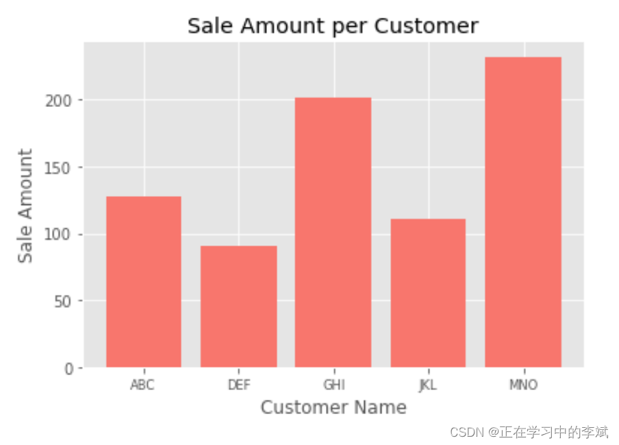
2. 单数据条形图
import matplotlib.pyplot as plt

plt.rcParams["font.sans-serif"]='SimHei'   #解决中文乱码问题
plt.rcParams['axes.unicode_minus']=False   #解决负号无法显示的问题

# 可以使用这个库的颜色
plt.style.use('ggplot')

customers = ['ABC', 'DEF', 'GHI', 'JKL', 'MNO']
customers_index = range(len(customers))
sale_amounts = [127, 90, 201, 111, 232]

# 创建一个基础图
fig = plt.figure()
# 创建 1*1一个子图,然后在 第一个子图上操作。(可以是 2*2 多个)
ax1 = fig.add_subplot(1,1,1)

ax1.bar(customers_index, sale_amounts, align='center', color='#F8766D')
ax1.xaxis.set_ticks_position('bottom')
ax1.yaxis.set_ticks_position('left')
# 修改 x
plt.xticks(customers_index, customers, rotation=0, fontsize='small')

# ax.spines['left'].set_color('none')  # 设置上‘脊梁’为无色

# 设置标签 标题等
plt.xlabel('Customer Name')
plt.ylabel('Sale Amount')
plt.title('Sale Amount per Customer')
# 保存
plt.savefig('bar_plot.png', dpi=400, bbox_inches='tight')
plt.show()
3、多类数据条形图
import matplotlib.pyplot as plt
import numpy as np

plt.style.use('ggplot')

# 设置matplotlib正常显示中文和负号
plt.rcParams['font.sans-serif']=['SimHei']   # 用黑体显示中文
plt.rcParams['axes.unicode_minus']=False     # 正常显示负号

# x轴刻度标签序列
customers = ['ABC', 'DEF', 'GHI', 'JKL', 'MNO']
# x轴刻度
customers_index = np.arange(len(customers))

sale_amounts = [127, 90, 201, 111, 232]
sale_amounts2 = [47, 30, 91, 301, 132]
sale_amounts3 = [87, 120, 41, 31, 332]

# 创建一个基础图 设置画布的大小
fig = plt.figure(figsize=(12,8))
# 创建一个子图,然后在子图上操作
ax1 = fig.add_subplot(1,1,1)

# 多次调用bar()函数即可在同一子图中绘制多组柱形图。
# 为了防止柱子重叠,每个柱子在x轴上的位置需要依次递增 0.3,如果柱子紧挨,这个距离即柱子宽度。
width = 0.3
rects1 = ax1.bar(customers_index - width, sale_amounts, width=width ,align='center', color='#F8766D',label='1号商品')
rects2 = ax1.bar(customers_index , sale_amounts2, width=width ,align='center', color='#B79F00',label='2号商品')
rects3 = ax1.bar(customers_index + width, sale_amounts3, width=width ,align='center', color='#00BA38',label='3号商品')

# 显示柱子值 fontsize 设置字体大小
ax1.bar_label(rects1,padding=3,**{'fontsize': 14})
ax1.bar_label(rects2,padding=3)
ax1.bar_label(rects3,padding=3)

# 刻度线只显示在 x 轴 底部。
ax1.xaxis.set_ticks_position('bottom')
# 刻度线只显示在 y 轴 右侧。
ax1.yaxis.set_ticks_position('left')

# 设置 X轴刻度
ax1.set_xticks(customers_index)
# 设置 X轴刻度标签
ax1.set_xticklabels(customers)
# 设置 X 轴标签 倾斜45°,字体大小
ax1.xaxis.set_tick_params(labelrotation = 45, labelsize = 12)
# 设置 X轴标签
ax1.set_xlabel('Customer Name', fontsize = 14)

# Y 轴
ax1.yaxis.set_tick_params(which = "both", labelsize = 10)
ax1.set_ylabel('Sale Amount')

# 显示label 里面设置的图例
ax1.legend(title = "类别",
         fontsize = 16,
         title_fontsize = 15,
         bbox_to_anchor = (1.01, 0.7))

# 保存
plt.savefig('bar_plot.png', dpi=400, bbox_inches='tight')
plt.show()

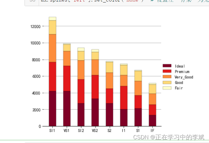
3. 普通堆叠柱状图
df=pd.read_csv('StackedColumn_Data.csv')
df=df.set_index("Clarity")

Sum_df=df.apply(lambda x: x.sum(), axis=0).sort_values(ascending=False)
df=df.loc[:,Sum_df.index]

meanRow_df=df.apply(lambda x: x.mean(), axis=1)
Sing_df=meanRow_df.sort_values(ascending=False).index

n_row,n_col=df.shape
#x_label=np.array(df.columns)
x_value=np.arange(n_col)

cmap=cm.get_cmap('YlOrRd_r',n_row)
color=[colors.rgb2hex(cmap(i)[:3]) for i in range(cmap.N) ]
bottom_y=np.zeros(n_col)

fig=plt.figure(figsize=(5,5))
#plt.subplots_adjust(left=0.1, right=0.9, top=0.7, bottom=0.1)

for i in range(n_row):
    label=Sing_df[i]
    plt.bar(x_value,df.loc[label,:],bottom=bottom_y,width=0.5,color=color[i],label=label,edgecolor='k', linewidth=0.25)
    bottom_y=bottom_y+df.loc[label,:].values

plt.xticks(x_value,df.columns,size=10)  #设置x轴刻度
#plt.tick_params(axis="x",width=5)

plt.legend(loc=(1,0.3),ncol=1,frameon=False)

plt.grid(axis="y",c=(166/256,166/256,166/256))

ax = plt.gca()                         #获取整个表格边框
ax.spines['top'].set_color('none')  # 设置上‘脊梁’为无色
ax.spines['right'].set_color('none')  # 设置右‘脊梁’为无色
ax.spines['left'].set_color('none')  # 设置左‘脊梁’为无色
4. 百分比堆叠柱状图
# 需要数据可以留言
df=pd.read_csv('StackedColumn_Data.csv')
df=df.set_index("Clarity")
SumCol_df=df.apply(lambda x: x.sum(), axis=0)
df=df.apply(lambda x: x/SumCol_df, axis=1)
meanRow_df=df.apply(lambda x: x.mean(), axis=1)

Per_df=df.loc[meanRow_df.idxmax(),:].sort_values(ascending=False)
Sing_df=meanRow_df.sort_values(ascending=False).index

df=df.loc[:,Per_df.index]
n_row,n_col=df.shape
x_value=np.arange(n_col)
cmap=cm.get_cmap('YlOrRd_r',n_row)
color=[colors.rgb2hex(cmap(i)[:3]) for i in range(cmap.N) ]

bottom_y=np.zeros(n_col)

fig=plt.figure(figsize=(5,5))
#plt.subplots_adjust(left=0.1, right=0.9, top=0.7, bottom=0.1)

for i in range(n_row):
    label=Sing_df[i]
    plt.bar(x_value,df.loc[label,:],bottom=bottom_y,width=0.5,color=color[i],label=label,edgecolor='k', linewidth=0.25)
    bottom_y=bottom_y+df.loc[label,:].values

plt.xticks(x_value,df.columns,size=10)  #设置x轴刻度

label_format = '{:.1f}%'  # 创建浮点数格式 .1f一位小数
ylabels = ax.get_yticks().tolist()
ax.yaxis.set_major_locator(mticker.FixedLocator(ylabels))  # 定位到散点图的x轴
ax.set_yticklabels([label_format.format(x*100) for x in ylabels])  # 使用列表推导式循环将刻度转换成浮点数

# plt.xticks(x_value,df.columns,size=10)  #设置x轴刻度
# plt.gca().set_yticklabels(['{:.0f}%'.format(x*100) for x in plt.gca().get_yticks()])

plt.legend(loc=(1,0.3),ncol=1,frameon=False)
plt.grid(axis="y",c=(166/256,166/256,166/256))

ax = plt.gca()                         #获取整个表格边框
ax.spines['top'].set_color('none')  # 设置上‘脊梁’为无色
ax.spines['right'].set_color('none')  # 设置右‘脊梁’为无色
ax.spines['left'].set_color('none')  # 设置左‘脊梁’为无色

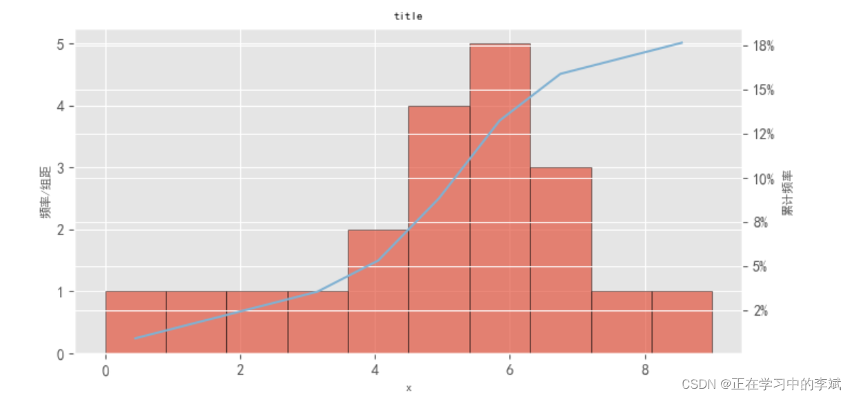
5. 柱形图加累计曲线(双Y轴坐标)
import matplotlib.pyplot as plt
import matplotlib as mpl
from matplotlib.ticker import FuncFormatter
#从pyplot导入MultipleLocator类,这个类用于设置刻度间隔
from matplotlib.pyplot import MultipleLocator

# 设置图形的显示风格
plt.style.use('ggplot')
# 中文和负号的正常显示
mpl.rcParams['font.sans-serif'] = ['Times New Roman']
mpl.rcParams['font.sans-serif'] = [u'SimHei']
mpl.rcParams['axes.unicode_minus'] = False

data = [0,1,  2, 3, 4,4,5, 5, 5, 5,6, 6, 6, 6, 6,7, 7,7,8,  9]

fig= plt.figure(figsize=(8, 4),dpi=100)

ax1 = fig.add_subplot(111)
##概率分布直方图
# a1 表示频率; a2表示x坐标   a3表示BarContainer
a1,a2,a3=ax1.hist(data,bins =10, alpha = 0.65,edgecolor='k')

##累计概率曲线
#生成累计概率曲线的横坐标
indexs=[]
a2=a2.tolist()
for i,value in enumerate(a2):
    if i<=len(a2)-2:
        index=(a2[i]+a2[i+1])/2
        indexs.append(index)


#生成累计概率曲线的纵坐标
def to_percent(temp,position):
    return '%1.0f'%(100*temp) + '%'
dis=a2[1]-a2[0]
print('dis',dis)
freq=[f*dis for f in a1]
acc_freq=[]
for i in range(0,len(freq)):
    if i==0:
        temp=freq[0]
    else:
        temp=sum(freq[:i+1])
    acc_freq.append(temp/102)

print('acc_freq',acc_freq)
print(sum(data))

#这是双坐标关键一步
ax2=ax1.twinx()

#绘制累计概率曲线
ax2.plot(indexs,acc_freq,color='#80b1d2')
#设置累计概率曲线纵轴为百分比格式
ax2.yaxis.set_major_formatter(FuncFormatter(to_percent))

ax1.set_xlabel('x',fontsize=8)
ax1.set_title("title",fontsize =8)
#把x轴的刻度间隔设置为1,并存在变量里
# x_major_locator=MultipleLocator(xlocator)
# ax1.xaxis.set_major_locator(x_major_locator)
ax1.set_ylabel('频率/组距',fontsize=8)
ax2.set_ylabel("累计频率",fontsize=8)
plt.show()
版权声明:本文为qq_35240689原创文章,遵循 CC 4.0 BY-SA 版权协议,转载请附上原文出处链接和本声明。