说明:本文中的代码均是在Android Studio 2.0 preview版本中编译。
Material Design是Android5.0 (API 21)推出的一套全新设计语言,同时体现了一种科技感。Google希望该设计语言的可视化风格(visual), 物体运动风格(motion)和交互设计风格(interaction design)能够在跨平台、跨设备的场合运行。——摘自Android官方文档
Material Design设计风格
- 提高用户的认知度,使用户见图知意;
- 鲜明形象的图形化设计,通过模拟自然界纸墨的形态变化,突出了光线、阴影、纸与纸之间的层级关系,带来一种既迎合于当前UI扁平化风格、又有一种真实空间感的图形效果;
- 有意义的动画效果,给用户以有效的引导和暗示,给用户带来非常愉悦的使用体验;
- 大色块的使用,大量高饱和度、亮度适中的大色块可以突出界面的主次,并不再有Android5.0以前Android Holo主题的沉重感,让界面更加富有时尚感和视觉冲击力;
Material Design新增属性及要点
-
引入3D环境,用光与影的的衬托体现Z轴的高度(elevation属性/translationZ属性)。
–
元素需要有层次感,同一高度只能允许有一个元素
–
不同高度的元素之间不可穿越和交叉
- 元素形状可以任意改变,变化过程要加入动画效果,不能突兀地变化
- 动画效果和运动轨迹要符合自然界的重力加速度或自由落体运动,不推荐线性的运动轨迹。
-
交互方式
–表层响应(Surface reaction)——点击图片、adapterView中的item时,产生涟漪波纹效果;
–元素响应(Material response)——点击菜单时,菜单会从点击的地方展开,点击元素时,有浮动效果;
–径向响应(Radial action)——用动画效果过渡、切换图片;
- 转场动画:要平滑、不要突兀、要有顺序。
Material Design主题
Android5.X中提供了以下基本主题:
- @android:style/Theme.Material (深色主题)
- @android:style/Theme.Material.Light (浅色主题)
- @android:style/Theme.Material.DarkActionBar (浅色主题、深色ActionBar)
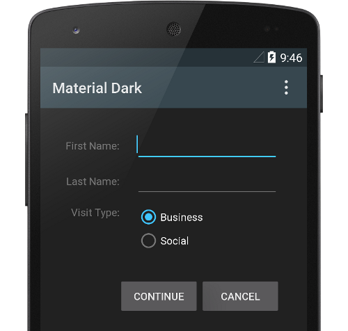
深色主题
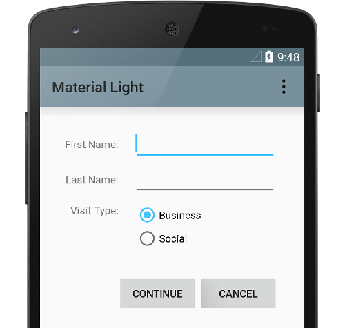
浅色主题
在不考虑兼容性的情况下,可以使用以上主题,但一般不推荐直接使用,因为这需要运行在Android5.0(≥API 21)以上版本的设备上,考虑到Android设备碎片化的问题,大多数情况需要使用support.v7 兼容包中的相应主题以兼容Android5.0(小于API 21)以前的设备。在使用兼容主题时,需要在Project中引入support.v7包,该包的版本要求>21.0.0,在引入后,就可以定义兼容主题了
。具体定义方式如下:
- @android:style/Theme.AppCompat (兼容的深色主题)
- @android:style/Theme.AppCompat.Light (兼容的深色主题)
- @android:style/Theme.AppCompat.Light.DarkActionBar (兼容的浅色主题、深色ActionBar)
在res/styles中定义主题示例如下:
<!-- 不考虑兼容性可继承下面被注释的主题,但不推荐 -->
<!--<style name="MyBaseAppTheme" parent="android:Theme.Material.Light"></style>-->
<!-- 推荐继承support.v7包中的兼容主题 -->
    <style name="MyBaseAppTheme" parent="Theme.AppCompat.NoActionBar">
        <!-- customize the color palette -->
        <item name="colorPrimary">#FF00FF</item>
        <item name="colorPrimaryDark">#8A2BE2</item>
        <item name="colorAccent">#000000</item>
        <item name="android:textColorPrimary">#ffff00</item>
        <item name="android:navigationBarColor">#90EE90</item>
        <item name="android:background">#473C8B</item>
    </style>
效果如下:
自定义Material Design Theme
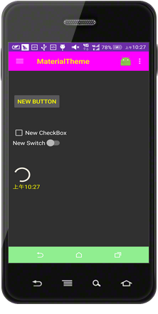
可设置如下属性值来修改对应部分的颜色:
-
状态栏背景色,属性:colorPrimaryDark;

-
ActionBar背景色,属性:colorPrimary;
-
进度条ProgressBar颜色,属性:colorAccent;

-
窗口背景色,属性:background;
-
导航栏背景色,属性:android:navigationBarColor;
-
字体颜色,属性:android:textColorPrimary;
|
|


注意,
由于ActionBar的灵活性不够高,Google推出了定制化程度更高的ToolBar来代替ActionBar。若要使用ToolBar,需要继承禁用ActionBar的主题
:
<style name="MyBaseAppTheme" parent="Theme.AppCompat.NoActionBar"/>
并在XML中定义ToolBar时定制其背景颜色等属性。
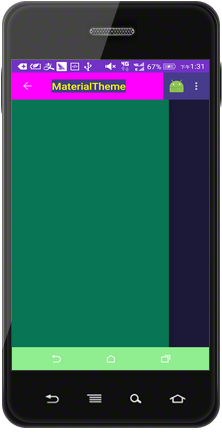
带有Material Design风格的DrawerLayout
要实现带有抽屉效果(DrawLayout)的布局,XML定义如下所示:
<RelativeLayout xmlns:android="http://schemas.android.com/apk/res/android"
xmlns:app="http://schemas.android.com/apk/res-auto"
xmlns:tools="http://schemas.android.com/tools"
android:layout_width="match_parent"
android:layout_height="match_parent"
tools:context="com.win16.materialtheme.MaterialActivity">
<android.support.v7.widget.Toolbar
android:id="@+id/toolbar"
android:layout_width="match_parent"
android:layout_height="?attr/actionBarSize"
android:background="?attr/colorPrimary"
android:minHeight="?attr/actionBarSize"
app:contentInsetLeft="72dp"
app:contentInsetStart="72dp"></android.support.v7.widget.Toolbar>
<android.support.v4.widget.DrawerLayout
android:id="@+id/drawer"
android:layout_width="match_parent"
android:layout_height="match_parent"
android:layout_below="@id/toolbar">
<LinearLayout
android:layout_width="match_parent"
android:layout_height="match_parent"
android:orientation="vertical"
android:padding="10dp">
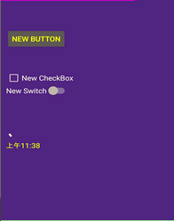
<Button
android:id="@+id/button"
android:layout_width="wrap_content"
android:layout_height="wrap_content"
android:layout_alignParentStart="true"
android:layout_alignParentTop="true"
android:layout_marginTop="55dp"
android:text="New Button" />
<CheckBox
android:id="@+id/checkBox"
android:layout_width="wrap_content"
android:layout_height="wrap_content"
android:layout_alignParentStart="true"
android:layout_below="@+id/button"
android:layout_marginTop="51dp"
android:text="New CheckBox" />
<Switch
android:id="@+id/switch1"
android:layout_width="wrap_content"
android:layout_height="wrap_content"
android:layout_alignParentStart="true"
android:layout_centerVertical="true"
android:text="New Switch" />
<ProgressBar
android:id="@+id/progressBar"
android:layout_width="wrap_content"
android:layout_height="wrap_content"
android:layout_alignParentStart="true"
android:layout_below="@+id/switch1"
android:layout_marginTop="55dp" />
<TextClock
android:layout_width="match_parent"
android:layout_height="wrap_content" />
</LinearLayout>
<LinearLayout
android:id="@+id/menu_frame"
android:layout_width="match_parent"
android:layout_height="match_parent"
android:layout_gravity="start|left"
android:layout_marginEnd="10dip"
android:layout_marginRight="10dip"
android:background="#087654"
android:orientation="vertical"
android:paddingTop="@dimen/abc_action_bar_default_height_material" />
</android.support.v4.widget.DrawerLayout>
</RelativeLayout>
布局首先是一个ToolBar,该控件包含在android.support.v7.widget中;接着是一个DrawerLayout,该控件包含在android.support.v4.widget包中,DrawerLayout中包含的第一个LinearLayout用于显示整个页面内容,第二个LinearLayout就是侧滑的抽屉,属性
android:layout_gravity="start|left"
表示抽屉将从左侧滑出。
activity逻辑实现
//需继承android.support.v7z包中的APPCompatibleActivity
public class MaterialActivity extends AppCompatActivity {

    private DrawerLayout mDrawerLayout;
    private ActionBarDrawerToggle mDrawerToggle;

    @Override
    protected void onCreate(Bundle savedInstanceState) {
        super.onCreate(savedInstanceState);
        setContentView(R.layout.activity_main);

        Toolbar toolbar = (Toolbar) findViewById(R.id.toolbar);

        //设置ToolBar用于替换主题中的ActionBar
        setSupportActionBar(toolbar);
        getSupportActionBar().setDisplayHomeAsUpEnabled(true);


        mDrawerLayout = (DrawerLayout) findViewById(R.id.drawer);

        mDrawerToggle =
                new ActionBarDrawerToggle(this, mDrawerLayout, toolbar, R.string.open, R.string.close) {
                    public void onDrawerClosed(View view) {
                        super.onDrawerClosed(view);
                        //关闭抽屉时的处理逻辑
                    }

                    public void onDrawerOpened(View drawerView) {
                        super.onDrawerOpened(drawerView);
                        //打开抽屉时的处理逻辑

                    }

                };
        //监听打开、关闭侧边抽屉
        mDrawerLayout.setDrawerListener(mDrawerToggle);
        //设置同步状态
        mDrawerToggle.syncState();
    }
实现效果
有关<当打开或关闭抽屉时,左上角图标的转场动画>请参阅我的“Android5.X的新特性”分类中的文章。
有关Material Design的更多特性,请参考我上传的PDF资源文件《Material Design 中文版 – v1.1》,该资源是Google官方推出的Material Design风格的中文版设计手册,它包含了Material Design设计标准的方方面面。