文章出自个人博客
https://knightyun.github.io/2021/07/05/css-flex-chrome-safari-bug
,转载请申明。
问题
最近的开发中有遇到一个页面样式的兼容性问题,大致是使用
flex
布局的两个嵌套弹性盒子,在
Chrome
和
Safari
中对一些特殊情况的处理行为不一致,从而产生了测试 bug;
复现
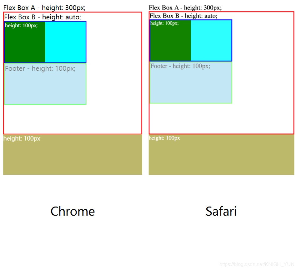
下面将问题简化为了一个
demo
模型,一个定高
300px
的
flex
盒子 A(红色边框),嵌套了另一个高度被子元素(绿色块)撑开的
flex
盒子 B(蓝色边框),其中盒子 B 为垂直伸缩
flex-direction: column;
,Footer 元素(绿色边框)高度固定
100px
,背景半透明;代码:
<!DOCTYPE html>
<html lang="en">
    <head>
        <meta charset="UTF-8" />
        <meta http-equiv="X-UA-Compatible" content="IE=edge" />
        <meta name="viewport" content="width=device-width, initial-scale=1.0" />
        <title>Demo</title>
        <style>
            .flex-box-a {
                display: flex;
                width: 300px;
                height: 300px;
                flex-direction: column;
                border: 2px solid red;
            }
            .flex-box-b {
                display: flex;
                width: 200px;
                height: auto;
                border: 2px solid blue;
            }
            .inner-green-box {
                width: 100px;
                height: 100px;
                background: green;
            }
            .inner-aqua-box {
                width: 100px;
                height: 100px;
                background: aqua;
            }
            .footer-box {
                width: 200px;
                height: 100px;
                border: 2px solid lime;
                background: skyblue;
                opacity: .5;
            }
            .bottom-brown-box {
                width: 304px;
                height: 100px;
                color: white;
                background: burlywood;
            }
        </style>
    </head>
    <body>
        Flex Box A - height: 300px;
        <div class="flex-box-a">
            Flex Box B - height: auto;
            <div class="flex-box-b">
                <div class="inner-green-box">height: 100px;</div>
                <div class="inner-aqua-box"></div>
            </div>
            <div class="footer-box">Footer - height: 100px;</div>
        </div>
        <div class="bottom-brown-box">
            height: 100px;
        </div>
    </body>
</html>
效果:
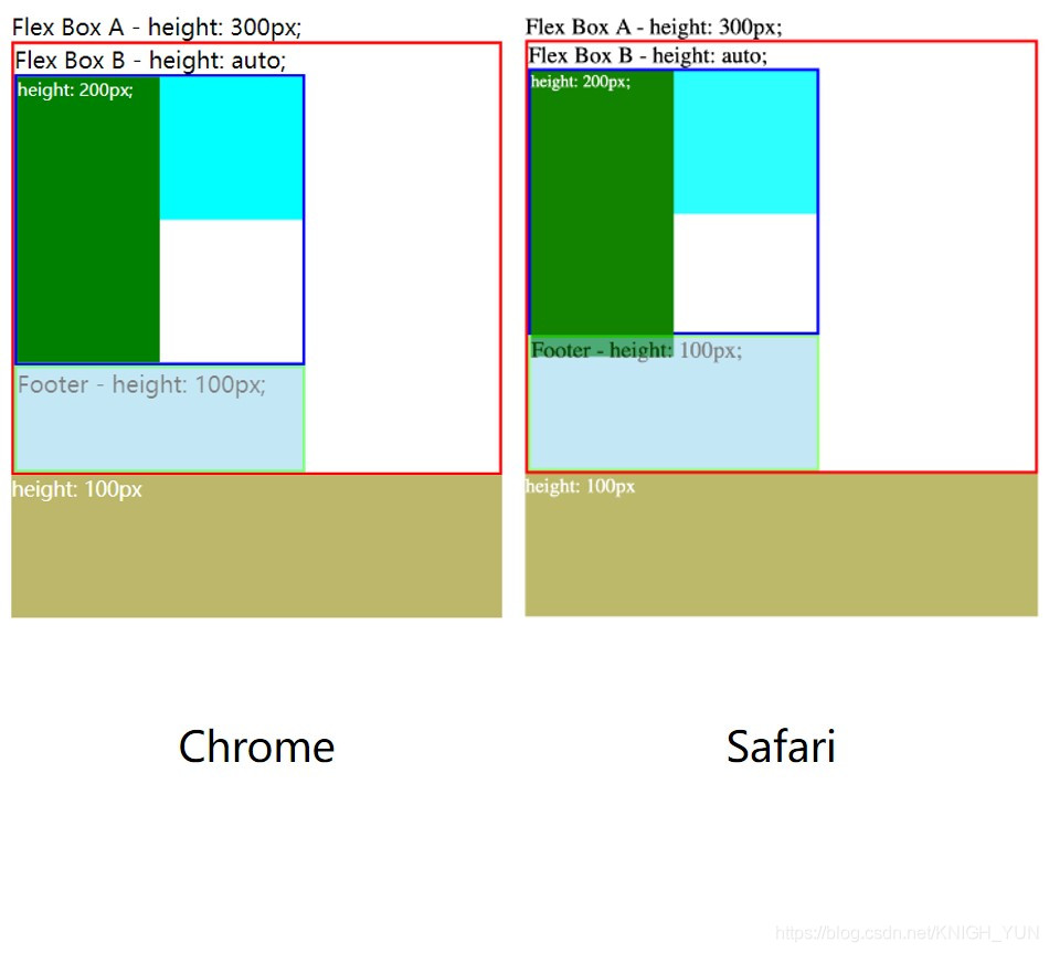
然后增加绿色块子元素的高度,可以发现在
Chrome
中
flex
盒子 B 的高度会被该子元素撑开,Footer 元素高度被压缩,而
Safari
中的盒子 B 的高度并没有被子元素撑开,而是超出部分被隐藏在了 Footer 下层,同时 Footer 元素也被少量压缩:
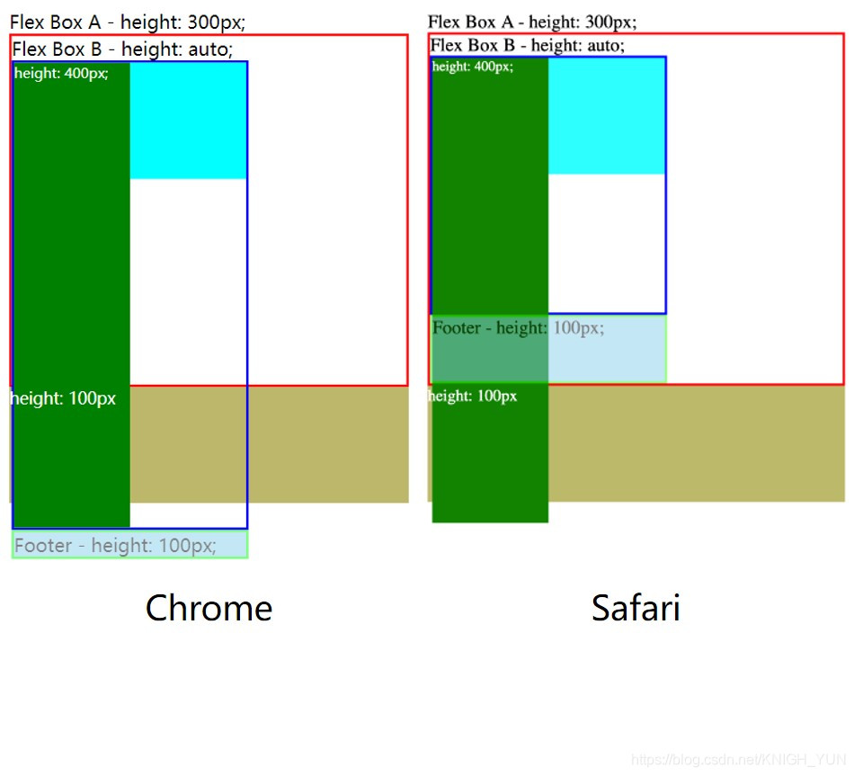
当绿色块子元素高度超过最外层
flex
盒子 A 的高度时,
Chrome
中的内层
flex
盒子 B 继续被撑开,Footer 元素直接脱离外层
flex
盒子,而
Safari
中只有子元素超出外层
flex
盒子,Footer 依然只被少量压缩:
解决
最终解决问题的方式是放开外层
flex
盒子 A 的
高度限制
,这样无论在
Chrome
还是
Safari
中
flex
盒子都能被自由撑开,行为表现一致:

因此开发中遇到类似
定高
与
弹性
并存的情况,需要合理设计布局,避免不必要的兼容问题;