- ComboBox填充数据模型,数据模型通常是JavaScript数组,ListModel或者是整数,但是也支持其他类型的数据模型。另外,ComboBox还可以编辑
-
属性
acceptableInput : bool,此属性控制组合框是否包含可编辑文本字段中的可接受文本
count : int,组合框中的项目数
currentIndex : int,保存组合框中当前项的索引,只读
currentText : string,组合框中当前项的文本,只读
delegate : Component,包含一个委托,该委托在组合框弹出窗口中显示项目
displayText : string,保存组合框按钮上显示的文本
down : bool,保存组合框按钮是否在视觉上向下
editText : string,指示将文本保存在可编辑组合框的文本字段中
editable : bool,控制组合框是否可编辑
flat : bool,控制组合框按钮是否平坦
highlightedIndex : int,表示组合框弹出列表中突出显示项的索引,,只读
indicator : Item,包含拖放指示器项
inputMethodComposing : bool,表示可编辑组合框中是否具有部分文本输入采用某种输入方法
inputMethodHints : flags,为输入法提供有关组合框的预期内容及其操作方式的提示
model : model,控制着为组合框提供数据的模型
popup : Popup,包含弹出窗口
pressed : bool,代表组合框按钮是否以物理的方式按下
textRole : string,表示用于填充组合框的模型角色
validator : Validator,包含可编辑组合框的输入文本验证程序 -
方法
void decrementCurrentIndex()
如果弹出列表可见,则递减组合框的当前索引或突出显示的索引
int find(string text, flags)
返回指定文本的索引,如果未找到匹配项,则返回 -1
void incrementCurrentIndex()
如果弹出列表可见,则增加组合框的当前索引或突出显示的索引
void selectAll()
选择组合框的可编辑文本字段中的所有文本
string textAt(int index)
返回指定索引的文本,如果索引超出范围,则返回空字符串 - 信号
-
void accepted()
在可编辑的组合框上按下 Return 或 Enter 键时会发出此信号。如果输入的字符串不在模型中,则将currentIndex 设置为 -1,并且 currentText 将相应地更新。注意:如果组合框上设置了 validator,则只有在输入处于 acceptable 状态时才会发出信号。 -
void activated(int index)
用户在弹出窗口进行选择项目激活索引处的项目时,将发出此信号。 -
void highlighted(int index)
当弹出列表中索引处的项目被用户突出显示时,将发出此信号
填充整数值的ComboBox
当我们进行在弹出窗口做出选择时,会触发activated信号,相应的在信号处理函数onActivated中,输出displayText(ComboBox上显示的文本)
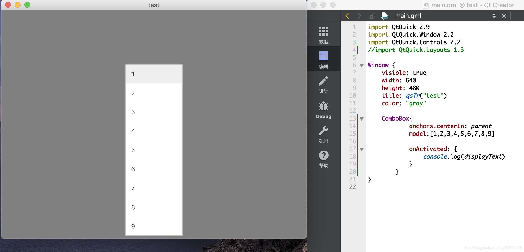
import QtQuick 2.9
import QtQuick.Window 2.2
import QtQuick.Controls 2.2

Window {
    visible: true
    width: 640
    height: 480
    title: qsTr("test")
    color: "gray"

    ComboBox{
            anchors.centerIn: parent
            model:[1,2,3,4,5,6,7,8,9]

            onActivated: {
                console.log(displayText)
            }
        }
}
填充ListModel的ComboBox
ComboBox为可编辑,当可编辑的组合框上按下 Return 或 Enter 键时会发出accepted()信号,所以在其信号处理函数中设置将新输入的数据添加进模型的末尾。
-
下图的【Four】【Five】是在ComboBox编辑后按【Enter】键后,在model模型末尾添加了数据
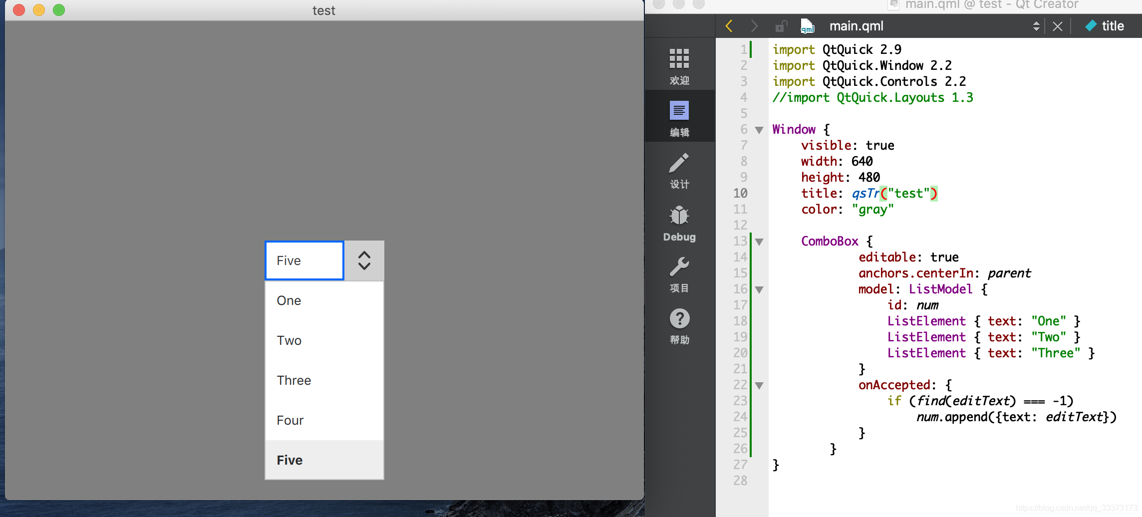
import QtQuick 2.9
import QtQuick.Window 2.2
import QtQuick.Controls 2.2

Window {
    visible: true
    width: 640
    height: 480
    title: qsTr("test")
    color: "gray"

    ComboBox {
            editable: true
            anchors.centerIn: parent
            model: ListModel {
                id: num
                ListElement { text: "One" }
                ListElement { text: "Two" }
                ListElement { text: "Three" }
            }
            onAccepted: {
                if (find(editText) === -1)
                    num.append({text: editText})
            }
        }
}
-
使用具有多个命名角色的模型时,为了显示其文本和代理实例,必须使用特定的 textRole 配置 ComboBox。 如下使用了2个命名角色key和value
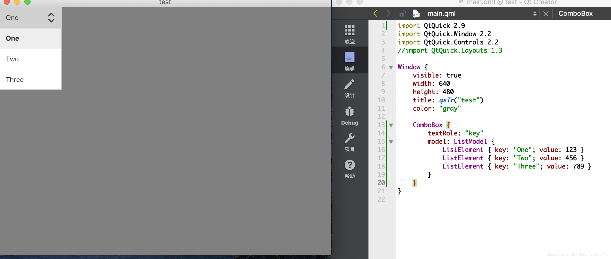
import QtQuick 2.9
import QtQuick.Window 2.2
import QtQuick.Controls 2.2
Window {
    visible: true
    width: 640
    height: 480
    title: qsTr("test")
    color: "gray"

    ComboBox {
        textRole: "key"
        model: ListModel {
            ListElement { key: "One"; value: 123 }
            ListElement { key: "Two"; value: 456 }
            ListElement { key: "Three"; value: 789 }
        }
    }
}
自定义ComboBox
-
ComboBox可视项组成:背景项background,内容项contentitem,弹出窗口popup,指示器indicator和委托项delegate
indicator自定义需要用到画布Canvas进行重绘比较复杂

import QtQuick 2.9
import QtQuick.Window 2.2
import QtQuick.Controls 2.2

Window {
    visible: true
    width: 640
    height: 480
    title: qsTr("test")
    color: "gray"

    ComboBox {
        anchors.centerIn: parent
          id: control
          model: ["One", "Two", "Three"]
          delegate: ItemDelegate { //呈现标准视图项 以在各种控件和控件中用作委托
              width: control.width
              contentItem: Text {
                  text: modelData   //即model中的数据
                  color: "green"
                  font: control.font
                  verticalAlignment: Text.AlignVCenter
              }
          }
          contentItem: Text { //界面上显示出来的文字
              leftPadding: 5 //左部填充为5
              text: control.displayText //表示ComboBox上显示的文本
              font: control.font    //文字大小
              color: control.pressed ? "orange" : "black"   //文字颜色
              verticalAlignment: Text.AlignVCenter  //文字位置
          }
          background: Rectangle {   //背景项
              implicitWidth: 120
              implicitHeight: 40
              color: "green"
              border.width: 1
              radius: 2
          }
          popup: Popup {    //弹出项
              y: control.height
              width: control.width
              implicitHeight: contentItem.implicitHeight
              padding: 1
              //istView具有一个模型和一个委托。模型model定义了要显示的数据
              contentItem: ListView {   //显示通过ListModel创建的模型中的数据
                  clip: true
                  implicitHeight: contentHeight
                  model: control.popup.visible ? control.delegateModel : null
              }
              background: Rectangle {
                  border.color: "green"
                  radius: 2
              }
          }
      }
}
版权声明:本文为qq_33373173原创文章,遵循 CC 4.0 BY-SA 版权协议,转载请附上原文出处链接和本声明。