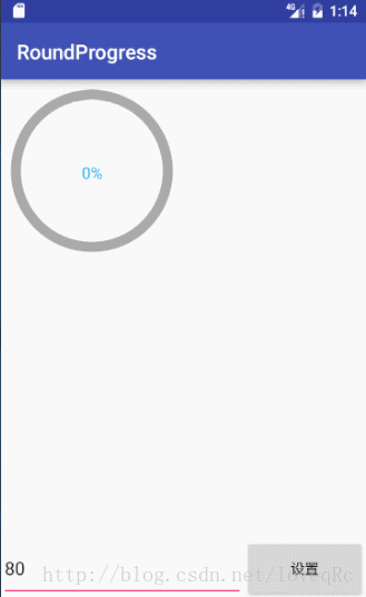
要实现的效果
需要知道的知识点
-
字体的高度和宽度是怎么测?
字体的高度就是textSize的大小。
字体的宽度怎么测量呢?Paint画笔中有测量字体宽度的api,如下:
    //测量字体的宽度
float width = mPaint.measureText(mProgerss + "%");-
字体的原点在哪里?
默认在字体的左下角(在drawText中用到,我们必须要让字体在控件中间) -
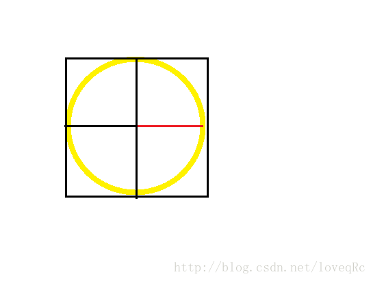
圆的半径怎么确定?
例如我们要画下图黄色的圆
那么我们的半径是红色那段还是黑色那段呢?,如图所示(黑色代表圆心到外切正方形的距离,红色代表黑色线段距离减去圆形线宽的一半的距离)。
答案是
红色那段
。

自定义控件第一步–自定义属性
在values新建attrs.xml文件,定义属性,如下所示
<?xml version="1.0" encoding="utf-8"?>
<resources>
    <declare-styleable name="RoundProgress">
        <!--背景圆形颜色 -->
        <attr name="bgColor" format="color"/>
        <!--进度条颜色 -->
        <attr name="roundColor" format="color"/>
        <!--进度条及背景圆形的宽度 -->
        <attr name="roundWidth" format="dimension"/>
        <!--中心字体的大小 -->
        <attr name="roundTextSize" format="dimension"/>
        <!--中心字体的颜色 -->
        <attr name="roundTextColor" format="color"/>
    </declare-styleable>
</resources>
自定义控件第二步–继承view
package rc.loveq.roundprogress;

import android.content.Context;
import android.content.res.TypedArray;
import android.graphics.Canvas;
import android.graphics.Color;
import android.graphics.Paint;
import android.graphics.RectF;
import android.util.AttributeSet;
import android.view.View;

/**
 * Author:Rc
 * Csdn:http://blog.csdn.net/loveqrc
 * 0n 2016/12/12 16:36
 * Email:664215432@qq.com
 */

public class RoundProgress extends View {
    private static final int DEFAULT_BG_COLOR = Color.GRAY;
    private static final int DEFAULT_ROUND_COLOR = Color.RED;
    private static final float DEFAULT_TEXT_SIZE = 16;
    private static final float DEFAULT_ROUND_WIDTH = 10;
    private static final int DEFAULT_TEXT_COLOR = Color.BLACK;
    private int mBgColor;
    private int mRoundColor;
    private float mTextSize;
    private float mRoundWidth;
    private int mTextColor;
    private Paint mPaint;
    private int mCenterY;
    private int mCenterX;
    private float mRadius;
    private RectF mRectF;
    private int mProgerss=0;

    public RoundProgress(Context context) {
        this(context,null);
    }

    public RoundProgress(Context context, AttributeSet attrs) {
        this(context,attrs,0);
    }

    public RoundProgress(Context context, AttributeSet attrs, int defStyleAttr) {
        super(context, attrs, defStyleAttr);
        TypedArray a = getResources().obtainAttributes(attrs, R.styleable.RoundProgress);
        //拿到在xml配置的属性,如果没有配置,就使用默认的。
        mBgColor = a.getColor(R.styleable.RoundProgress_bgColor, DEFAULT_BG_COLOR);
        mRoundColor = a.getColor(R.styleable.RoundProgress_roundColor, DEFAULT_ROUND_COLOR);
        mTextSize = a.getDimension(R.styleable.RoundProgress_roundTextSize, DEFAULT_TEXT_SIZE);
        mRoundWidth = a.getDimension(R.styleable.RoundProgress_roundWidth, DEFAULT_ROUND_WIDTH);
        mTextColor = a.getColor(R.styleable.RoundProgress_roundTextColor, DEFAULT_TEXT_COLOR);
        a.recycle();//释放资源
        init();//初始化画笔
    }

    private void init() {
        mPaint = new Paint(Paint.ANTI_ALIAS_FLAG);
        mPaint.setStyle(Paint.Style.STROKE);
    }

    /**
     * 当layout大小变化后会回调次方法
     * 通过这方法获取宽高
     * @param w
     * @param h
     * @param oldw
     * @param oldh
     */
    @Override
    protected void onSizeChanged(int w, int h, int oldw, int oldh) {
        super.onSizeChanged(w, h, oldw, oldh);
        mCenterX = w/2;//控宽的中心点
        mCenterY = h/2;//控件高的中心点
        //防止宽高不一致
        int min = Math.min(mCenterX, mCenterY);
        //半径
        mRadius = min-mRoundWidth/2;
        //为画圆弧准备
        mRectF = new RectF(mCenterX-mRadius,mCenterY-mRadius,mCenterX+mRadius,mCenterY+mRadius);
    }

    @Override
    protected void onDraw(Canvas canvas) {
    //        super.onDraw(canvas); 我们自己来画
        //1、先画背景圆环
        mPaint.setColor(mBgColor);
        mPaint.setStrokeWidth(mRoundWidth);
        canvas.drawCircle(mCenterX, mCenterY,mRadius,mPaint);
        //2、画动态圆弧
        mPaint.setColor(mRoundColor);
        canvas.drawArc(mRectF,0, (float) (3.6*mProgerss),false,mPaint);
        //3、画中间的文字
        mPaint.setColor(mTextColor);
        mPaint.setStrokeWidth(0);//如果不设置回0,很难看
        mPaint.setTextSize(mTextSize);
        //测量字体的宽度
        float width = mPaint.measureText(mProgerss + "%");
        canvas.drawText(mProgerss+"%",mCenterX-width/2,mCenterY+mTextSize/2,mPaint);
    }
    public void setProgerss(int progerss){
        mProgerss=progerss;
        postInvalidate();
    }
}
自定义控件第三步–在布局中使用
- 在根节点声明自定义命名空间
xmlns:app="http://schemas.android.com/apk/res-auto"- 引用控件
<rc.loveq.roundprogress.RoundProgress
        android:layout_marginTop="10dp"
        android:layout_marginLeft="10dp"
        android:id="@+id/rp"
        android:layout_width="160dp"
        android:layout_height="160dp"
        app:bgColor="@android:color/darker_gray"
        app:roundColor="@android:color/holo_red_dark"
        app:roundWidth="10dp"
        app:roundTextColor="#18b4ed"
        app:roundTextSize="16sp"
    />
下载地址
版权声明:本文为loveqRc原创文章,遵循 CC 4.0 BY-SA 版权协议,转载请附上原文出处链接和本声明。