响应式布局
一、介绍和版心
前面已经简单接触过。响应式布局就是代码随着屏幕大小的改变显示不同。
档位划分
:
-
媒体查询:档位划分;
市场上默认
的划分;三个节点、四个档位-
w<768
超小屏幕
(xs)(手机,学习rem布局里面的档位划分都是在这个范围) -
768<= w <992
小屏设备
(sm)(平板) -
992<= w <1200
中等屏幕
(md)(小显示屏的PC显示器) -
1200<=w
大宽屏设备
(lg)(大桌面显示器)
-
w<768
语法
:把市场上所有屏幕包括在内;
/* 1. 超小屏幕下 xs 小于 768 */
@media screen and (min-width: 0px) {
}
/* 2. 小屏幕下 sm 大于等于768 */
@media screen and (min-width: 768px) {
}
/* 3. 中等屏幕下 md 大于等于 992px */
@media screen and (min-width: 992px) {
}
/* 4. 大屏幕下 lg 大于等于1200 */
@media screen and (min-width: 1200px) {
}
版心
-
不同的档位下,版心不同;
-
档位设置:版心;
-
所有的子元素都是归于版心下,不同的版心宽度,意味着子元素要以不同的布局排版满足
用户浏览友好
的需求;
语法
:
/* 1. 超小屏幕下 xs 小于 768 布局容器的宽度为 100% */
@media screen and (max-width: 767px) {
    .container {
    	width: 100%;
    }
}
/* 2. 小屏幕下 sm 大于等于768 布局容器改为 750px */
@media screen and (min-width: 768px) {
    .container {
    	width: 750px;
    }
}
/* 3. 中等屏幕下 md 大于等于 992px 布局容器修改为 970px */
@media screen and (min-width: 992px) {
    .container {
    	width: 970px;
    }
}
/* 4. 大屏幕下 lg 大于等于1200 布局容器修改为 1170 */
@media screen and (min-width: 1200px) {
    .container {
    	width: 1170px;
    }
}
-
注意:
- 媒体查询使用符号的相关:min-,max-包含等号,后面是数值单位为px;
- 除超小屏以外:版心的宽度设置都是小于当前档位最小界值,比如 min-width: 768px,版心是750px; 原因:两边留空白,用户体验好。
-
以上市场默认划分,
可根据自己需求添加档位
;
二、BootStrap
网址:
版本:
- 2.x.x:停止维护,代码不够简洁,功能不够完善。
- 3.x.x:目前使用最多,稳定,不支持IE6-IE7。对 IE8 支持,界面效果不好,偏向用于开发响应式布局、 移动设备优先的WEB 项目。
- 4.x.x:最新版,目前还不是很流行
超级常见和好用的一个响应式布局模板。
如何使用?
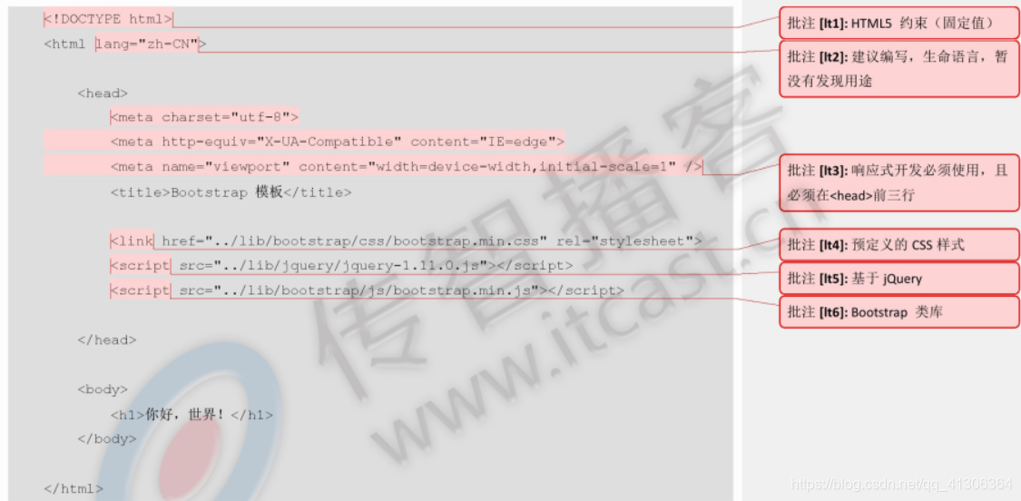
<!DOCTYPE html>
<html lang="zh-CN">
    <head>
    <meta charset="utf-8">
    <!-- 要求 当前网页 使用 IE浏览器 最高版本的内核 来渲染 -->
    <meta http-equiv="X-UA-Compatible" content="IE=edge">

    <!-- 视口的设置:视口的宽度和设备一致,默认的缩放比例和PC端一致,用户不能自行缩放 -->
    <meta name="viewport" content="width=device-width, initial-scale=1">
    <title>BootStrap Template</title>

    <!-- Bootstrap 的文件引入 已经有初始化文件 Normalize.css-->
    <link href="css/bootstrap.min.css" rel="stylesheet">

    <!-- HTML5 shim and Respond.js for IE8 support of HTML5 elements and media queries -->
    <!--解决ie9以下浏览器对html5新增标签的不识别,并导致CSS不起作用的问题-->
    <!--解决ie9以下浏览器对 css3 Media Query 的不识别 -->
    <!-- WARNING: Respond.js doesn't work if you view the page via file:// -->

    <!-- 条件注释:解决小于IE9的版本一些问题 -->
    <!--[if lt IE 9]>
    <script src="//cdn.bootcss.com/html5shiv/3.7.2/html5shiv.min.js"></script>
    <script src="//cdn.bootcss.com/respond.js/1.4.2/respond.min.js"></script>
    <![endif]-->
    </head>
    <body>
    	<h1>你好,世界!</h1>
    </body>
</html>
特点就是
栅格系统
可以非常方便快速地搭建一个网站。
可以查看手册:
bootstrap入门基础
。
使用bootstrap制作轮播图:
模板

<div id="carousel-example-generic" class="carousel slide" data-ride="carousel">
  <!-- Indicators -->
  <ol class="carousel-indicators">
    <li data-target="#carousel-example-generic" data-slide-to="0" class="active"></li>
    <li data-target="#carousel-example-generic" data-slide-to="1"></li>
    <li data-target="#carousel-example-generic" data-slide-to="2"></li>
  </ol>

  <!-- Wrapper for slides -->
  <div class="carousel-inner" role="listbox">
    <div class="item active">
      <img src="..." alt="...">
      <div class="carousel-caption">
        ...
      </div>
    </div>
    <div class="item">
      <img src="..." alt="...">
      <div class="carousel-caption">
        ...
      </div>
    </div>
    ...
  </div>

  <!-- Controls -->
  <a class="left carousel-control" href="#carousel-example-generic" role="button" data-slide="prev">
    <span class="glyphicon glyphicon-chevron-left" aria-hidden="true"></span>
    <span class="sr-only">Previous</span>
  </a>
  <a class="right carousel-control" href="#carousel-example-generic" role="button" data-slide="next">
    <span class="glyphicon glyphicon-chevron-right" aria-hidden="true"></span>
    <span class="sr-only">Next</span>
  </a>
</div>
使用bootstrap做轮播图案例
-
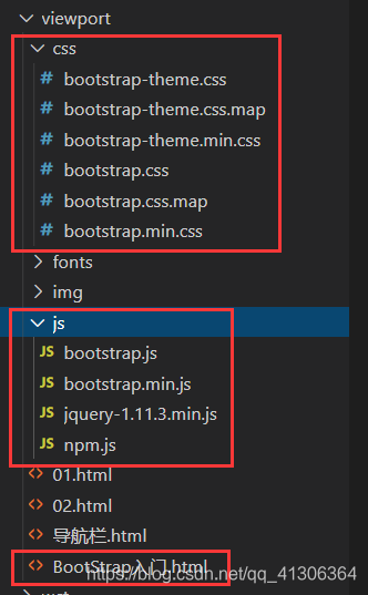
先将bootstrap所需工具引入到项目中
-
使用bootstrap模板
<!DOCTYPE html> <html lang="zh-CN"> <head> <meta charset="utf-8"> <!-- 要求 当前网页 使用 IE浏览器 最高版本的内核 来渲染 --> <meta http-equiv="X-UA-Compatible" content="IE=edge"> <!-- 视口的设置:视口的宽度和设备一致,默认的缩放比例和PC端一致,用户不能自行缩放 --> <meta name="viewport" content="width=device-width, initial-scale=1"> <title>BootStrap Template</title> <!-- Bootstrap 的文件引入 已经有初始化文件 Normalize.css--> <link href="css/bootstrap.min.css" rel="stylesheet"> <!-- HTML5 shim and Respond.js for IE8 support of HTML5 elements and media queries --> <!--解决ie9以下浏览器对html5新增标签的不识别,并导致CSS不起作用的问题--> <!--解决ie9以下浏览器对 css3 Media Query 的不识别 --> <!-- WARNING: Respond.js doesn't work if you view the page via file:// --> <!-- 条件注释:解决小于IE9的版本一些问题 --> <!--[if lt IE 9]> <script src="//cdn.bootcss.com/html5shiv/3.7.2/html5shiv.min.js"></script> <script src="//cdn.bootcss.com/respond.js/1.4.2/respond.min.js"></script> <![endif]--> </head> <body> <h1>你好,世界!</h1> </body> </html> -
到官网上找轮播图代码,直接拷贝到html中
	<div id="carousel-example-generic" class="carousel slide" data-ride="carousel">
  <!-- Indicators -->
  <ol class="carousel-indicators">
    <li data-target="#carousel-example-generic" data-slide-to="0" class="active"></li>
    <li data-target="#carousel-example-generic" data-slide-to="1"></li>
    <li data-target="#carousel-example-generic" data-slide-to="2"></li>
  </ol>

  <!-- Wrapper for slides -->
  <div class="carousel-inner" role="listbox">
    <div class="item active">
      <img src="..." alt="...">
      <div class="carousel-caption">
        ...
      </div>
    </div>
    <div class="item">
      <img src="..." alt="...">
      <div class="carousel-caption">
        ...
      </div>
    </div>
    ...
  </div>

  <!-- Controls -->
  <a class="left carousel-control" href="#carousel-example-generic" role="button" data-slide="prev">
    <span class="glyphicon glyphicon-chevron-left" aria-hidden="true"></span>
    <span class="sr-only">Previous</span>
  </a>
  <a class="right carousel-control" href="#carousel-example-generic" role="button" data-slide="next">
    <span class="glyphicon glyphicon-chevron-right" aria-hidden="true"></span>
    <span class="sr-only">Next</span>
  </a>
</div>
完整代码
<!DOCTYPE html>
<html lang="zh-CN">
  <head>
    <meta charset="utf-8">
    <!--声明文档兼容模式,表示使用IE浏览器的最新模式-->
    <meta http-equiv="X-UA-Compatible" content="IE=edge">
    <!--设置视口的宽度(值为设备的理想宽度)页面的初始缩放值<理想宽度/可见宽度> initial-scale=1比例值-->
    <meta name="viewport" content="width=device-width, initial-scale=1">
    <!-- 上述3个meta标签*必须*放在最前面,任何其他内容都*必须*跟随其后! -->
    <title>Bootstrap 101 Template</title>

    <!-- Bootstrap -->
    <link href="css/bootstrap.css" rel="stylesheet">

    <!-- HTML5 shim and Respond.js for IE8 support of HTML5 elements and media queries -->
    <!-- WARNING: Respond.js doesn't work if you view the page via file:// -->
    <!--[if lt IE 9]>
      <script src="//cdn.bootcss.com/html5shiv/3.7.2/html5shiv.min.js"></script>
      <script src="//cdn.bootcss.com/respond.js/1.4.2/respond.min.js"></script>
    <![endif]-->
  </head>
  <body>
    <div id="carousel-example-generic" class="carousel slide" data-ride="carousel">
      <!-- Indicators -->
      <ol class="carousel-indicators">
        <li data-target="#carousel-example-generic" data-slide-to="0" class="active"></li>
        <li data-target="#carousel-example-generic" data-slide-to="1"></li>
        <li data-target="#carousel-example-generic" data-slide-to="2"></li>
      </ol>

      <!-- Wrapper for slides -->
      <div class="carousel-inner" role="listbox">
        <div class="item active">
          <img src="img/1.jpg" alt="...">
          <div class="carousel-caption">
            ...
          </div>
        </div>
        <div class="item">
          <img src="img/2.jpg" alt="...">
          <div class="carousel-caption">
            ...
          </div>
        </div>
        <div class="item">
          <img src="img/3.jpg" alt="...">
          <div class="carousel-caption">
            ...
          </div>
        </div>
      </div>

      <!-- Controls -->
      <a class="left carousel-control" href="#carousel-example-generic" role="button" data-slide="prev">
        <span class="glyphicon glyphicon-chevron-left" aria-hidden="true"></span>
        <span class="sr-only">Previous</span>
      </a>
      <a class="right carousel-control" href="#carousel-example-generic" role="button" data-slide="next">
        <span class="glyphicon glyphicon-chevron-right" aria-hidden="true"></span>
        <span class="sr-only">Next</span>
      </a>
    </div>

    <!-- jQuery (necessary for Bootstrap's JavaScript plugins) -->
    <script src="js/jquery-1.11.3.min.js"></script>
    <!-- Include all compiled plugins (below), or include individual files as needed -->
    <script src="js/bootstrap.js"></script>
  </body>
</html>
效果图
-
浏览器查看:最大页面

-
缩小页面:自适应

-
手机端显示

总结
bootstrap能够快速搭建一个前端网页,非常好用!尤其适合新手。
版权声明:本文为qq_41306364原创文章,遵循 CC 4.0 BY-SA 版权协议,转载请附上原文出处链接和本声明。