目录
- 测试环境:Windows 10
- 开发工具:Vs Code
补充说明:
inline 属性
inline
:行内属性,是从左到右的排版,详细理解是如果 在使用了
<div>
标签后,对
div
标签内的子元素标签,设置了
inline
属性,那么就会对立面的子标签进行一个行
row
的排版,行内元素,代码如下:
<html>
<head>
    <style>
        /* 声明父元素为flex容器 */
ul {
    display:inline; /*或者 inline-flex*/
}
ul p{
    display: inline;
}
li {
    width: 100px;
    height: 100px;
    background-color: #8cacea;
    margin: 8px;

}
    </style>
</head>
<body>
    <ul> <!--parent element-->
        <p>test</p>
        <p>test</p>
        <li></li> <!--first child element-->
        <li></li> <!--second child element-->
        <li></li> <!--third child element-->
      </ul>
</body>
</html>
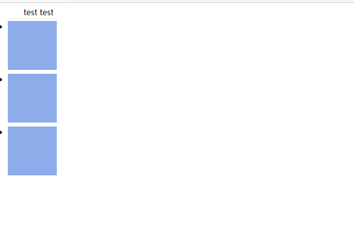
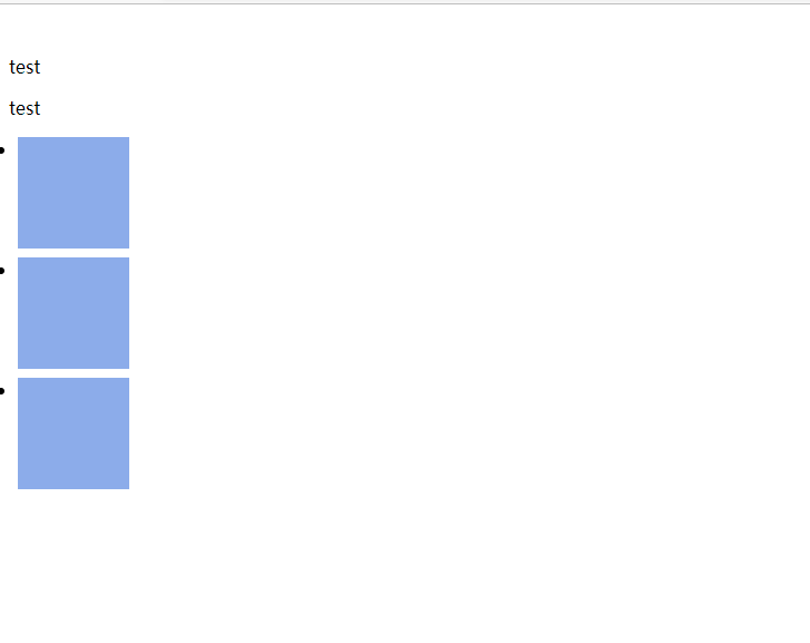
特别注意
:
ul
父元素设置了
inline
是不对其子元素其作用的,只有使用了 CSS 后代或子代选择器的配置,才生效。
结果图:
修改CSS后代选择器的子元素
li
标签为
inline
属性代码:
<html>
<head>
    <style>
        /* 声明父元素为flex容器 */
ul {
    display:inline; /*或者 inline-flex*/
}
ul p{
    display: inline;
}
ul li{
    display: inline;
    /* display: inline-block; */

}
li {
    width: 100px;
    height: 100px;
    background-color: #8cacea;
    margin: 8px;

}
    </style>
</head>
<body>
    <ul> <!--parent element-->
        <p>test</p>
        <p>test</p>
        <li></li> <!--first child element-->
        <li></li> <!--second child element-->
        <li></li> <!--third child element-->
      </ul>
</body>
</html>
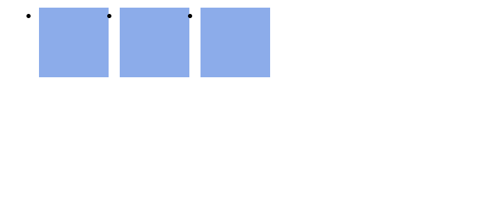
结果图:
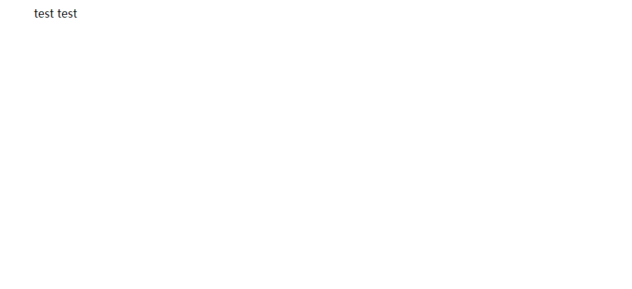
看起来,
li
标签的方块消失了,
inline
看来只对文本标签起作用,如
p
、
h1
标签等等
将 li 标签的 inline 属性修改为 inline-block ,代码如下:
<html>
<head>
    <style>
        /* 声明父元素为flex容器 */
ul {
    display:inline; /*或者 inline-flex*/
}
ul p{
    display: inline;
}
ul li{
    /* display: inline; */
    display: inline-block;

}
li {
    width: 100px;
    height: 100px;
    background-color: #8cacea;
    margin: 8px;

}
    </style>
</head>
<body>
    <ul> <!--parent element-->
        <p>test</p>
        <p>test</p>
        <li></li> <!--first child element-->
        <li></li> <!--second child element-->
        <li></li> <!--third child element-->
      </ul>
</body>
</html>
结果图:
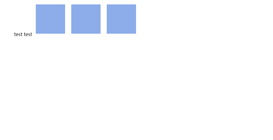
看起来,
li
标签头的黑色圆点消失了,相当于是
list-style:none
如下:
li {
    width: 100px;
    height: 100px;
    background-color: #8cacea;
    margin: 8px;
    list-style: none;

}
效果如下:(
li
标签的黑点消失了)
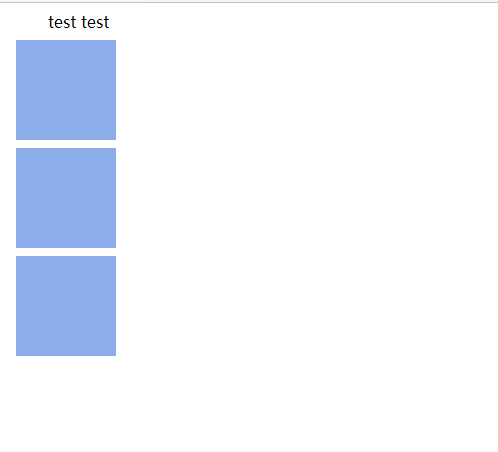
block 属性
block
:代表了 column 列的排版,将子元素进行从上到下的排版,块级元素。
演示代码:
<html>
<head>
    <style>
        /* 声明父元素为flex容器 */
ul {
    display:inline; /*或者 inline-flex*/
}
ul p{
    display: block;
}
li {
    width: 100px;
    height: 100px;
    background-color: #8cacea;
    margin: 8px;

}
    </style>
</head>
<body>
    <ul> <!--parent element-->
        <p>test</p>
        <p>test</p>
        <li></li> <!--first child element-->
        <li></li> <!--second child element-->
        <li></li> <!--third child element-->
      </ul>
</body>
</html>
结果图:
回归正题
一、flex 一维布局模块
注意,设为 Flex 布局以后,子元素的
float
、
clear
和
vertical-align
属性将失效。
flex
说是一个一维的模块,但实际上是在 CSS 配置
display
属性时,值配置为
flex
,如下所示:
演示代码:
<html>
<head>
    <style>
        /* 声明父元素为flex容器 */
ul {
    display:flex; /*或者 inline-flex*/
}

li {
    width: 100px;
    height: 100px;
    background-color: #8cacea;
    margin: 8px;

}
    </style>
</head>
<body>
    <ul> <!--parent element-->
        <li></li> <!--first child element-->
        <li></li> <!--second child element-->
        <li></li> <!--third child element-->
      </ul>
</body>
</html>
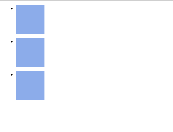
将
ul p
选择器和
p
标签删除,会看起来简洁些。
结果图:
看起来就像是自动设置了
inline
属性一样。
默认
row
行布局。
flex 模块的基本逻辑流程
,是牢记一个容器,n 个项目,一个容器只能在行方向,即从左到右,或从右到左,进行排版,如果是在第二行,那么则会重新开启一个新的容器,来容纳第二行内的项目,所以才被称作是一维的布局模块。
对于 flex 来说,新的一行就是一个新的独立的 flex 容器
所以,
ul
标签被看做是一个容器,而子元素
li
标签则被认为是 项目元素
-
Flex容器(
Flex Container
):父元素显式设置了
display:flex
-
Flex项目(
Flex Items
):Flex容器内的项目子元素
flex
容器被看做一个四边形一维网格,而这其中横向
x
纵向
y
则是分为主轴
x
(
Main-Axis
)和侧轴
y
(
Cross-Axis
交叉轴
),可看做是四边形的
x
和
y
轴,以这个容器为区域,里面又对项目进行,CSS 属性配置,但是基本是长方形的容器,所以项目们只能在这长方形内进行布局。除非上面提到的,另开一个新的
flex
容器。
拿了张图引用下
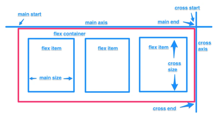
通俗的说,感觉
Main-Axis
就是水平方向,从左到右,这也是默认方向。
Cross-Axis
是垂直方向,从上往下。
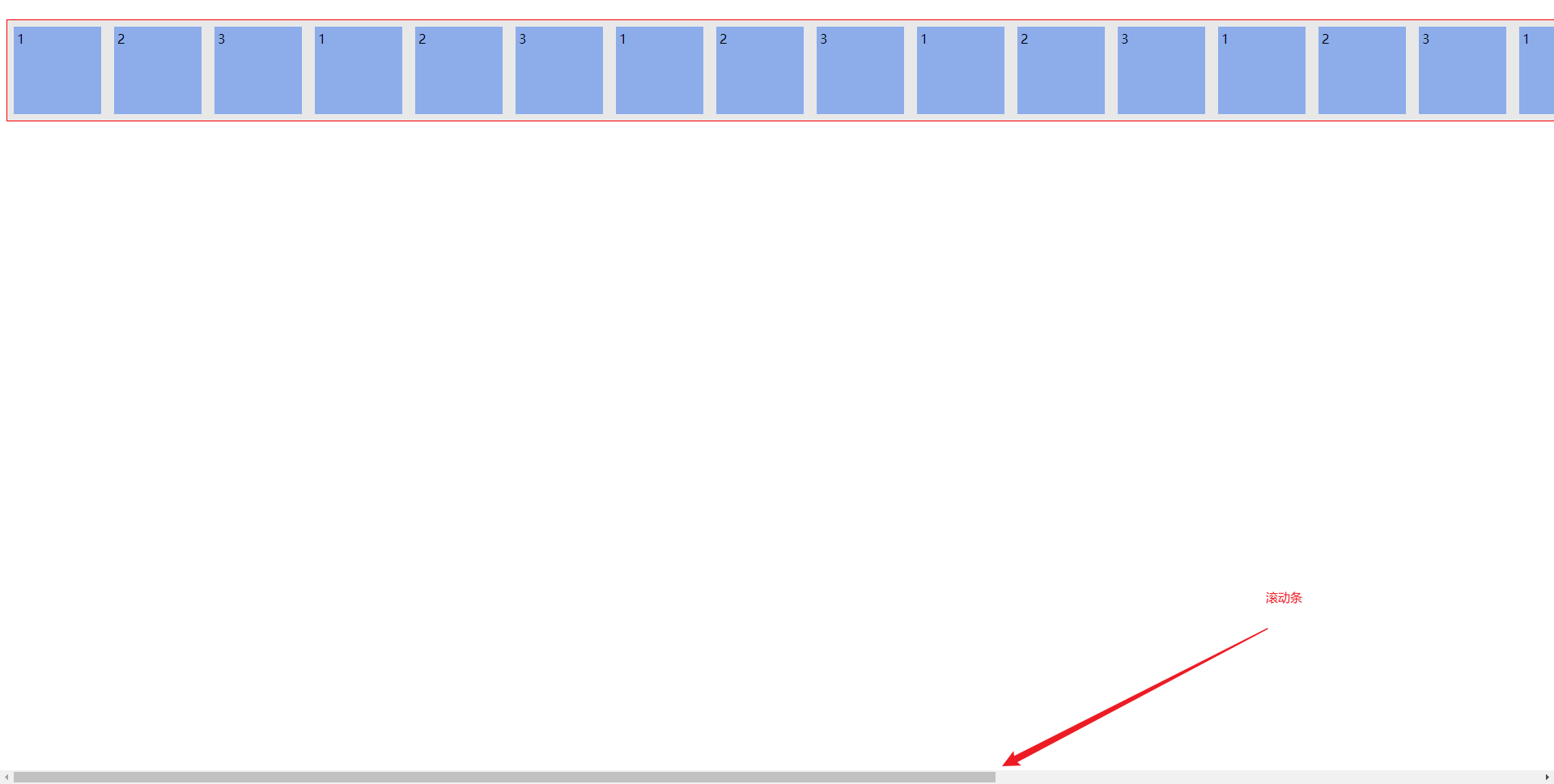
特别补充:除了
display:flex;
还有一个
display:inline-flex;
其实就是把容器塞进一个类似 div 标签的标签内,比如这里是 div 标签,那么就类似文本行处理,在这个 div 标签范围内,处理容器内的项目,不过不会换行,而是超过窗口的长度,就会弹出滚动条。
代码示例:
<html>
<head>
    <style>
        /* 声明父元素为flex容器 */
ul {
    display:inline-flex;
    border: 1px solid red;
    padding: 0;
    list-style: none;
    background-color: #e8e8e9;
    /* justify-content: flex-start; */
}
li {
    background-color: #8cacea;
    width: 100px;
    height: 100px;
    margin: 8px;
    padding: 4px;
}
    </style>
</head>
<body>
    <ul> <!--parent element-->
        <li>1</li> <!--first child element-->
        <li>2</li> <!--second child element-->
        <li>3</li> <!--third child element-->
        <li>1</li> <!--first child element-->
        <li>2</li> <!--second child element-->
        <li>3</li> <!--third child element-->
        <li>1</li> <!--first child element-->
        <li>2</li> <!--second child element-->
        <li>3</li> <!--third child element-->
        <li>1</li> <!--first child element-->
        <li>2</li> <!--second child element-->
        <li>3</li> <!--third child element-->
        <li>1</li> <!--first child element-->
        <li>2</li> <!--second child element-->
        <li>3</li> <!--third child element-->
        <li>1</li> <!--first child element-->
        <li>2</li> <!--second child element-->
        <li>3</li> <!--third child element-->
        <li>1</li> <!--first child element-->
        <li>2</li> <!--second child element-->
        <li>3</li> <!--third child element-->
        <li>1</li> <!--first child element-->
        <li>2</li> <!--second child element-->
        <li>3</li> <!--third child element-->
    </ul>
</body>
</html>
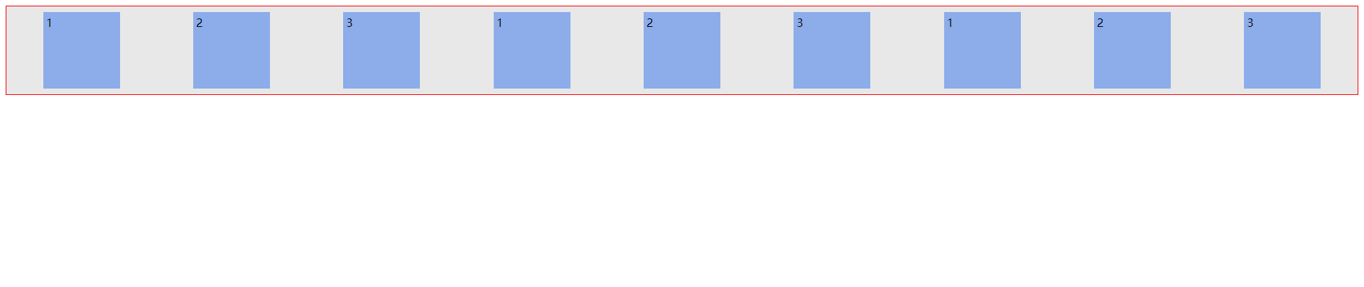
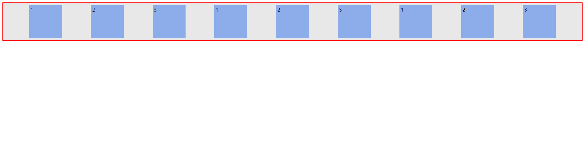
效果图:
二、容器 container 的属性
-
flex-direction
主轴方向 -
flex-wrap
主轴一行满了换行 -
flex-flow
1和2的组合 -
justify-content
主轴元素
对齐方式 -
align-items
交叉轴元素
对齐方式
单行
-
align-content
交叉轴多轴
对齐方式
多行
1. flex-direction 轴属性 – 主轴、侧轴 布局方向配置
row
(默认值):主轴为水平方向,起点在左端。
row-reverse
:主轴为水平方向,起点在右端。
column
:主轴为垂直方向,起点在上沿。
column-reverse
:主轴为垂直方向,起点在下沿。
配置前端排版布局,flex 模块默认是从左到右,而这其中的关键在于
flex-direction
属性,默认值是
row
,但是如果是这样子配置
flex-direction: "column"
,那么
flex
就不再是按行排版布局了,即从左到右,而是竖向(纵向)排版布局,即从上到下,还记得
flex
模块布局,是一维布局吗?理解了就清楚,配置了
column
,则是
相当于是顺时针转动了
90°
修改为 (侧轴) 列布局:
<html>
<head>
    <style>
        /* 声明父元素为flex容器 */
ul {
    display:flex; /*或者 inline-flex*/
    flex-direction: column;
}
li {
    width: 100px;
    height: 100px;
    background-color: #8cacea;
    margin: 8px;
}
    </style>
</head>
<body>
    <ul> <!--parent element-->
        <li></li> <!--first child element-->
        <li></li> <!--second child element-->
        <li></li> <!--third child element-->
      </ul>
</body>
</html>
结果图:
2. flex-wrap 换行属性 – 是否换行排列布局 默认不换行
nowrap
(默认值) 不换行压缩宽度
wrap
换行
wrap-reverses
反向换行
nowrap 默认值
flex-wrap
换行处理
wrap
v. 包,裹,包装;
flex-wrap
属性的默认值为
nowrap
,即不换行布局,一行里面挤满了所有的项目。(会自动计算出在一行内合适的排版)
代码如下:
<html>
<head>
    <style>
        /* 声明父元素为flex容器 */
ul {
    display:flex; /*或者 inline-flex*/
    /* flex-direction: column; */
    /* flex-wrap: wrap; */
}
li {
    width: 100px;
    height: 100px;
    background-color: #8cacea;
    margin: 8px;
}
    </style>
</head>
<body>
    <ul> <!--parent element-->
        <li></li> <!--first child element-->
        <li></li> <!--second child element-->
        <li></li> <!--third child element-->
        <li></li> <!--first child element-->
        <li></li> <!--second child element-->
        <li></li> <!--third child element-->
        <li></li> <!--first child element-->
        <li></li> <!--second child element-->
        <li></li> <!--third child element-->
        <li></li> <!--first child element-->
        <li></li> <!--second child element-->
        <li></li> <!--third child element-->
        <li></li> <!--first child element-->
        <li></li> <!--second child element-->
        <li></li> <!--third child element-->
        <li></li> <!--first child element-->
        <li></li> <!--second child element-->
        <li></li> <!--third child element-->
        <li></li> <!--first child element-->
        <li></li> <!--second child element-->
        <li></li> <!--third child element-->
        <li></li> <!--first child element-->
        <li></li> <!--second child element-->
        <li></li> <!--third child element-->
    </ul>
</body>
</html>
结果如下所示:
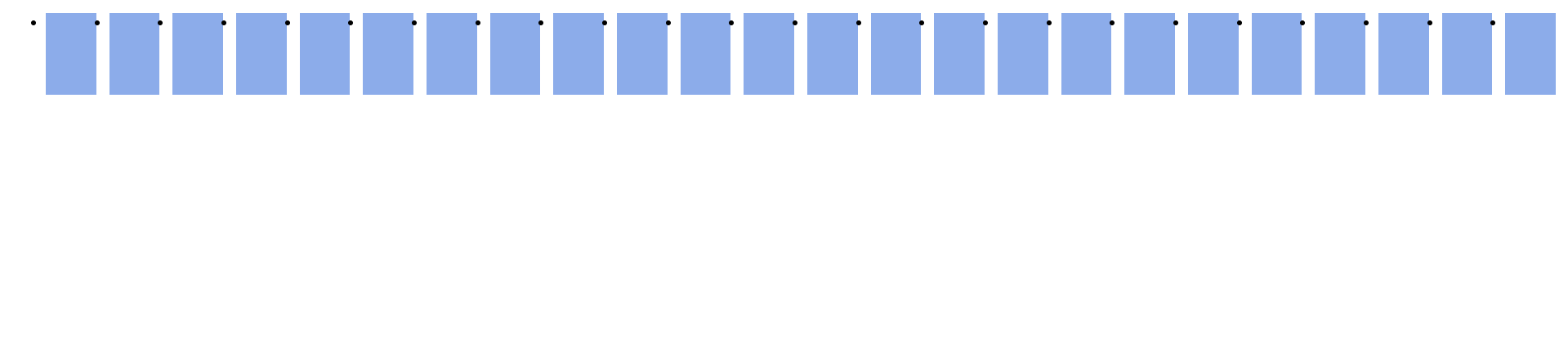
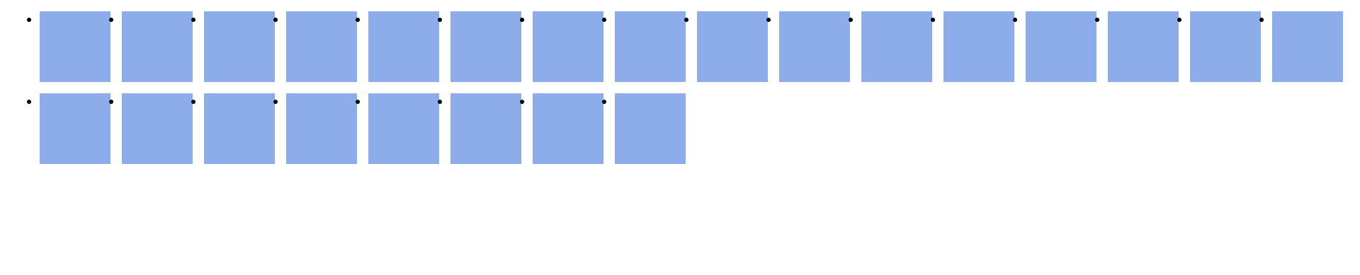
wrap 换行
如果是想要换行的话,就配置
flex-wrap
属性的值为
wrap
当你希望Flex容器内的Flex项目达到一定数量时,能换行排列。当Flex容器中没有足够的空间放置Flex项目(Flex项目默认宽度),那么Flex项目将会换行排列。把它(
flex-wrap
)的值设置为
wrap
就有这种可能。
在这种情况下,当一行再不能包含所有列表项的默认宽度,他们就会多行排列
<html>
<head>
    <style>
        /* 声明父元素为flex容器 */
ul {
    display:flex; /*或者 inline-flex*/
    /* flex-direction: column; */
    flex-wrap: wrap;
}
li {
    width: 100px;
    height: 100px;
    background-color: #8cacea;
    margin: 8px;
}
    </style>
</head>
<body>
    <ul> <!--parent element-->
        <li></li> <!--first child element-->
        <li></li> <!--second child element-->
        <li></li> <!--third child element-->
        <li></li> <!--first child element-->
        <li></li> <!--second child element-->
        <li></li> <!--third child element-->
        <li></li> <!--first child element-->
        <li></li> <!--second child element-->
        <li></li> <!--third child element-->
        <li></li> <!--first child element-->
        <li></li> <!--second child element-->
        <li></li> <!--third child element-->
        <li></li> <!--first child element-->
        <li></li> <!--second child element-->
        <li></li> <!--third child element-->
        <li></li> <!--first child element-->
        <li></li> <!--second child element-->
        <li></li> <!--third child element-->
        <li></li> <!--first child element-->
        <li></li> <!--second child element-->
        <li></li> <!--third child element-->
        <li></li> <!--first child element-->
        <li></li> <!--second child element-->
        <li></li> <!--third child element-->
    </ul>
</body>
</html>
结果图:
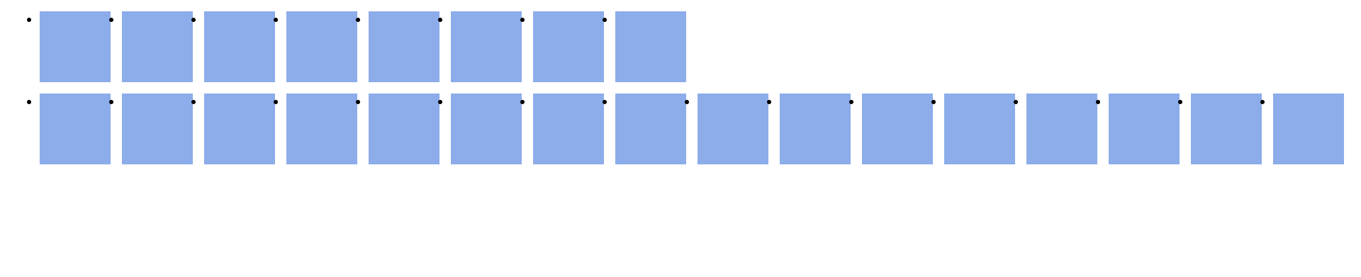
wrap-reverse 换行,反向
反向的排版布局,之前的
wrap
值,方向的从左到右,一行排版不下,就会换行,从而形成从上到下的,行排版换行布局,而这个
wrap-reverse
是从左到右,从下到上的方式,进行排版布局的。
代码演示:
<html>
<head>
    <style>
        /* 声明父元素为flex容器 */
ul {
    display:flex; /*或者 inline-flex*/
    /* flex-direction: column; */
    flex-wrap: wrap-reverse;
}
li {
    width: 100px;
    height: 100px;
    background-color: #8cacea;
    margin: 8px;
}
    </style>
</head>
<body>
    <ul> <!--parent element-->
        <li></li> <!--first child element-->
        <li></li> <!--second child element-->
        <li></li> <!--third child element-->
        <li></li> <!--first child element-->
        <li></li> <!--second child element-->
        <li></li> <!--third child element-->
        <li></li> <!--first child element-->
        <li></li> <!--second child element-->
        <li></li> <!--third child element-->
        <li></li> <!--first child element-->
        <li></li> <!--second child element-->
        <li></li> <!--third child element-->
        <li></li> <!--first child element-->
        <li></li> <!--second child element-->
        <li></li> <!--third child element-->
        <li></li> <!--first child element-->
        <li></li> <!--second child element-->
        <li></li> <!--third child element-->
        <li></li> <!--first child element-->
        <li></li> <!--second child element-->
        <li></li> <!--third child element-->
        <li></li> <!--first child element-->
        <li></li> <!--second child element-->
        <li></li> <!--third child element-->
    </ul>
</body>
</html>
结果图:
3. flex-flow 速记写法 – flex-direction – flex-wrap
如果还记得使用
border
的速记写法?
border: 1px solid red
。这里的概念是相同的,多个值写在同一行,比如下面的示例:
ul {
    flex-flow: row wrap;
}
相当于
ul {
    flex-direction: row;
    flex-wrap: wrap;
}
除了这个组合之外,你还可以尝试一些其它的组合。
flex-flow: row nowrap
,
flex-flow: column wrap
,
flex-flow: column nowrap
。
4. justify-content 主轴对齐属性
Flexbox
模块真得很好。如果你仍然不相信它的魅力,那么
justify-content
属性可能会说服你。
怎么理解主轴,其实在这里,主轴指的是直角坐标系下的 x 轴,即横轴,在这里我们将这里的主轴对齐,看做是左对齐、右对齐、居中,还有将主轴划分为等长的两部分,等长划分的中点,又会有另外的两个值,给予特定的变化。
flex-start
(默认)靠着
Main-start
对齐//参考常见术语(一般是左方向,
左对齐
)
flex-end
靠着
Main-end
对齐//参考常见术语(一般是右方向,
右对齐
)
center
靠着主轴居中对齐//一般就是居中对齐
space-between
两端对齐,靠着容器壁,剩余空间平分
space-around
分散对齐,不靠着容器壁,剩余空间在每个项目二侧平均分配
space-evenly
平均对齐,不靠着容器壁,剩余空间绝对平分
可接受参数:
ul {
    justify-content: flex-start || flex-end || center || space-between || space-around
}
代码演示:
<html>
<head>
    <style>
        /* 声明父元素为flex容器 */
ul {
    display:flex;
    border: 1px solid red;
    padding: 0;
    list-style: none;
    background-color: #e8e8e9;
    justify-content: flex-start;
}
li {
    background-color: #8cacea;
    width: 100px;
    height: 100px;
    margin: 8px;
    padding: 4px;
}
    </style>
</head>
<body>
    <ul> <!--parent element-->
        <li>1</li> <!--first child element-->
        <li>2</li> <!--second child element-->
        <li>3</li> <!--third child element-->

    </ul>
</body>
</html>
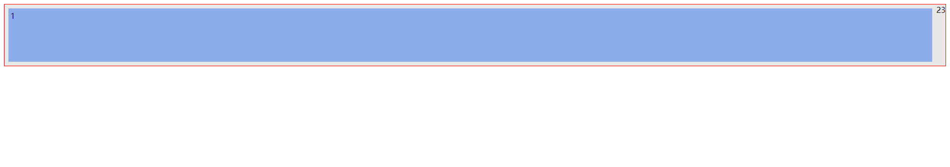
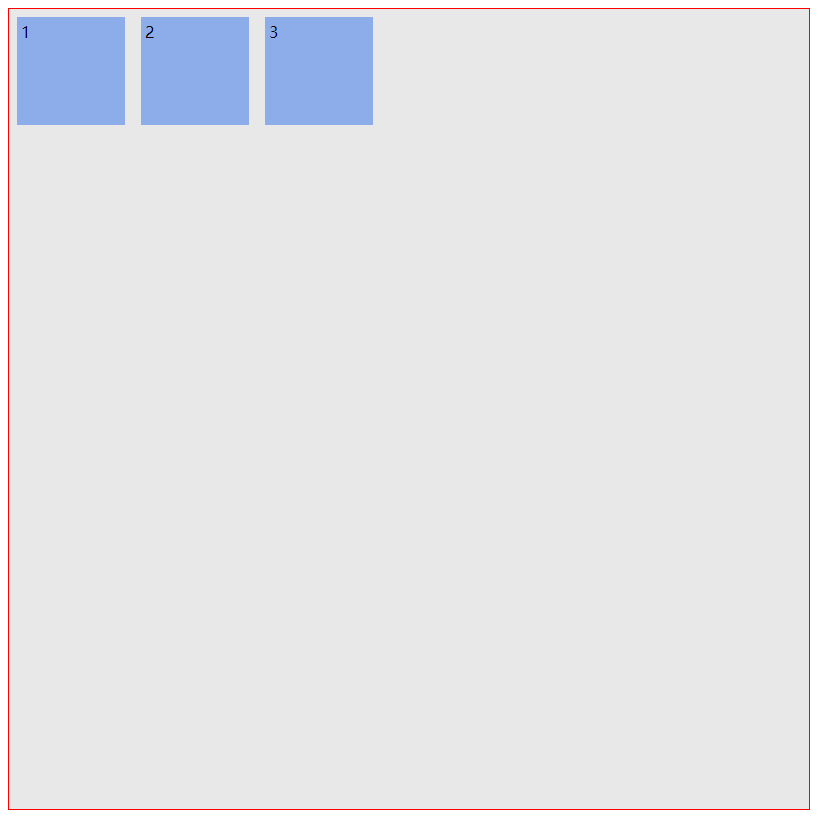
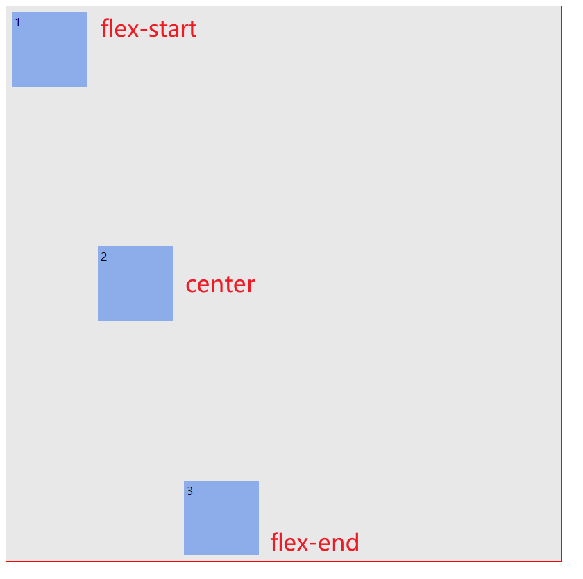
flex-start 左对齐 – 默认值
justify-content
的默认属性值是
flex-start
。
flex-start
让所有Flex项目靠
Main-Axis
主轴开始边缘(左对齐)。
ul {
    justify-content: flex-start;
}
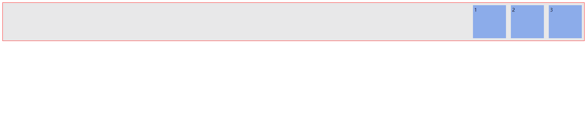
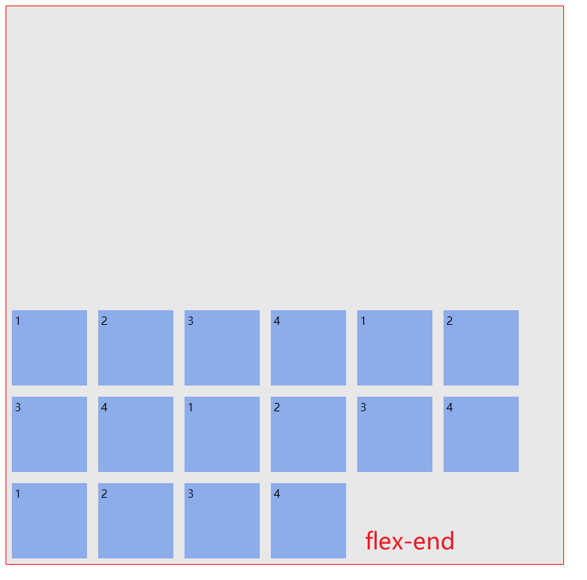
flex-end 右对齐
flex-end
让所有Flex项目靠
Main-Axis
结束边缘(右对齐)。
ul {
    justify-content: flex-end;
}
效果图:
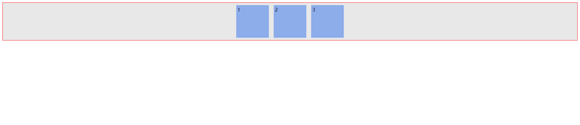
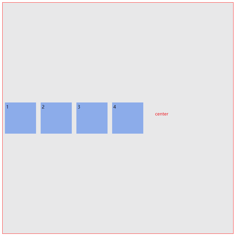
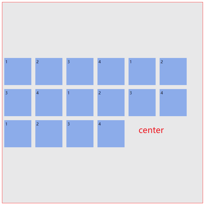
center 居中对齐
和你预期的一样,
center
让所有Flex项目排在
Main-Axis
中间(居中对齐)。
ul {
    justify-content: center;
}
效果图:
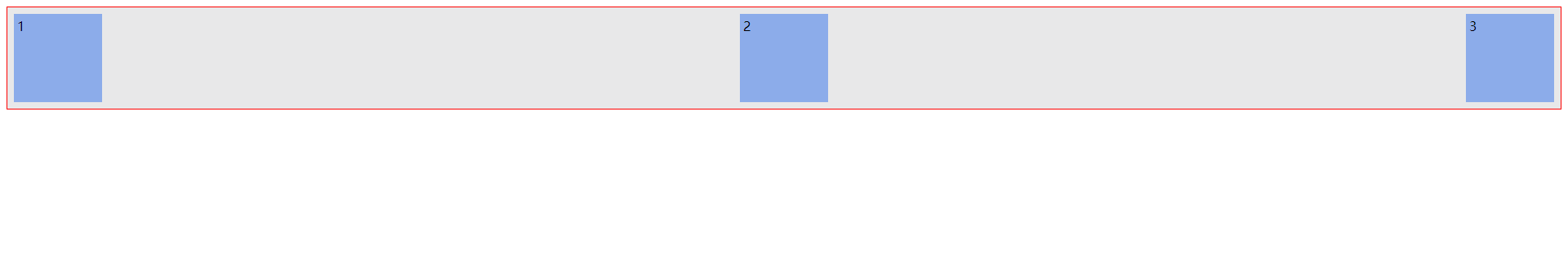
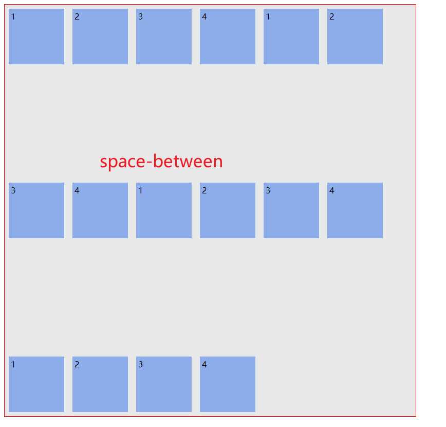
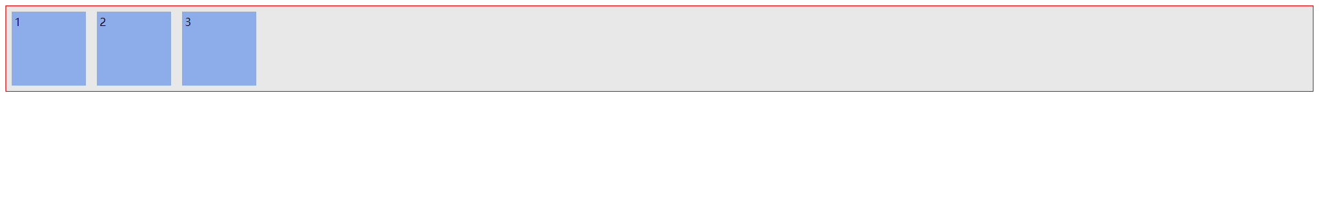
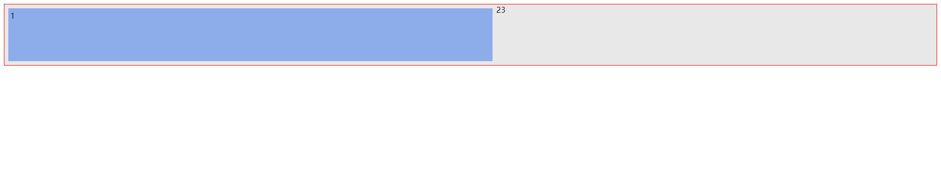
space-between 自动计算项目之间间隔,平均分配间隔
space-between
让除了第一个和最一个Flex项目的两者间间距相同(两端对齐)。
比较极端,最左右两边的项目的挤到了最左边和最右边,里面的项目则是平均分配剩下的间隔。
代码1:
<html>
<head>
    <style>
        /* 声明父元素为flex容器 */
ul {
    display:flex;
    border: 1px solid red;
    padding: 0;
    list-style: none;
    background-color: #e8e8e9;
    justify-content: space-between;
}
li {
    background-color: #8cacea;
    width: 100px;
    height: 100px;
    margin: 8px;
    padding: 4px;
}
    </style>
</head>
<body>
    <ul> <!--parent element-->
        <li>1</li> <!--first child element-->
        <li>2</li> <!--second child element-->
        <li>3</li> <!--third child element-->
    </ul>
</body>
</html>
效果图1:如果安排三个 li 元素,结果就是如下所示
代码2:
<html>
<head>
    <style>
        /* 声明父元素为flex容器 */
ul {
    display:flex;
    border: 1px solid red;
    padding: 0;
    list-style: none;
    background-color: #e8e8e9;
    justify-content: space-between;
}
li {
    background-color: #8cacea;
    width: 100px;
    height: 100px;
    margin: 8px;
    padding: 4px;
}
    </style>
</head>
<body>
    <ul> <!--parent element-->
        <li>1</li> <!--first child element-->
        <li>2</li> <!--second child element-->
        <li>3</li> <!--third child element-->
        <li>1</li> <!--first child element-->
        <li>2</li> <!--second child element-->
        <li>3</li> <!--third child element-->
        <li>1</li> <!--first child element-->
        <li>2</li> <!--second child element-->
        <li>3</li> <!--third child element-->
    </ul>
</body>
</html>
效果图2:
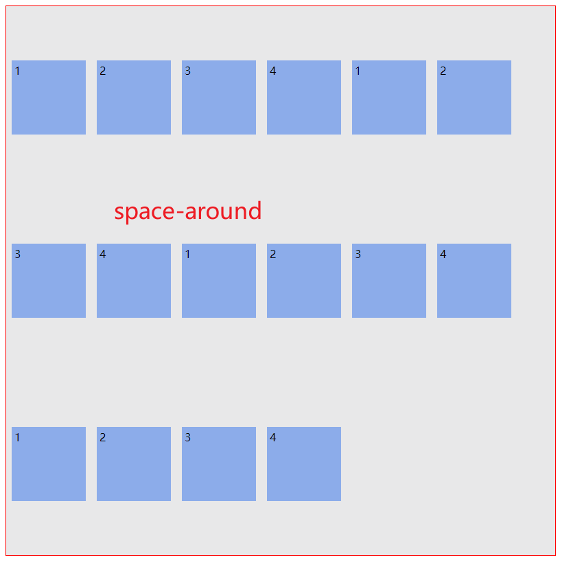
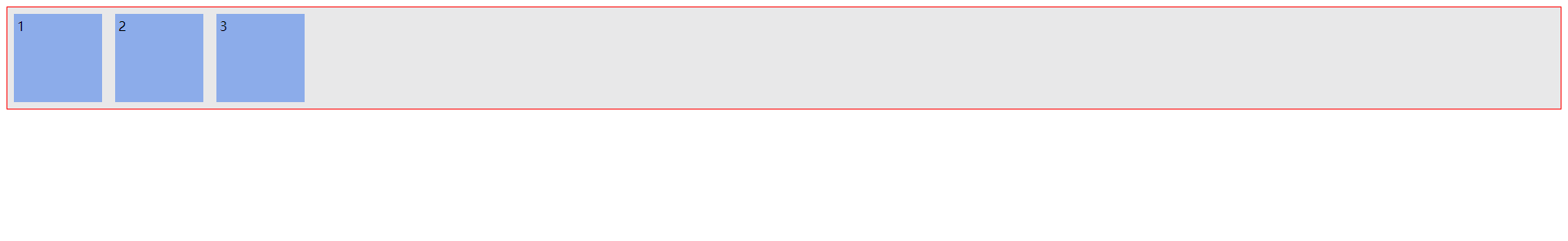
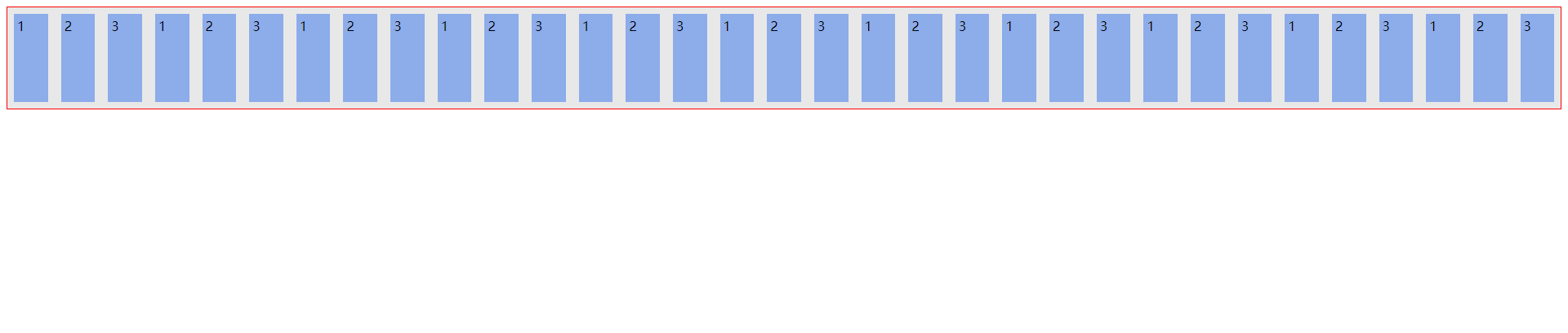
space-around 间隔相等属性
对所有的项目都分配一样的间隔。这个有点类似
space-between
,但其实还是有区别的,
space-between
注重于 第一个和最后一个项目与边界线之间的间隔是近乎没有的,但是
space-around
与边界线之间是有间隔的,而且该间隔与最后一个的间隔相加起来等于其他项目之间的间隔。
代码:
<html>
<head>
    <style>
        /* 声明父元素为flex容器 */
ul {
    display:flex;
    border: 1px solid red;
    padding: 0;
    list-style: none;
    background-color: #e8e8e9;
    justify-content: space-around;
}
li {
    background-color: #8cacea;
    width: 100px;
    height: 100px;
    margin: 8px;
    padding: 4px;
}
    </style>
</head>
<body>
    <ul> <!--parent element-->
        <li>1</li> <!--first child element-->
        <li>2</li> <!--second child element-->
        <li>3</li> <!--third child element-->
        <li>1</li> <!--first child element-->
        <li>2</li> <!--second child element-->
        <li>3</li> <!--third child element-->
        <li>1</li> <!--first child element-->
        <li>2</li> <!--second child element-->
        <li>3</li> <!--third child element-->
    </ul>
</body>
</html>
效果图:
space-evenly 间隔绝对相等属性
space-evenly
平均对齐,不靠着容器壁,剩余空间绝对平分
测试代码:
<html>
<head>
    <style>
        /* 声明父元素为flex容器 */
ul {
    display:flex;
    border: 1px solid red;
    padding: 0;
    list-style: none;
    background-color: #e8e8e9;
    justify-content: space-evenly;
}
li {
    background-color: #8cacea;
    width: 100px;
    height: 100px;
    margin: 8px;
    padding: 4px;
}
    </style>
</head>
<body>
    <ul> <!--parent element-->
        <li>1</li> <!--first child element-->
        <li>2</li> <!--second child element-->
        <li>3</li> <!--third child element-->
        <li>1</li> <!--first child element-->
        <li>2</li> <!--second child element-->
        <li>3</li> <!--third child element-->
        <li>1</li> <!--first child element-->
        <li>2</li> <!--second child element-->
        <li>3</li> <!--third child element-->
    </ul>
</body>
</html>
效果图:
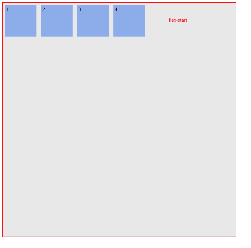
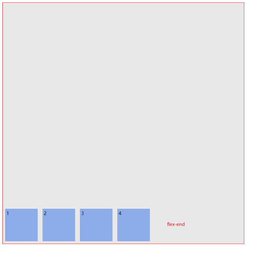
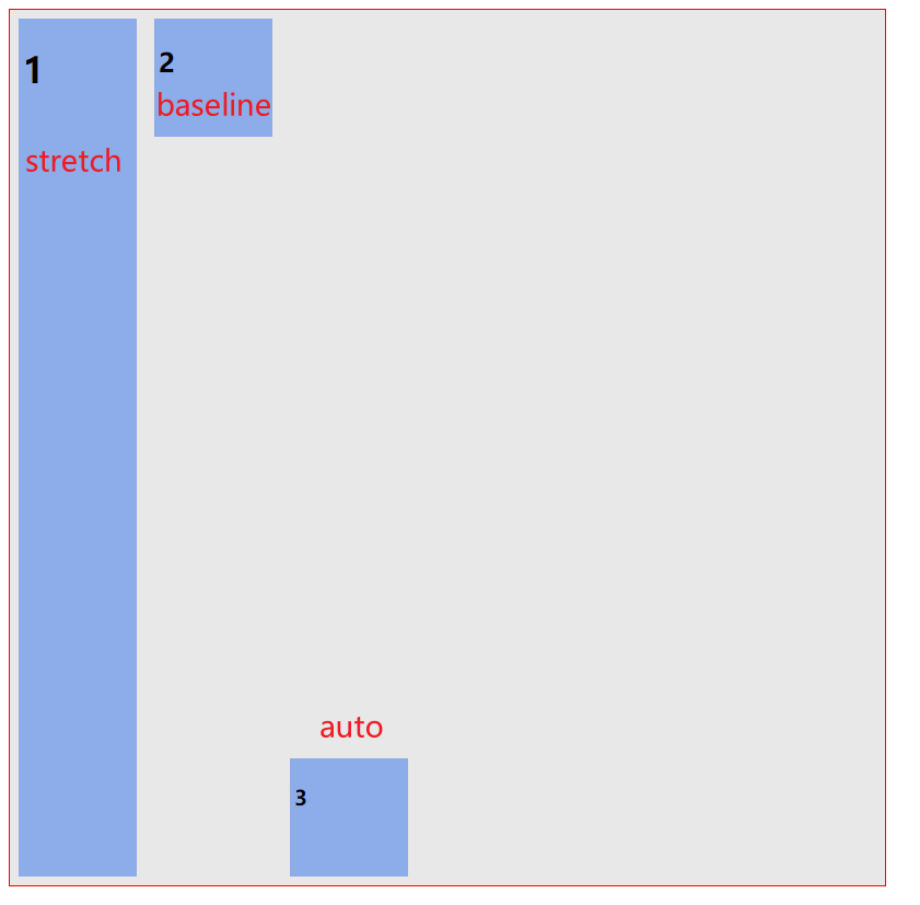
5. align-items 交叉轴对齐属性 -「单轴」
flex-start
:交叉轴的起点对齐。
flex-end
:交叉轴的终点对齐。
center
:交叉轴的中点对齐。
baseline
: 项目的第一行文字的基线对齐。
stretch
(默认值):如果项目未设置高度或设为
auto
,将占满整个容器的高度。
理解这个属性的重点在于,上下移动,将项目上下两个方向移动的
flex-start
、
flex-end
,还有居中
center
、以及对项目内第一个出现的文本对齐
baseline
,最后是项目上下铺满容器的配置
stretch
测试代码:
<html>
<head>
    <style>
        /* 声明父元素为flex容器 */
ul {
    width: 800px;
    height: 800px;
    display:flex;
    border: 1px solid red;
    padding: 0;
    list-style: none;
    background-color: #e8e8e9;
    align-items: flex-start;
}
li {
    background-color: #8cacea;
    width: 100px;
    height: 100px;
    margin: 8px;
    padding: 4px;
}
    </style>
</head>
<body>
    <ul> <!--parent element-->
        <li>1</li> <!--first child element-->
        <li>2</li> <!--second child element-->
        <li>3</li> <!--third child element-->
        <li>4</li> <!--first child element-->

    </div>
</body>
</html>
前三个测试效果图:
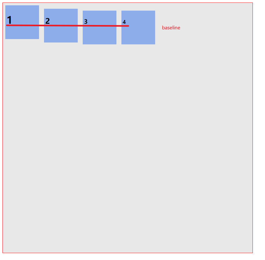
baseline 测试代码:
<html>
<head>
    <style>
        /* 声明父元素为flex容器 */
ul {
    width: 800px;
    height: 800px;
    display:flex;
    border: 1px solid red;
    padding: 0;
    list-style: none;
    background-color: #e8e8e9;
    align-items: baseline;
}
#text1 {
    background-color: #8cacea;
    width: 100px;
    height: 100px;
    margin: 8px;
    padding: 4px;

}
#text2 {
    background-color: #8cacea;
    width: 100px;
    height: 100px;
    margin: 8px;
    padding: 4px;
}
#text3 {
    background-color: #8cacea;
    width: 100px;
    height: 100px;
    margin: 8px;
    padding: 4px;

}
#text4 {
    background-color: #8cacea;
    width: 100px;
    height: 100px;
    margin: 8px;
    padding: 4px;
}
    </style>
</head>
<body>
    <ul> <!--parent element-->
        <li id="text1"><h1>1</h1></li> <!--first child element-->
        <li id="text2"><h2>2</h2></li> <!--second child element-->
        <li id="text3"><h3>3</h3></li> <!--third child element-->
        <li id="text4"><h4>4</h4></li> <!--first child element-->

    </div>
</body>
</html>
baseline
测试效果图:(
以第一个出现的文本的底为基线对齐后面的文本
)
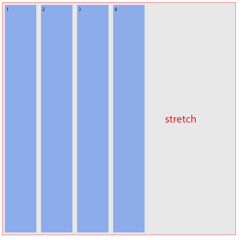
stretch 测试代码:
stretch
:如果项目未设置高度或设为
auto
,将占满整个容器的高度。
<html>
<head>
    <style>
        /* 声明父元素为flex容器 */
ul {
    width: 800px;
    height: 800px;
    display:flex;
    border: 1px solid red;
    padding: 0;
    list-style: none;
    background-color: #e8e8e9;
    align-items: stretch;
}
li {
    background-color: #8cacea;
    width: 100px;
    /* height: 100px; */
    margin: 8px;
    padding: 4px;

}

    </style>
</head>
<body>
    <ul> <!--parent element-->
        <li>1</li> <!--first child element-->
        <li>2</li> <!--second child element-->
        <li>3</li> <!--third child element-->
        <li>4</li> <!--first child element-->

    </div>
</body>
</html>
6. align-content 交叉轴行对齐方式 -「多轴」
flex-start
:与交叉轴的起点对齐。
flex-end
:与交叉轴的终点对齐。
center
:与交叉轴的中点对齐。
space-between
:与交叉轴两端对齐,轴线之间的间隔平均分布。
space-around
:每根轴线两侧的间隔都相等。所以,轴线之间的间隔比轴线与边框的间隔大一倍。
stretch
(默认值):轴线占满整个交叉轴。
如果将交叉轴顺时针旋转
90°
,那么就会变成
justify-content
的主轴对齐的模式,其实这个方法和主轴的方法一模一样的,只不过这里是在
y
轴上进行布局,而主轴是在
x
轴上布局。当然
justify-content
是单轴的属性,这里列举的只是单轴,如果说是多轴,就要知道至少多轴必须是有换行的属性
flex-wrap:wrap;
特别注意:align-content属性定义了多根轴线的对齐方式。如果项目只有一根轴线,该属性不起作用。
测试代码:
<html>
<head>
    <style>
        /* 声明父元素为flex容器 */
ul {
    width: 800px;
    height: 800px;
    border: 1px solid red;
    padding: 0;
    list-style: none;
    background-color: #e8e8e9;
    display:flex;
    flex-wrap: wrap;
    align-content: flex-start;
}
li {
    background-color: #8cacea;
    width: 100px;
    height: 100px;
    margin: 8px;
    padding: 4px;

}

    </style>
</head>
<body>
    <ul> <!--parent element-->
        <li>1</li> <!--first child element-->
        <li>2</li> <!--second child element-->
        <li>3</li> <!--third child element-->
        <li>4</li> <!--first child element-->
        <li>1</li> <!--first child element-->
        <li>2</li> <!--second child element-->
        <li>3</li> <!--third child element-->
        <li>4</li> <!--first child element-->
        <li>1</li> <!--first child element-->
        <li>2</li> <!--second child element-->
        <li>3</li> <!--third child element-->
        <li>4</li> <!--first child element-->
        <li>1</li> <!--first child element-->
        <li>2</li> <!--second child element-->
        <li>3</li> <!--third child element-->
        <li>4</li> <!--first child element-->

    </div>
</body>
</html>
效果图:
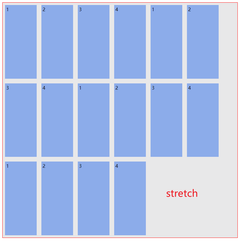
stretch
测试代码:(
要特别注意,
stretch
与项目的高度息息相关,必须撤销掉项目的高度
height
)
<html>
<head>
    <style>
        /* 声明父元素为flex容器 */
ul {
    width: 800px;
    height: 800px;
    border: 1px solid red;
    padding: 0;
    list-style: none;
    background-color: #e8e8e9;
    display:flex;
    flex-wrap: wrap;
    align-content: stretch;
}
li {
    background-color: #8cacea;
    width: 100px;
    /* height: 100px; */
    margin: 8px;
    padding: 4px;

}

    </style>
</head>
<body>
    <ul> <!--parent element-->
        <li>1</li> <!--first child element-->
        <li>2</li> <!--second child element-->
        <li>3</li> <!--third child element-->
        <li>4</li> <!--first child element-->
        <li>1</li> <!--first child element-->
        <li>2</li> <!--second child element-->
        <li>3</li> <!--third child element-->
        <li>4</li> <!--first child element-->
        <li>1</li> <!--first child element-->
        <li>2</li> <!--second child element-->
        <li>3</li> <!--third child element-->
        <li>4</li> <!--first child element-->
        <li>1</li> <!--first child element-->
        <li>2</li> <!--second child element-->
        <li>3</li> <!--third child element-->
        <li>4</li> <!--first child element-->

    </div>
</body>
</html>
三、项目元素 item 的属性
flex-grow
:长大
flex-shrink
: 缩小
align-self
: 覆盖
container align-items
属性
order
排序
flex-basis
: 有效宽度
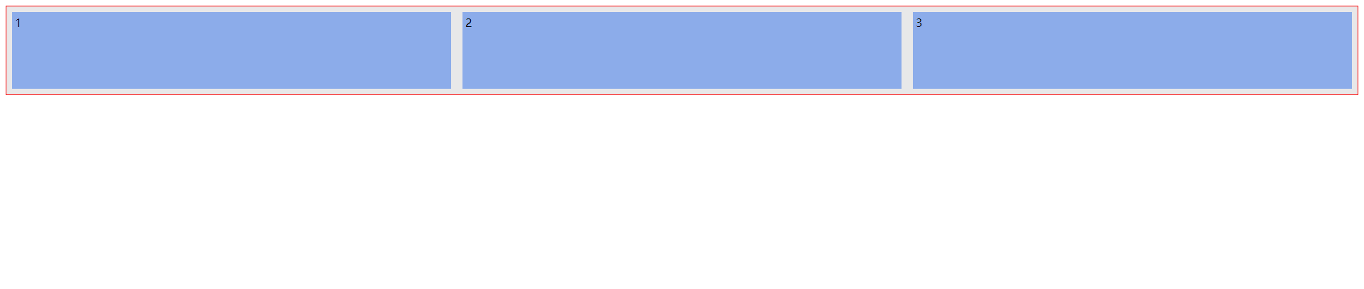
flex-grow 指定单个项目元素变大化属性 – 有多余空间
在容器主轴上存在剩余空间
时,
flex-grow
才有意义- 该属性的值,称为
放大因子
, 常见的属性值如下:
| 属性值 | 描述 |
|---|---|
默认值 |
不放大,保持初始值 |
|
设置默认值,与等效 |
放大因子 |
正数 |
代码演示:
<html>
<head>
    <style>
        /* 声明父元素为flex容器 */
ul {
    display:flex;
    border: 1px solid red;
    padding: 0;
    list-style: none;
    background-color: #e8e8e9;
    /* justify-content: flex-start; */
}
li {
    background-color: #8cacea;
    width: 100px;
    height: 100px;
    margin: 8px;
    padding: 4px;
    flex-grow: 0;
    /* flex-grow: initial; */
    /* flex-grow: 1; */
    /* flex-grow: 0.5; */
}
    </style>
</head>
<body>
    <ul> <!--parent element-->
        <li>1</li> <!--first child element-->
        <li>2</li> <!--second child element-->
        <li>3</li> <!--third child element-->

    </ul>
</body>
</html>
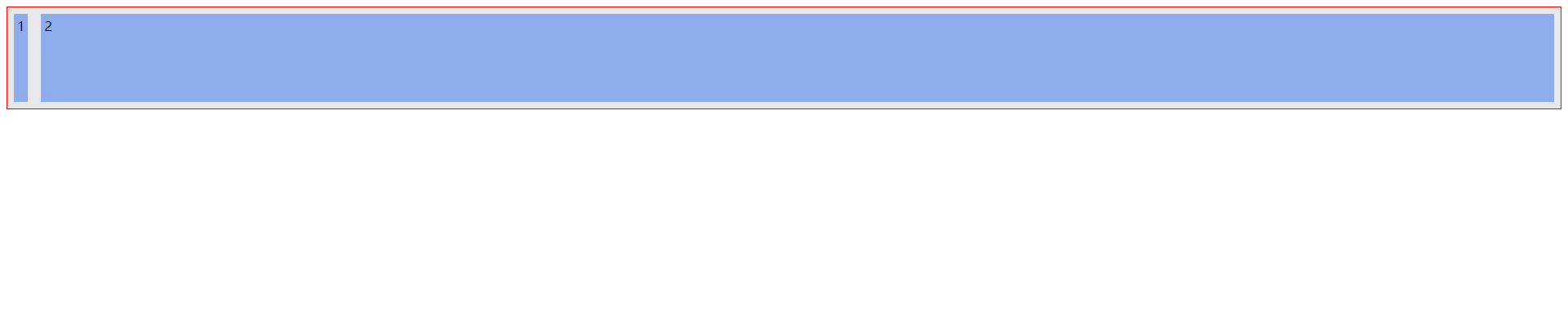
赋值为
0
的效果图:
赋值为
initial
的效果图:
赋值为
1
的效果图:
可以看到
0
和
initial
是差不多的,但是值为 1 时,即放大因子为 1 时,会等比例增大,且无论是 0.5,还是 2、3、4 都只是值为 1 时的变化大小,即没有什么变化, 值为 1 时,便是最大的。
演示 设置
id
选择器的代码:
<html>
<head>
    <style>
        /* 声明父元素为flex容器 */
ul {
    display:flex;
    border: 1px solid red;
    padding: 0;
    list-style: none;
    background-color: #e8e8e9;
    /* justify-content: flex-start; */
}
#grow {
    background-color: #8cacea;
    width: 100px;
    height: 100px;
    margin: 8px;
    padding: 4px;
    /* flex-grow: 0; */
    /* flex-grow: initial; */
    flex-grow: 1;
    /* flex-grow: 0.5; */
}
    </style>
</head>
<body>
    <ul> <!--parent element-->
        <li id="grow">1</li> <!--first child element-->
        <li>2</li> <!--second child element-->
        <li>3</li> <!--third child element-->

    </ul>
</body>
</html>
值为 1 时的效果图:(挤压其他项目元素)
值为 0.5 时的效果图:(放大一半)
flex-shrink项目元素缩小化属性 – 无多余空间
- 当容器
主轴
“
空间不足
” 且 “
禁止换行
” 时,
flex-shrink
才有意义
该属性的值,称为收缩因子, 常见的属性值如下:
| 属性值 | 描述 |
|---|---|
默认值 |
允许项目收缩 |
|
设置初始默认值,与等效 |
|
禁止收缩,保持原始尺寸 |
|
收缩因子: 正数 |
测试代码:
<html>
<head>
    <style>
        /* 声明父元素为flex容器 */
ul {
    display:flex;
    border: 1px solid red;
    padding: 0;
    list-style: none;
    background-color: #e8e8e9;
    /* justify-content: flex-start; */
}
li {
    background-color: #8cacea;
    width: 100px;
    height: 100px;
    margin: 8px;
    padding: 4px;
    flex-shrink:1;
}
    </style>
</head>
<body>
    <ul> <!--parent element-->
        <li>1</li> <!--first child element-->
        <li>2</li> <!--second child element-->
        <li>3</li> <!--third child element-->
        <li>1</li> <!--first child element-->
        <li>2</li> <!--second child element-->
        <li>3</li> <!--third child element-->
        <li>1</li> <!--first child element-->
        <li>2</li> <!--second child element-->
        <li>3</li> <!--third child element-->
        <li>1</li> <!--first child element-->
        <li>2</li> <!--second child element-->
        <li>3</li> <!--third child element-->
        <li>1</li> <!--first child element-->
        <li>2</li> <!--second child element-->
        <li>3</li> <!--third child element-->
        <li>1</li> <!--first child element-->
        <li>2</li> <!--second child element-->
        <li>3</li> <!--third child element-->
        <li>1</li> <!--first child element-->
        <li>2</li> <!--second child element-->
        <li>3</li> <!--third child element-->
        <li>1</li> <!--first child element-->
        <li>2</li> <!--second child element-->
        <li>3</li> <!--third child element-->
        <li>1</li> <!--first child element-->
        <li>2</li> <!--second child element-->
        <li>3</li> <!--third child element-->
        <li>1</li> <!--first child element-->
        <li>2</li> <!--second child element-->
        <li>3</li> <!--third child element-->
        <li>1</li> <!--first child element-->
        <li>2</li> <!--second child element-->
        <li>3</li> <!--third child element-->

    </ul>
</body>
</html>
效果图:
测试代码 2:这个测试代码,可以随你心意去将注释去除,并测试,加深理解,可以将
flex-grow
的值 改为 0.5、1、2、3 等等或者 flex-shrink 值改为 0.5、1、2、3等等,去测试一下,很有趣。这里也就不再过多解读。
<html>
<head>
    <style>
        /* 声明父元素为flex容器 */
ul {
    display:flex;
    border: 1px solid red;
    padding: 0;
    list-style: none;
    background-color: #e8e8e9;
    /* justify-content: flex-start; */
}

#grow {
    background-color: #8cacea;
    width: 100px;
    height: 100px;
    margin: 8px;
    padding: 4px;
    flex-grow:1;
}

#shrink1 {
    background-color: #8cacea;
    /* width: 100px;
    height: 100px; */
    margin: 8px;
    padding: 4px;
    flex-shrink:1;
}
    </style>
</head>
<body>
    <ul> <!--parent element-->
        <li id="shrink1">1</li> <!--first child element-->
        <li id="grow">2</li> <!--second child element-->


    </ul>
</body>
</html>
效果图:
align-self: 会覆盖container align-items 属性
- 该属性可覆盖容器的
align-items
, 用以
自定义某个项目的对齐方式
| 属性值 | 描述 |
|---|---|
默认值 |
继承属性值 |
|
与交叉轴起始线对齐 |
|
与交叉轴终止线对齐 |
|
与交叉轴中间线对齐: 居中对齐 |
|
在交叉轴方向上拉伸 |
|
与基线对齐(与内容相关用得极少) |
flex-start
、
flex-end
、
center
测试代码:
<html>
<head>
    <style>
        /* 声明父元素为flex容器 */
ul {
    width: 800px;
    height: 800px;
    border: 1px solid red;
    padding: 0;
    list-style: none;
    background-color: #e8e8e9;
    display:flex;
    align-items: flex-start;
}
#box1 {
    background-color: #8cacea;
    width: 100px;
    height: 100px;
    margin: 8px;
    padding: 4px;
    align-self: flex-start;

}
#box2 {
    background-color: #8cacea;
    width: 100px;
    height: 100px;
    margin: 8px;
    padding: 4px;
    align-self: center;

}
#box3 {
    background-color: #8cacea;
    width: 100px;
    height: 100px;
    margin: 8px;
    padding: 4px;
    align-self: flex-end;

}

    </style>
</head>
<body>
    <ul> <!--parent element-->
        <li id="box1">1</li> <!--first child element-->
        <li id="box2">2</li> <!--second child element-->
        <li id="box3">3</li> <!--third child element-->
    </ul>
</body>
</html>
原图:(
注释掉 所有的
align-self
属性
)
修改后效果图:
stretch
、
baseline
、
auto
测试代码2:
特别注意
stretch
必须注释掉 高度
height
<html>
<head>
    <style>
        /* 声明父元素为flex容器 */
ul {
    width: 800px;
    height: 800px;
    border: 1px solid red;
    padding: 0;
    list-style: none;
    background-color: #e8e8e9;
    display:flex;
    align-items: flex-end;
}
#box1 {
    background-color: #8cacea;
    width: 100px;
    /* height: 100px; */
    margin: 8px;
    padding: 4px;
    align-self: stretch;

}
#box2 {
    background-color: #8cacea;
    width: 100px;
    height: 100px;
    margin: 8px;
    padding: 4px;
    align-self: baseline;

}
#box3 {
    background-color: #8cacea;
    width: 100px;
    height: 100px;
    margin: 8px;
    padding: 4px;
    align-self: auto;

}

    </style>
</head>
<body>
    <ul> <!--parent element-->
        <li id="box1"><h1>1</h1></li> <!--first child element-->
        <li id="box2"><h2>2</h2></li> <!--second child element-->
        <li id="box3"><h3>3</h3></li> <!--third child element-->
    </ul>
</body>
</html>
效果图:
可以看到配置
auto
样式,那么项目3元素,就会继承 容器的
align-items
的配置,即继承了 容器的
flex-end
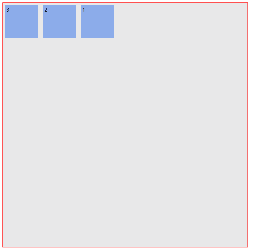
order 项目先后排序布局属性
order
属性定义项目的排列顺序。数值越小,排列越靠前,默认为
0
。
.item {
  order: <integer>;
}
特别注意:该数值可以是小数如 0.5、或负数如 -2 等等
测试代码:
<html>
<head>
    <style>
        /* 声明父元素为flex容器 */
ul {
    width: 800px;
    height: 800px;
    border: 1px solid red;
    padding: 0;
    list-style: none;
    background-color: #e8e8e9;
    display:flex;

}
#box1 {
    background-color: #8cacea;
    width: 100px;
    height: 100px;
    margin: 8px;
    padding: 4px;
    order:3;

}
#box2 {
    background-color: #8cacea;
    width: 100px;
    height: 100px;
    margin: 8px;
    padding: 4px;
    order:2;

}
#box3 {
    background-color: #8cacea;
    width: 100px;
    height: 100px;
    margin: 8px;
    padding: 4px;
    order:1;

}

    </style>
</head>
<body>
    <ul> <!--parent element-->
        <li id="box1">1</li> <!--first child element-->
        <li id="box2">2</li> <!--second child element-->
        <li id="box3">3</li> <!--third child element-->
    </ul>
</body>
</html>
效果图:可以看到按道理是 1 2 3 布局的,但是顺序被替换了,所以变成 3 2 1 布局
flex-basis
flex-basis
属性定义了在分配多余空间之前,项目占据的主轴空间(
Main size
)。浏览器根据这个属性,计算主轴是否有多余空间。它的默认值为
auto
,即项目的本来大小。
.item {
  flex-basis: <length> | auto; /* default auto */
}
它可以设为跟
width
或
height
属性一样的值(比如350px,
单位
px
),则项目将占据固定空间。
测试代码:
<html>
<head>
    <style>
        /* 声明父元素为flex容器 */
ul {
    width: 800px;
    height: 800px;
    border: 1px solid red;
    padding: 0;
    list-style: none;
    background-color: #e8e8e9;
    display:flex;

}
#box1 {
    background-color: #8cacea;
    width: 100px;
    height: 100px;
    margin: 8px;
    padding: 4px;
    flex-basis: auto;
}
#box2 {
    background-color: #8cacea;
    width: 100px;
    height: 100px;
    margin: 8px;
    padding: 4px;
    flex-basis: 200px;

}
#box3 {
    background-color: #8cacea;
    width: 100px;
    height: 100px;
    margin: 8px;
    padding: 4px;
    flex-basis: 300px;

}

    </style>
</head>
<body>
    <ul> <!--parent element-->
        <li id="box1">1</li> <!--first child element-->
        <li id="box2">2</li> <!--second child element-->
        <li id="box3">3</li> <!--third child element-->
    </ul>
</body>
</html>
效果图:
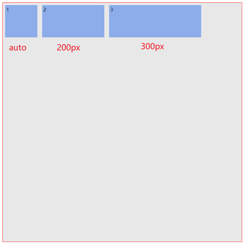
auto
默认为
#box1
id
选择器内的宽度
width
配置的值 ,忽略其高度
height
,不受影响。
另一个便是配置宽度参数,固定在容器内,但是经过测试,如果将
#box3
的
300px
改为
800px
,即超过容器的宽度,就会对前面的项目元素,进行挤压,压缩前面项目元素的宽度。
参考链接: