html>
春节贺卡
您的浏览器不支持
开启好运2016
//Music点击播放,唱片旋转
function clearkb(n){//用js查找第一个子元素
var x = n.firstChild;
while(x.nodeType != 1){
x = x.nextSibling;
}
return x;
}
var audios = document.getElementById(“audio”);
var Musics = document.getElementById(“Musics”);
var Musecs_first = clearkb(Musics);
Musics.οnclick=function(){
if(audios.paused){
audios.play();
Musecs_first.style.animationPlayState=”running”;
Musecs_first.style.webkitAnimationPlayState=”running”;
}else{
audios.pause();
Musecs_first.style.animationPlayState=”paused”;
Musecs_first.style.webkitAnimationPlayState=”paused”;
}
}
/*所有的统一处理样式*/
*{
margin: 0;
padding: 0;
border:none;
font-size: 1.5625vw;
font-family: “微软雅黑”;
}
html,body{
width: 100%;
height: 100%;
}
/*右上角音乐图标*/
#Musics{
position: fixed;
top: 3vw;
right: 4vw;
z-index: 5;
width: 15vw;
height: 15vw;
border: 4px solid #ef1639;
border-radius: 50%;
background: #fff;
}
#Musics>img:first-of-type{
position: absolute;
top: 0;
right: 0;
bottom: 0;
left: 0;
margin: auto;
width: 79%;
}
#Musics > img:last-of-type{
position: absolute;
top: 24%;
right: 2.5%;
width: 28.421%;
}
/*音乐唱片点击旋转*/
@-moz-keyframes musecx{
from{transform: rotate(0deg);}
to{transform: rotate(360deg);}
}
@-webkit-keyframes musecx{
from{transform: rotate(0deg);}
to{transform: rotate(360deg); }
}
@-o-keyframes musecx{
from{transform: rotate(0deg); }
to{transform: rotate(360deg);}
}
@-ms-keyframes musecx{
from{transform: rotate(0deg);}
to{transform: rotate(360deg);}
}
@keyframes musecx{
from{transform: rotate(0deg); }
to{transform: rotate(360deg); }
}
#Musics>img:first-of-type{
animation: musecx 5s;
-webkit-animation: musecx 5s infinite linear;
-moz-animation: musecx 5s infinite linear;
-ms-animation: musecx 5s infinite linear;
-o-animation: musecx 5s infinite linear;
animation-play-state: running;
-webkit-animation-play-state: running;
}
/*控制背景*/
.page{
width: 100%;
height: 100%;
}
.page .bg{
z-index: -1;
position: absolute;
width: 100%;
height: 100%;
}
/*页面一*/
#page1{
display: none;
}
#page1>.bg{
background: url(../images/p1_bg.jpg) no-repeat center center;
background-size: 100%;
}
#page1>.one_one{
position: absolute;
top: 0;
right: 0;
margin:0 auto;
background: url(../images/p1_lantern.png) no-repeat center top;
background-size: 100%;
left: 0;
color: #FFFFFF;
width: 45vw;
height: 71.2vh;
font-size: 3.506rem;
padding-top: 51vw;
text-align: center;
-webkit-box-sizing: border-box;
-moz-box-sizing: border-box;
-ms-box-sizing:border-box;
-o-box-sizing: border-box;
box-sizing: border-box;
}
/*红光闪烁*/
#page1>.one_one:before{
content: “”;
z-index: -1;
position: absolute;
top:0;
right: 0;
bottom: 0;
left: 0;
width: 30vw;
height: 30vw;
margin:auto;
margin-top: 45vw;
text-align: center;
background-color: #D60B3B;
border-radius: 50%;
opacity: .7;
-webkit-box-shadow: 0 0 10vw 10vw #D60B3B;
-moz-box-shadow:0 0 10vw 10vw #D60B3B;
-ms-box-shadow:0 0 10vw 10vw #D60B3B;
-0-box-shadow:0 0 10vw 10vw #D60B3B;
box-shadow: 0 0 10vw 10vw #D60B3B;
animation: redLightTwinkle .75s linear infinite alternate;
-webkit-animation: redLightTwinkle .75s linear infinite alternate;
}
@keyframes redLightTwinkle{
from{
width: 30vw;
height: 30vw;
opacity: .7;
}
to{
width: 23vw;
height: 23vw;
opacity: 0.4;
}
}
@-webkit-keyframes redLightTwinkle{
from{
width: 30vw;
height: 30vw;
opacity: .7;
}
to{
width: 23vw;
height: 23vw;
opacity: 0.4;
}
}
@-moz-keyframes redLightTwinkle{
from{
width: 30vw;
height: 30vw;
opacity: .7;
}
to{
width: 23vw;
height: 23vw;
opacity: 0.4;
}
}
@-o-keyframes redLightTwinkle{
from{
width: 30vw;
height: 30vw;
opacity: .7;
}
to{
width: 23vw;
height: 23vw;
opacity: 0.4;
}
}
@-ms-keyframes redLightTwinkle{
from{
width: 30vw;
height: 30vw;
opacity: .7;
}
to{
width: 23vw;
height: 23vw;
opacity: 0.4;
}
}
/*下面娃娃*/
#page1 .one_two {
position: absolute;
left: 0;
right: 0;
bottom: 10vh;
background: url(../images/p1_imooc.png) no-repeat center center;
background-size:100%;
margin: auto;
width: 27.656vw;
height: 40vw;
}
/*娃娃下面的文字*/
#page1 .one_three{
position: absolute;
left: 0;
right: 0;
bottom: 7vh;
text-align: center;
font-size: 2.134rem;
color: #231815;
}
/*页面二*/
#page2{
display: block;
}
#page2>.bg{
background: url(../images/p2_bg.jpg) no-repeat center center;
background-size: 100%;
}
/*内圈keyframes*/
@keyframes whiterotateone{
from{transform: rotate(0deg);}
to{transform: rotate(-1080deg);}
}
@-webkit-keyframes whiteratateone{
from{transform: rotate(0deg);}
to{transform: rotate(-1080deg);}
}
@-moz-keyframes whiteratateone{
from{transform: rotate(0deg);}
to{transform: rotate(-1080deg);}
}
@-ms-keyframes whiteratateone{
from{transform: rotate(0deg);}
to{transform: rotate(-1080deg);}
}
/*夹圈keyframes*/
@keyframes whiterotatetwo{
from{transform: rotate(0deg);}
to{transform: rotate(720deg);}
}
@-webkit-keyframes whiterotatetwo{
from{transform: rotate(0deg);}
to{transform: rotate(720deg);}
}
@-moz-keyframes whiterotatetwo{
from{transform: rotate(0deg);}
to{transform: rotate(720deg);}
}
@-ms-keyframes whiterotatetwo{
from{transform: rotate(0deg);}
to{transform: rotate(720deg);}
}
/*外圈keyframes*/
@keyframes whiterotatethree{
from{transform: rotate(0deg);}
to{transform: rotate(-360deg);}
}
@-webkit-keyframes whiterotatethree{
from{transform: rotate(0deg);}
to{transform: rotate(-360deg);}
}
@-moz-keyframes whiterotatethree{
from{transform: rotate(0deg);}
to{transform: rotate(-360deg);}
}
@-ms-keyframes whiterotatethree{
from{transform: rotate(0deg);}
to{transform: rotate(-360deg);}
}
/*外圈*/
#page2 > .two_one{
position: absolute;
top: 0;
right: 0;
bottom: 0;
left: 0;
width: 59.375vw;
height: 59.375vw;
margin: auto;
border-radius: 50%;
background: url(../images/p2_circle_outer.png) no-repeat center center;
background-size: 100%;
animation: whiterotatethree 1s linear infinite 2s;
-webkit-animation: whiterotatethree 1s linear infinite 2s;
-moz-animation: whiterotatethree 1s linear infinite 2s;
-ms-animation: whiterotatethree 1s linear infinite 2s;
-moz-animation: whiterotatethree 1s linear infinite 2s;*/
}
/*夹层圈*/
#page2>.two_one:before{
content: “”;
position: absolute;
top: 0;
right: 0;
bottom: 0;
left: 0;
margin: auto;
border-radius: 50%;
background: url(../images/p2_circle_middle.png) no-repeat center center;
background-size: 100%;
width: 45.625vw;
height: 45.625vw;
animation: whiterotatetwo 1s linear infinite 1s;
-webkit-animation: whiterotatetwo 1s linear infinite 1s;
-moz-animation: whiterotatetwo 1s linear infinite 1s;
-ms-animation: whiterotatetwo 1s linear infinite 1s;
-moz-animation: whiterotatetwo 1s linear infinite 1s;
}
/*内圈*/
#page2>.two_one:after{
content: “”;
position: absolute;
top: 0;
right: 0;
bottom: 0;
left: 0;
margin: auto;
border-radius: 50%;
background: url(../images/p2_circle_inner.png) no-repeat center center;
background-size: 100%;
width: 39.9375vw;
height: 39.9375vw;
animation: whiterotateone 1s linear infinite;
-webkit-animation: whiterotateone 1s linear infinite;
-moz-animation: whiterotateone 1s linear infinite;
-ms-animation: whiterotateone 1s linear infinite;
-moz-animation: whiterotateone 1s linear infinite;
}
/*2016*/
#page2>.two_two{
position: absolute;
top: 0;
right: 0;
bottom: 0;
left: 0;
margin: auto;
background: url(../images/p2_2016.png) no-repeat center center;
background-size: 100%;
width: 27.5vw;
height: 6.24vh;
}
/*页面三*/
#page3{
display: none;
}
/*第三页-背景*/
#page3>.bg{
background: url(../images/p3_bg.jpg) no-repeat center center;
background-size: 100%;
}
/*第三页-logo*/
#page3>.three_one{
position: absolute;
top: 7.82vh;
right: 0;
left: 0;
margin: auto;
width: 34.6875vw;
height: 6.327vh;
background: url(../images/p3_logo.png) no-repeat center center;
background-size: 100%;
}
/*第三页-春联左边*/
#page3>.three_two{
position: absolute;
left: 0vw;
top: 15vh;
background: url(../images/p3_couplet_second.png) no-repeat center center;
background-size: 100%;
width: 25.625vw;
height: 61.558441558vh;
}
/*第三页-中间文字*/
#page3>.three_three{
position: absolute;
left:0;
right: 0;
top: 8vh;
background: url(../images/p3_title.png) no-repeat center center;
background-size: 100%;
width: 48.125vw;
height: 70.3896vh;
margin:0 auto;
}
/*第三页-春联右边*/
#page3>.three_four{
position: absolute;
top: 15vh;
right: 0;
background: url(../images/p3_couplet_first.png) no-repeat right center;
background-size:100%;
width: 25.625vw;
height: 61.558441558vh;
}
/*第三页-福*/
#page3>.three_five{
position: absolute;
bottom: 10vh;
left: 0;
right: 0;
background:url(../images/p3_blessing.png) no-repeat center center;
background-size: 100%;
width: 32.03125vw;
height: 32.03125vw;
margin:0 auto;
}
问题在#page2这个盒子里
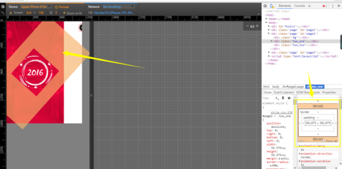
margin:auto是让图片居中的,但是在旋转的时候就会撑开页面。求大神解决下这个BUG,谢谢!