1.效果图如下
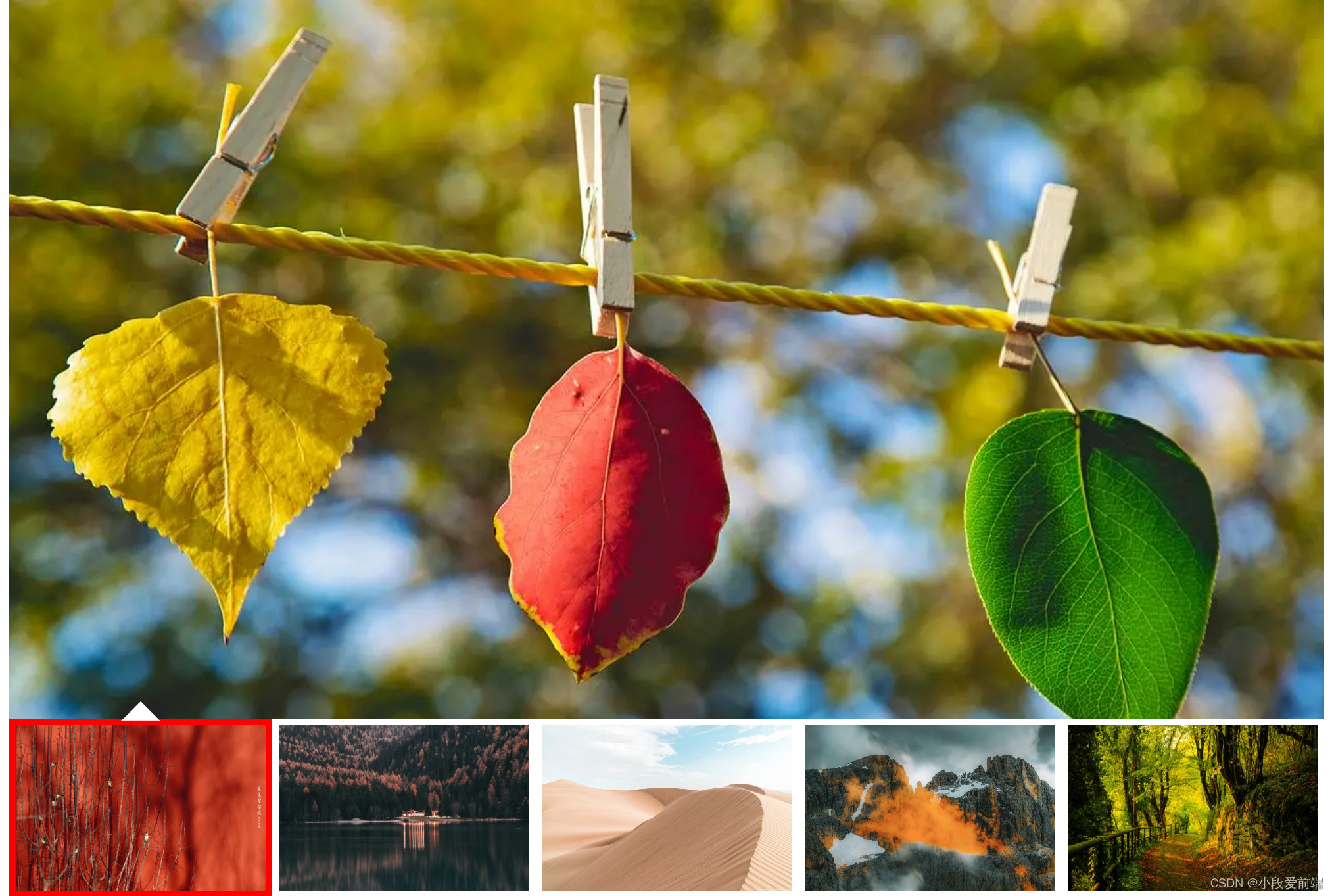
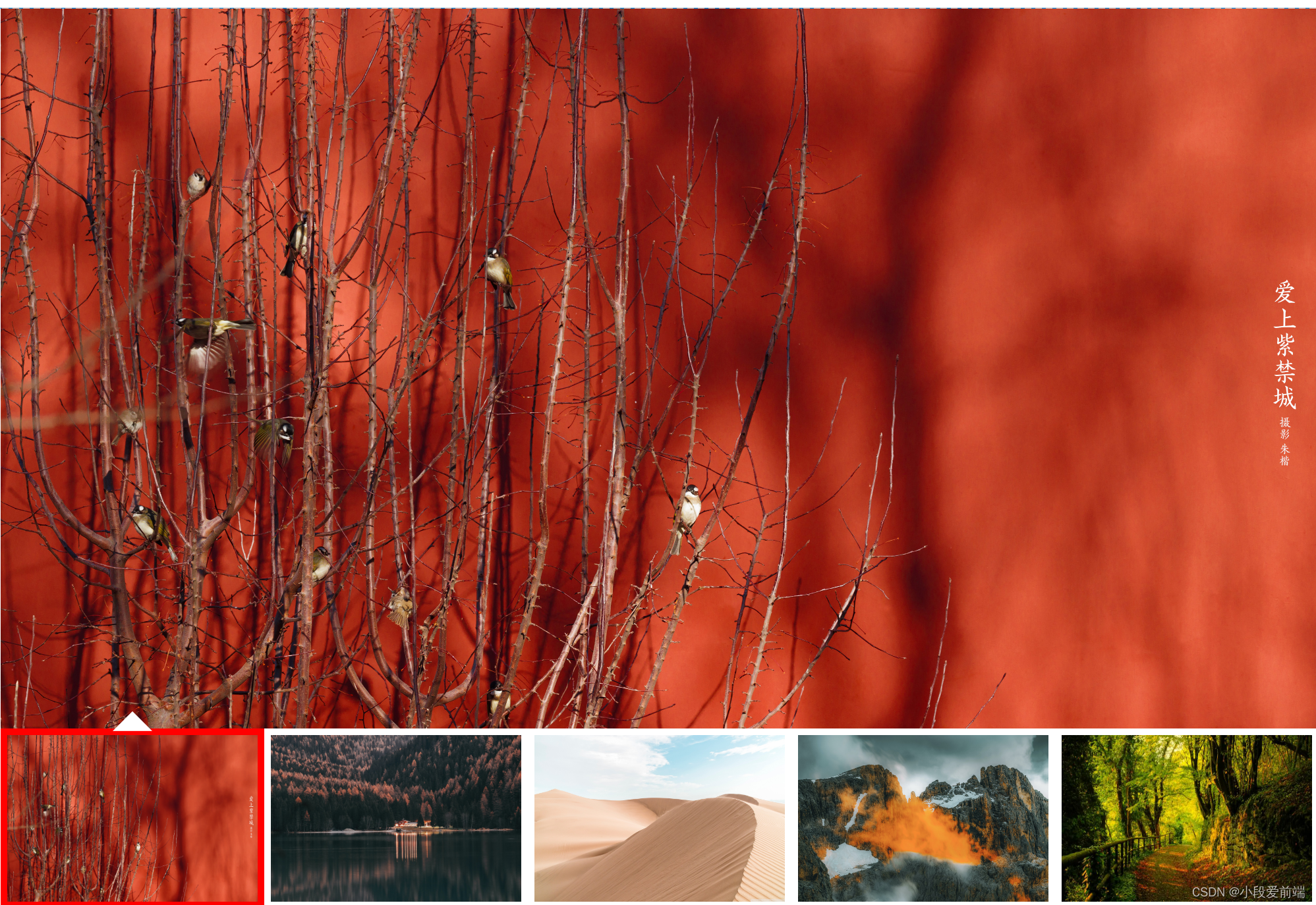
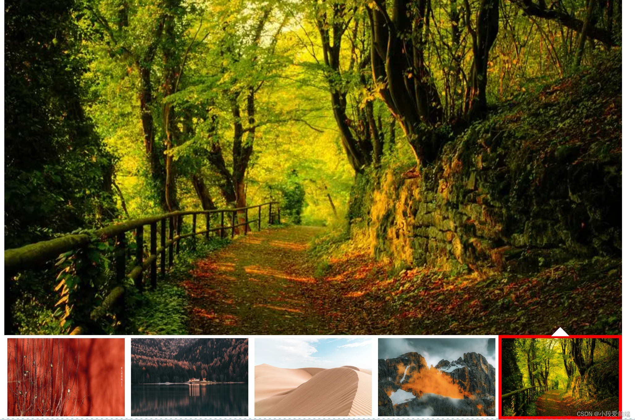
20230802_164944
2.代码如下:
html:
<!DOCTYPE html>
<html lang="en">
  <head>
    <meta charset="UTF-8" />
    <meta name="viewport" content="width=device-width, initial-scale=1.0" />
    <title>Document</title>
    <link rel="stylesheet" href="./index.css" />
  </head>
  <body>
    <div class="imgBox">
      <ul>
        <li><img src="./img/bj01.jpg" alt="" /></li>
        <li><img src="./img/bj02.jpg" alt="" /></li>
        <li><img src="./img/bj03.jpg" alt="" /></li>
        <li><img src="./img/bj04.jpg" alt="" /></li>
        <li>
          <img
            src="./img/u=3336599678,691291465&fm=253&fmt=auto&app=138&f=JPEG.webp"
            alt=""
          />
        </li>
        <li class="banner"></li>
        <li class="border"></li>
      </ul>
    </div>
  </body>
</html>

css:
*{
    margin: 0;
    padding: 0;
}
.imgBox{
    width: 1000px;
    margin: 0 auto;
    height: 100vh;
}

ul{
    list-style: none;
    width: 100%;
    height: 100%;
    display: flex;
    justify-content: space-around;
    align-items:flex-end;
    position: relative;
}
li{
    width: 200px;
    /* height: 20vh; */
    height: 20%;
    cursor: pointer;
    /* 加个透明边框,让图片看起来有距离 */
    border: 5px solid transparent;
    box-sizing: border-box;
}
img{
    width: 100%;
    height: 100%;
}
.banner{
    width: 100%;
    /* height: 80vh; */
    height: 80%;
    background: url(./img/u=3382102852\,2605056039&fm=253&fmt=auto&app=120&f=JPEG.webp);
    background-size: cover;
    /* background-position: center; */
    position: absolute;
    top: 0;
    left: 0;
    border: none;
    transition:all 0.5s linear;
}
.border{
    position: absolute;
    left: 0;
    bottom: 0;
    width: 200px;
    /* height: 20vh; */
    height: 20%;
    border: 5px solid red;
    /* 加这个属性可以让移动框不会被鼠标捕捉到 */
    pointer-events: none;
    transition:all 0.5s linear;
}
.border::before{
    content: "";
    position: absolute;
    width: 30px;
    height: 15px;
    background-color: #fff;
    /* 计算 居中 */
    left: calc(50% - 15px);
    top: -18px;
    /* 裁切出一个三角形 */
    clip-path: polygon(0 100%,50% 0,100% 100%);

}
/* 鼠标移入小图,改变大图 */
li:nth-of-type(1):hover~.banner{
background: url(./img/bj01.jpg);
background-size: cover;
}
li:nth-of-type(2):hover~.banner{
background: url(./img/bj02.jpg);
background-size: cover;
}
li:nth-of-type(3):hover~.banner{
background: url(./img/bj03.jpg);
background-size: cover;
}
li:nth-of-type(4):hover~.banner{
background: url(./img/bj04.jpg);
background-size: cover;
}
li:nth-of-type(5):hover~.banner{
background: url(./img/u=3336599678\,691291465&fm=253&fmt=auto&app=138&f=JPEG.webp);
background-size: cover;
}
/* 鼠标移入小图,改变移动框的位置 */
li:nth-of-type(1):hover~.border{
    left: 0;
}
li:nth-of-type(2):hover~.border{
    left: 200px;
}
li:nth-of-type(3):hover~.border{
    left: 400px;
}
li:nth-of-type(4):hover~.border{
    left: 600px;
}
li:nth-of-type(5):hover~.border{
    left: 800px;
}
版权声明:本文为weixin_52954097原创文章,遵循 CC 4.0 BY-SA 版权协议,转载请附上原文出处链接和本声明。