ui界面颜色设计
重点
(
Top highlight
)
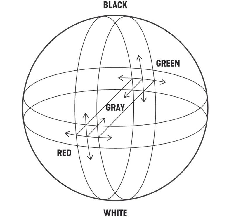
Color is a sensory impression that the eyes perceive from the light, translating in a diverse form of concepts and emotions. For artists, its correct manipulation has been of great importance, so it has been theorized in many ways and with different methods throughout history.
Ç的olor是一种感官印象,眼睛从光感知,在概念和情绪多样化形式平移。 对于艺术家来说,正确的操作非常重要,因此在整个历史中,它已经以多种方式和不同的方法得到了理论化。
Painting, printing, photography, graphic design and interface design use color theory to evoke specific ideas and concepts, taking advantage of the non-verbal capacity of color as opposed to other slower forms of communication.
绘画,印刷,摄影,图形设计和界面设计使用色彩理论来唤起特定的思想和观念,充分利用色彩的非语言能力,而不是其他较慢的交流形式。

In interface design, color psychology is used to influence the perceptions a user may have, from reinforcing brand recognition to generating more clicks on the purchase button. Other important results, such as improved usability, can also be the result of good color mastery.
在界面设计中,从增强品牌识别到在购买按钮上产生更多点击,色彩心理被用来影响用户可能拥有的感知。 其他重要结果,例如改进的可用性,也可以是良好的颜色掌握能力的结果。
In this article I write about six considerations that I regularly use for color selection when I design an interface.
在本文中,我将介绍设计界面时经常用于颜色选择的六个注意事项。
链接
(
Link
)
Specific colors are linked to certain emotions, but not always.
Since we are born our eyes learn about the colors of the real world, with time the memory associates these colors with certain experiences and elements. This familiarity can give the user some context about the goal of the interface.
特定的颜色与某些情感相关,但并非总是如此。
自从我们出生以来,我们的眼睛就了解现实世界的色彩,随着时间的流逝,记忆会将这些色彩与某些体验和元素相关联。 这种熟悉程度可以为用户提供有关界面目标的一些上下文。

This, of course, is not an absolute, since human perception of reality is very different and cannot be generalized in all its forms. The German artist Joseph Albers in his methodical book,
Interaction of Color
,
points out that the main strong characteristic of color is the relativity. Red in the west countries may represent danger and evil, but in China it means happiness, joy and celebration. Despite this, he also states that certain colors are perceived by a large number of people in the same way, such as the green color related to ecology or pink as a sign of femininity.
当然,这不是绝对的,因为人类对现实的理解是非常不同的,并且不能以其所有形式进行概括。 德国艺术家约瑟夫·阿尔伯斯在他有条不紊的书,
彩色的互动
,
指出色的主强的特点就是相对论。 西方国家的红色可能代表着危险和邪恶,但在中国,红色代表着幸福,欢乐和庆祝。 尽管如此,他还指出,许多人以相同的方式感知某些颜色,例如与生态相关的绿色或粉红色代表着女性气质。
和谐
(
Harmony
)
Harmonious colors give a logical sense to the elements.
There are many ways to create color harmonies. One of them is through the use of analogous colors, which are the colors that are close to each other in the color wheel.
和谐的色彩使元素具有逻辑感。
有很多方法可以创建色彩和声。 其中之一是通过使用类似的颜色,即在色轮中彼此接近的颜色。

Why are analogous colors attractive? Because this is color behavior that comes from nature. The sunset displeases the sky from orange to purple, the sea can change from blue to turquoise, the rainbow includes all seven colors in a harmonious transition. We can conclude then that sight finds a natural delight in analogous colors.
为什么类似的颜色具有吸引力? 因为这是自然产生的色彩行为。 日落使天空从橙色变成紫色,海洋可以从蓝色变成绿松石,彩虹在和谐过渡中包括所有七种颜色。 我们可以得出结论,视线会以类似的颜色获得自然的愉悦。
It is advisable to maintain this color range only between warm or cold, since the temperature also generates a considerable harmony. It is also possible to play with the saturation and brightness in these colors to create depth in the use of analogues. It all depends on the effect you want to create and the content that the interface displays.
建议仅在暖色或冷色之间保持此颜色范围,因为温度也会产生相当大的和谐。 还可以利用这些颜色的饱和度和亮度来创建类似物的使用深度。 这完全取决于您要创建的效果以及界面显示的内容。
对比
(
Contrast
)
Color contrast gives dynamism to the interface
.
Another form of color harmony is achieved through the use of complements, which are those that face each other in the color wheel. With the use of complementary color elements, you can create an effect of contrast and dynamism in the design.
色彩对比使界面更具动感
。
色彩补充的另一种形式是通过使用补色来实现的,补色是在色轮中彼此面对的补色。 通过使用互补色元素,可以在设计中产生对比和动态效果。

Among the benefits of contrasting colors, there is the effect of energy and movement that can be given to the interface, as well as the intensification of some relevant point to which we want the user to pay attention. It is not easy to create harmony with these colors as their misuse could create visual chaos and being unpleasant to the eye. Proportion is the key.
对比颜色的好处包括,可以赋予界面能量和移动效果,以及增强一些我们希望用户注意的相关点。 要使这些颜色和谐相处并不容易,因为它们的滥用会造成视觉混乱,并使眼睛不适。 比例是关键。
To know more about color contrast I recommend the book by the Swiss Johannes Itten,
The Art of Color
, where he exposes the theory of the seven types of contrast: hue, temperature, light-dark, complementary, saturation, simultaneous and quantitative. Whatever type of color contrast we choose, it should be maintained throughout the web/app pages for design consistency.
要了解有关色彩对比的更多信息,我推荐瑞士人Johannes Itten撰写的《
色彩的艺术
》一书,其中介绍了七种对比类型的理论:色相,温度,明暗,互补,饱和度,同时和定量。 无论我们选择哪种颜色对比,都应在整个Web /应用页面中进行维护,以确保设计的一致性。
规模
(
Scale
)
Color scales reduce the cognitive load.
Maintaining the hue but modifying the lightning at different levels helps to separate the elements without overloading the composition.
色阶可减轻认知负担。
保持色调,但将闪电修改为不同的水平有助于分离元素,而不会使合成物过载。

Color scales in UI design are also influenced by nature, not only in elements such as the leaves of trees, the sky or the ocean, but also in the volumetry of objects and shadows. The human eye perceives many variations of the same color depending on lighting, depth and even texture. It is not surprise that the people expect UI colors like they know it in the real world.
UI设计中的色阶也受自然影响,不仅受树木叶子,天空或海洋等元素的影响,而且受物体和阴影的影响。 人眼会根据照明,深度甚至质地来感知相同颜色的许多变化。 人们期望UI颜色像他们在现实世界中一样就不足为奇了。
We can say that the goal of working with color scales is to avoid adding a new color or tone that the brain must process and understand unnecessarily. The easier and faster an interface design is to understand, the more delight it will produce for the user.
我们可以说使用色标的目的是避免添加大脑必须处理和不必要理解的新颜色或色调。 界面设计越容易理解和越快,它将为用户带来更多的乐趣。
比例
(
Proportion
)
Defining a color proportion balances the composition.
Having colors with more and less presence gives clarity in the style and avoids unnecessary color conflicts.
定义颜色比例可平衡组成。
越来越多地使用颜色可以使样式更清晰,并避免不必要的颜色冲突。

The color hierarchy is important to define an atmosphere and at the same time, a predominant color in the composition that supports all the elements of the web. In the current trend of UI design, white is the favorite color, as it keeps the interface clean, highlights the interaction color and improves readability. However, if you want to create a more immersive and artistic effect on a specific page, choosing a more saturated color works really well.
颜色层次结构对于定义一种氛围非常重要,同时,它也是构成网络中所有元素的主要色彩。 在当前的UI设计趋势中,白色是最受欢迎的颜色,因为白色可以保持界面干净,突出显示交互颜色并提高可读性。 但是,如果要在特定页面上创建更具沉浸感和艺术感的效果,则选择更饱和的颜色确实会很好。
相互作用
(
Interaction
)
The interaction color must be clear in its execution and consistent in the interface.
Calls to action must have sufficient contrast with respect to the background and sufficient visual weight with respect to other components so that the user can identify them effortlessly.
交互颜色在执行过程中必须清晰且在界面中保持一致。
号召性用语必须相对于背景具有足够的对比度,并且相对于其他组件必须具有足够的视觉重量,以便用户可以轻松识别它们。

However, the interaction color is not always characterized by being the most saturated or brightest, but rather by being the one that stands out from the other elements on the screen, either by its tone, shape, size or contrast. Therefore, the effectiveness of an interaction color will be measured by the speed with which the user identifies the areas of interaction and executes a task with less thought.
但是,交互色并不总是以最饱和或最亮为特征,而是以其色调,形状,大小或对比度在屏幕上与其他元素脱颖而出。 因此,交互颜色的有效性将通过用户识别交互区域并以较少思考的方式执行任务的速度来衡量。
Secondary calls to action, on the other hand, weigh less and coexist visually closer to the information elements. In our example of the Nike application, the configuration and sound buttons indicate that these are interactions due to the shape but not to the color. This hierarchy of buttons is important so that the user can give a natural order to the elements and avoid the bad practice of having more than one primary call to action per screen.
另一方面,次要行动号召力更轻,并且在视觉上更接近信息元素。 在我们的Nike应用示例中,配置和声音按钮指示这些是由于形状而不是颜色的相互作用。 按钮的这种层次结构很重要,因此用户可以对元素进行自然排序,并避免在每个屏幕上使用多个主要号召性用语的不良做法。
In conclusion, color is the great influencer of things, affects the perception of its environment and directly influences other colors and even itself. Although the in-depth study of its theory can improve our mastery of design, the process of creating a professional color scheme depends largely on our visual experience and perception of the real world. Let’s start training our eyes for it.
总之,颜色是事物的重要影响者,它影响事物对环境的感知,并直接影响其他颜色甚至自身。 尽管对其理论的深入研究可以改善我们对设计的掌握,但是创建专业配色方案的过程很大程度上取决于我们的视觉体验和对现实世界的感知。 让我们开始训练我们的眼睛。
Thanks for reading.
谢谢阅读。
翻译自:
https://uxdesign.cc/fundamentals-of-color-in-interface-design-ui-8127149f13e6
ui界面颜色设计