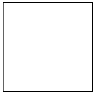
border就是边框。边框有三个要素:粗细、线型、颜色。
颜色如果不写,默认是黑色。另外两个属性不写,要命了,显示不出来边框。
<
style
>
div
{
padding
:
0
;
}
.box
{
width
:
300px
;
height
:
300px
;
/* 边框的3个要素,其中颜色,可以省略不写。不写默认是黑色。 */
border
:
3px
solid
;
}
<
/
style
>
</
head
>
<
body
>
<
div
class
=
“box”
>
</
div
>
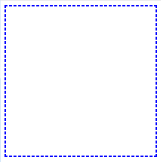
线型的设置:
/*
dotted
点虚线 */
border
:
3px
dotted
blue
;

/* dashed矩形虚线 */
border
:
3px
dashed
blue
;
/* solid实线 */
border
:
3px
solid
blue
;

/* double内外双实线 */
border
:
3px
double
blue
;

/* groove沟槽状边框 */
border
:
50px
groove
blue
;

/* ridge菱形边框 */
border
:
50px
ridge
blue
;
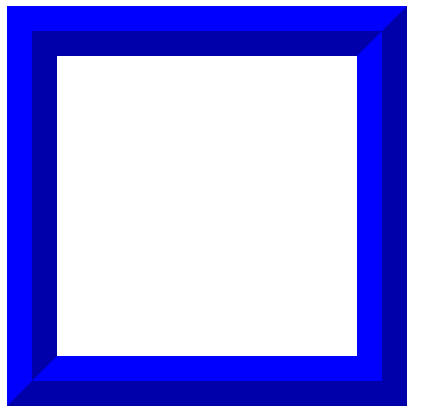
可以发现菱形边框与沟槽状边框的区别是亮面和暗面相反
/* inset3D凹边 */
border
:
50px
inset
blue
;

/* outset3D凸边 */
border
:
50px
outset
blue
;
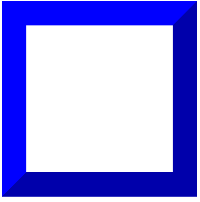
凹凸边的亮暗也是相反的
不过线型在不同浏览器有不同的显示效果比如,border:10px ridge red; 在chrome和firefox、IE中有细微差别:
chrome:

firefox:

IE:

谷歌和火狐差别不大,但ie的颜色明显深了很多
border属性能够被拆开
border是一个大综合属性,
border:1px solid red;
border属性能够被拆开,有两大种拆开的方式:1) 按3要素:border-width、border-style、border-color2) 按方向:border-top、border-right、border-bottom、border-left
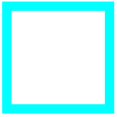
把边框border按3要素:
<
style
>
.box
{
width
:
300px
;
height
:
300px
;
/* 按3要素拆开: */
border-width
:
30px
;
border-style
:
solid
;
border-color
:
aqua
;
}
<
/
style
>
</
head
>
<
body
>
<
div
class
=
“box”
>
</
div
>
</
body
>
如果某一个小要素后面是空格隔开的多个值,那么就是
上右下左
的顺序
/* 10px 20px —上下10 左右20 */
border-width
:
10px
20px
;
/* solid dashed dotted — 上solid 左右dashed 下dotted */
border-style
:
solid
dashed
dotted
;
/* red green blue yellow — 上red 右green 下blue 左yellow */
border-color
:
red
green
blue
yellow
;

把边框border按方向来拆开
<
style
>
.box
{
width
:
300px
;
height
:
300px
;
/* 按照方向拆分 */
border-top
:
30px
solid
red
;
border-right
:
30px
solid
green
;
border-bottom
:
30px
solid
blue
;
border-left
:
30px
solid
yellow
;
}
<
/
style
>
</
head
>
<
body
>
<
div
class
=
“box”
></
div
>
</
body
>

把边框border按方向还能再拆一层,
就是把每个方向的,每个要素拆开,一共12条语句:
/* 边框按方向还能再拆一层把每个方向按照3要素写 */
border-top-width
:
30px
;
border-top-style
:
solid
;
border-top-color
:
red
;
border-right-width
:
30px
;
border-right
:
solid
;
border-right-color
:
green
;
border-bottom-width
:
30px
;
border-bottom-style
:
solid
;
border-bottom-color
:
aqua
;
border-left-width
:
30px
;
border-left-style
:
solid
;
border-left-color
:
blue
;
border可以没有
<
style
>
.box
{
width
:
300px
;
height
:
300px
;
background-color
:
red
;
/* 4个边都没有边框 */
/* border: none; */
border
:
30px
solid
blue
;
/* 某一个边没有边框 */
border-left
:
none
;
}
<
/
style
>
</
head
>
<
body
>
<
div
class
=
“box”
>
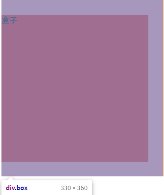
盒子
</
div
>
outline轮廓线
outline轮廓线 在边框线的外面,它和盒模型没有任何关系。轮廓线不占据页面宽度。
去除input文本框的轮廓线:outline: none;
<
style
>
.txt
{
width
:
300px
;
height
:
26px
;
line-height
:
26px
;
border
:
1px
solid
greenyellow
;
outline
:
none
;
}
<
/
style
>
</
head
>
<
body
>
<
input
type
=
“text”
name
=
“”
id
=
“”
class
=
“txt”
>
</
body
>

轮廓线不占据页面宽度。
outline
:
20px
solid
orange
;
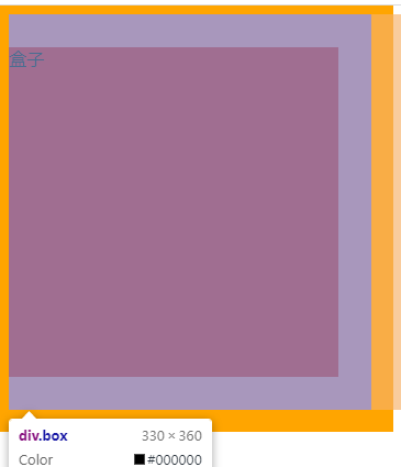
所以,我们在实际项目中编写页面的时候,我们通常使用outline轮廓线去查看当前某个区块在页面中的位置。
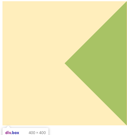
border可以透明
透明是让颜色不可见,但是具体的某个方向的边框实际在浏览器渲染的时候,边框还是存在。
<
style
>
.box
{
width
:
0px
;
height
:
0px
;
border-top
:
200px
solid
transparent
;
border-right
:
200px
solid
green
;
border-bottom
:
200px
solid
transparent
;
border-left
:
200px
solid
transparent
;
}
<
/
style
>
</
head
>
<
body
>
<
div
class
=
“box”
></
div
>
</
body
>
border制作小箭头:
<
style
>
.arrow
{
width
:
20px
;
height
:
20px
;
border-top
:
1px
solid
red
;
border-left
:
1px
solid
red
;
transform
:
rotate
(
45deg
);
margin
:
50px
0
0
50px
;
}
<
/
style
>
</
head
>
<
body
>
<
div
class
=
“arrow”
></
div
>
</
body
>

如上代码,三角形箭头原理:正方形的任意相邻的两边线然后旋转一定的角度,得到我们需要的任意方向的箭头,deg角度单位,rotate旋转角度.
-
小三角形的大小由正方形的宽高去控制
-
小三角形的粗细由border边框线的宽度去控制
-
小三角形的颜色由border边框线的颜色去控制