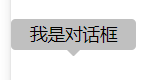
<div class=”tooltip”>
<p>我是对话框</p>
<span class=”triangle”></span>
</div>
.tooltip {
    position: relative;
    background-color: silver;
    width: 200upx;
    height: 50upx;
    border-radius: 0.25em;
    display: flex;
    justify-content: center;
    align-items: center;
    z-index: 200;
}
.triangle {
    display: block;
    border: 10upx solid transparent;
    border-top-color: silver;
    position: absolute;
    bottom: -20upx;
    left: calc(50% - 10upx);
}
效果如下:
但是还有问题
不设置 triangle 宽高,设置 border 10像素的透明边框,然后设置 top 方向边框颜色和父元素一致就可完成这样的效果,同理,变换小尾巴箭头方向只需要在top,bottom,left,right方向上单独设置不同的边框颜色即可。
这种方式是挺奇妙的,但存在以下几个问题:
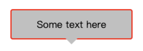
样式残缺
clip-path
针对以上问题,现在有了一种特别好的方式,就是通过css3新增的clip-path属性来实现
clip-path属性可以创建一个只有元素的部分区域可以显示的剪切区域,区域内的部分显示,区域外的隐藏
css代码如下:
.triangle {
display: block;
height: 20px;
width: 20px;
background-color: inherit;
border: inherit;
position: absolute;
bottom: -10px;
left: calc(50% – 10px);
// —关键代码 start—
clip-path: polygon(0% 0%, 100% 100%, 0% 100%);
transform: rotate(-45deg);
// —end—
border-radius: 0 0 0 2px;
}
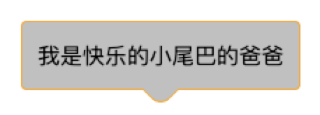
我们可以看到 triangle 继承了父元素 tooltip 的边框颜色以及背景色,同时我们还设置了小尾巴2个像素的圆角。