[Angular 组件库 NG-ZORRO 基础入门] – 源码初窥: Select
前言回顾
今天我们继续介绍一个新组件 Select,当提供给用户可选数据较多时的使用场景较多,比如省市区联动选择、后台账号管理等等。
组件
开发之前
我们仍然会以昨天的分析流程进行
Select
组件的介绍,在这几天组件源码介绍过程中,我们也会逐步选择难度上升的组件进行说明,循序渐进。
Select 组件
功能分析
select
功能组件想必大家在学习前端时都已经接触过了,最基础的选择组件至少包含显示、下拉选项两部分:
<select>
  <option value ="material">Material</option>
  <option value ="ng-zorro">NG-ZORRO</option>
</select>
而对于 Angular 设计而言,我们需要
select
组件支持双向绑定、事件触发、自定义文本等多种功能,那么我们带着这些需求继续进行。
代码实现
如何设计
html 原生使用方式给了我们很好的设计提示,就是将
option
选项抽离出来单独维护,那么我们想象中的选择组件应该是和原生使用方式类似的:
<nz-select>
  <nz-option nzValue="material">Material</nz-option>
  <nz-option nzValue="ng-zorro">NG-ZORRO</nz-option>
</nz-select>
我们查阅 NG-ZORRO 的 Select 组件文档发现实际上的确是这样使用的,但是它提供了一个属性
nzLabel
来直接渲染显示文本信息,所以我们可以这样使用:
<nz-select>
  <nz-option nzValue="material" nzLabel="Material"></nz-option>
  <nz-option nzValue="ng-zorro" nzLabel="NG-ZORRO"></nz-option>
</nz-select>
组件文件结构
我们看一下
Select
组件的源码文件结构:
components/select
├── demo
├── doc
├── style
├── index.ts
├── nz-option-container.component.html
├── nz-option-container.component.ts
├── nz-option-container.spec.ts
├── nz-option-group.component.html
├── nz-option-group.component.ts
├── nz-option-li.component.html
├── nz-option-li.component.ts
├── nz-option-li.spec.ts
├── nz-option.component.html
├── nz-option.component.ts
├── nz-option.pipe.spec.ts
├── nz-option.pipe.ts
├── nz-select-top-control.component.html
├── nz-select-top-control.component.ts
├── nz-select-top-control.spec.ts
├── nz-select-unselectable.directive.ts
├── nz-select-unselectable.spec.ts
├── nz-select.component.html
├── nz-select.component.spec.ts
├── nz-select.component.ts
├── nz-select.module.ts
├── nz-select.service.spec.ts
├── nz-select.service.ts
├── package.json
└── public-api.ts
看起来非常多的文件,但是我们现在只需要关注这几个文件
nz-select.component.*
和
nz-option.component.*
,和我们之前想的一样,NG-ZORRO 的选择组件设计和原生
select
元素是一致的。
代码设计
那么如果让我们用 Angular 实现最简单的
select
组件,我们按照上述设计该怎么实现呢?(以下为模拟设计,非 NG-ZORRO 源码)
@Component({
  selector: 'nz-select',
  template: '
    <!-- 显示选中的项目 -->
    <div>
        {{selectedOption.nzLabel}}
    </div>
    <!-- 投射渲染 nz-option -->
    <ng-template>
      <ul>
           <ng-content></ng-content>
      </ul>
    </ng-template>
  ',
})
export class NzInputComponent {
  @ContentChildren(NzOptionComponent) listOfNzOptionComponent: QueryList<NzOptionComponent>;
}

@Component({
  selector: 'nz-option',
  template: '
     <li>{{nzOption.nzLabel}}</li>
  ',
})
export class NzOptionComponent {}
我们仍然使用了
ng-content
进行内容投射,在
NzInputComponent
里可以通过 ContentChildren 获取全部选项,当然我们可以通过这个在后面进行更多操作。
源码查阅
我们对照源码分解一下现有的组件,看一下 NG-ZORRO 是如何去设计这个组件的(以下代码可能存在部分删除,重点在于结构性说明):
nz-select.component.html
<div cdkOverlayOrigin
  nz-select-top-control
  class="ant-select-selection">
</div>
<ng-template
  cdkConnectedOverlay
  nzConnectedOverlay
  [cdkConnectedOverlayHasBackdrop]="true"
  [cdkConnectedOverlayMinWidth]="nzDropdownMatchSelectWidth? null : triggerWidth"
  [cdkConnectedOverlayWidth]="nzDropdownMatchSelectWidth? triggerWidth : null"
  [cdkConnectedOverlayOrigin]="cdkOverlayOrigin"
  (backdropClick)="closeDropDown()"
  (detach)="closeDropDown();"
  (positionChange)="onPositionChange($event)"
  [cdkConnectedOverlayOpen]="open">
  <div
    class="ant-select-dropdown">
    <div nz-option-container
      style="overflow: auto;transform: translateZ(0px);"
      (keydown)="onKeyDown($event)"
      [nzMenuItemSelectedIcon]="nzMenuItemSelectedIcon"
      [nzNotFoundContent]="nzNotFoundContent"
      (nzScrollToBottom)="nzScrollToBottom.emit()">
    </div>
    <ng-template [ngTemplateOutlet]="nzDropdownRender"></ng-template>
  </div>
</ng-template>
<!--can not use ViewChild since it will match sub options in option group -->
<ng-template>
  <ng-content></ng-content>
</ng-template>
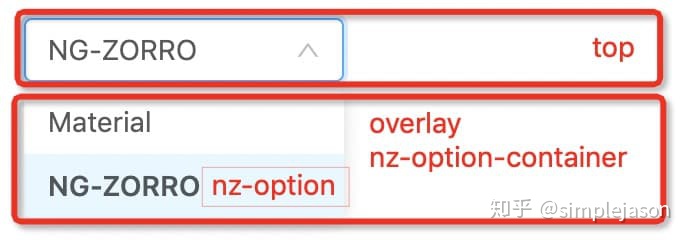
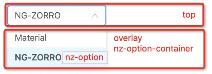
我们可以看到,
Select
组件被拆分成了多个部分:
- – nz-select-top-control
- – nz-option-container
- – nz-option
CDK Overlay
我们在上面看到,点击弹出下拉选项使用的是 cdk overlay 来创建一个浮动面板,来渲染下拉列表。事实上,在所有涉及到弹出层的组件中(Modal / Drawer / Message 等等)均采用了
cdk overlay
来创建弹出层,overlay 的使用方法也是十分简单的:
const overlayRef = overlay.create({
  height: '400px',
  width: '600px',
});
const userProfilePortal = new ComponentPortal(UserProfile);
overlayRef.attach(userProfilePortal);
在
select
组件中,我们发现使用了 cdk 的
CdkOverlayOrigin
和
cdkConnectedOverlay
指令: – CdkOverlayOrigin:指令应用于元素,以使其可以使用 ConnectedPositionStrategy 用作overlay的位置源。 – CdkConnectedOverlay:CdkConnectedOverlay指令的嵌入元素(通常使用ng-template加载)表明该嵌入元素是一个overlay。
更多 cdk 相关的内容,大家可以去 Material CDK 官方网站查看。
总结 & 预告
我们今天暂时先介绍
nz-select
组件的基本设计结构,让我们对整个组件设计有个大概的理解,当然其中具体的设计和数据同步我们还未涉及,在明天我们会继续介绍选项列表渲染和数据同步的相关知识,大家也可以提前思考一下。
相关资源
- iThelp 文章地址:
[Angular 元件庫 NG-ZORRO 基礎入門] Day 25 – 原始碼初窺: Select – iT 邦幫忙::一起幫忙解決難題,拯救 IT 人的一天ithelp.ithome.com.tw
- Select 组件:
选择器 Select – NG-ZORROng.ant.design
- CDK:
Angular Materialmaterial.angular.io