一共有6种flex属性用于调节flex布局
flex-direction
flex-wrap
flex-flow
justify-content
align-items
align-content
flex-direction
flex-direction属性决定主轴方向,默认横向row
.box {
    flex-direction : row | row-reverse | column | column-reverse;
}
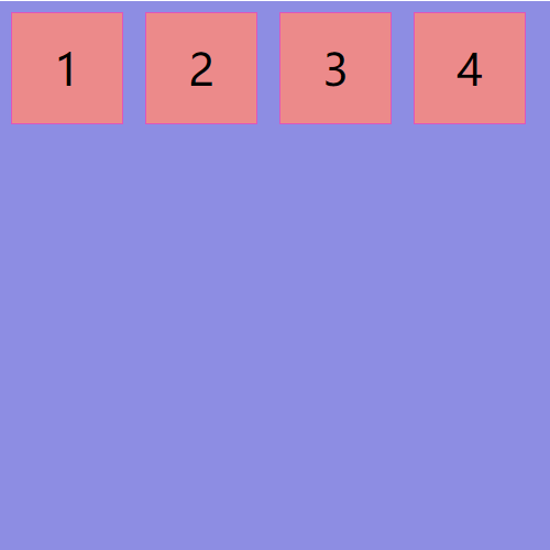
row(默认值):主轴为水平方向,起点在左端。
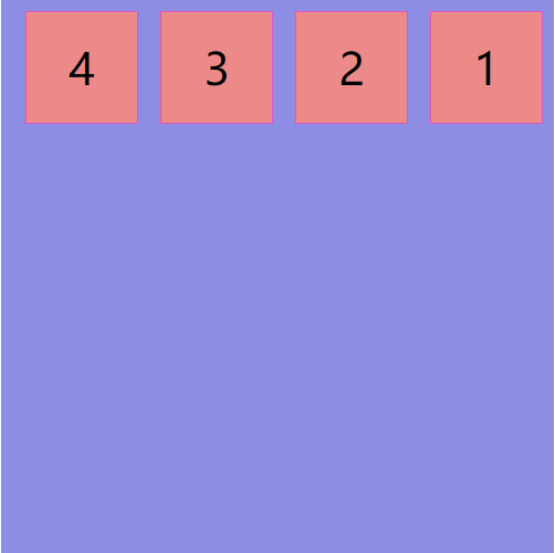
row-reverse:主轴为水平方向,起点在右端。
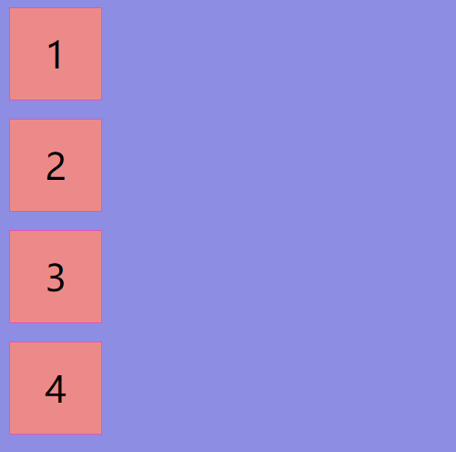
column:主轴为垂直方向,起点在上端。
column-reverse:主轴为垂直方向,起点在下端。
row
row-reverse
column
column-reverse

flex-wrap
flex-wrap属性指定 flex 元素单行显示还是多行显示。若允许换行,这个属性允许你控制元素的堆叠方向。
.box {
    flex-wrap: nowrap | wrap | wrap-reverse;
}
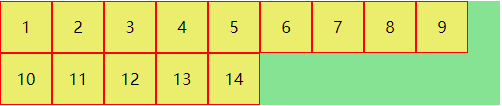
nowrap(默认值):flex 的元素被摆放到到一行,不换行
wrap:元素不够宽度排列后可以换行排列,第一行在上方
wrap-reverse:元素不够宽度排列后可以换行排列,第一行在下方
nowrap

原宽度和高度一样的元素在容器内排列不下,宽度被压缩
wrap
第一行在上方
wrap-reverse

第一行在下方
flex-flow
.box {
  flex-flow: <flex-direction> || <flex-wrap>;
}
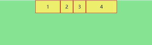
row nowrap (默认值)
row nowrap

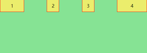
row wrap

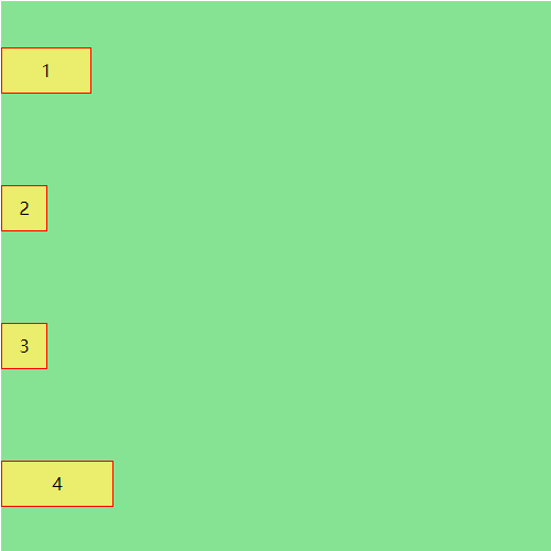
column nowrap
column warp

justify-content
justify-content定义了元素在弹性容器主轴上的对齐方式
.box {
    justify-content : flex-start | flex-end | center | 0
}
flex-start(默认值):主轴起点对齐
flex-end:主轴终点对齐
center:主轴居中
space-between:两端对齐(首元素在start位置,末元素在end位置),元素均匀排列,间隔均分
space-around:每个元素周围分布相同的空间,项目之间的间隔比项目与容器的间隔大一倍
space-evenly:每个元素均匀排列,周围的间隙都相等(兼容性不太好)
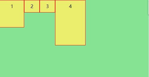
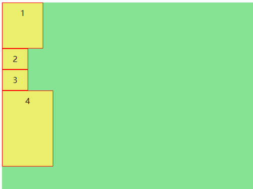
flex-start

主轴为row时↑
主轴为column时↑
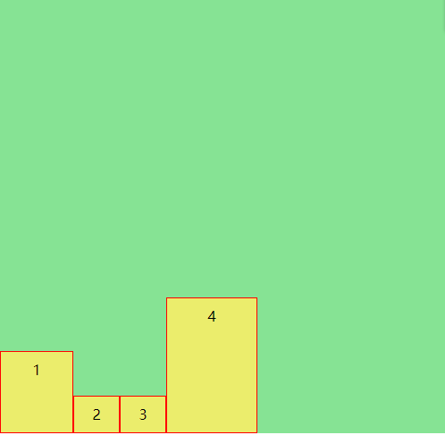
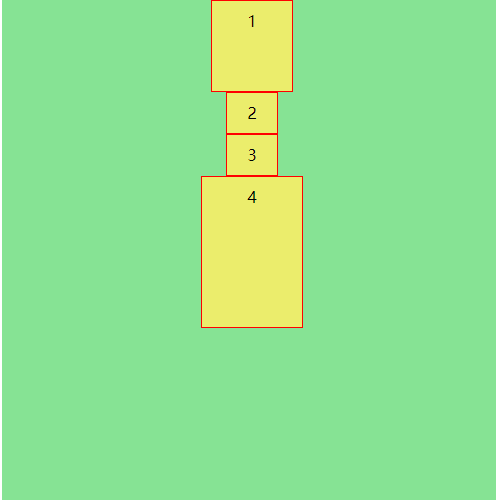
flex-end
主轴为row时↑
主轴为column时
center
主轴为row时

主轴为column时
space-between
主轴为row时

主轴为column时
space-around
主轴为row时
主轴为column时
space-evenly

主轴为row时

主轴为column时
align-items
justify-content定义了元素在弹性容器交叉轴上的对齐方式
.box {
    align-items: flex-start | flex-end | center | baseline | stretch
}
flex-start:交叉轴起点对齐
flex-end:交叉轴终点对齐
center: 交叉轴轴居中
stretch(默认值):如果被排列的项目未设置高度(宽度)或设置为auto,项目将占满整个容器的高度(宽度)
baseline:项目的第一行文字的基线对齐
flex-start
主轴为row时
主轴为column时
flex-end
主轴为row时

主轴为column时
center

主轴为row时
主轴为column时
stretch
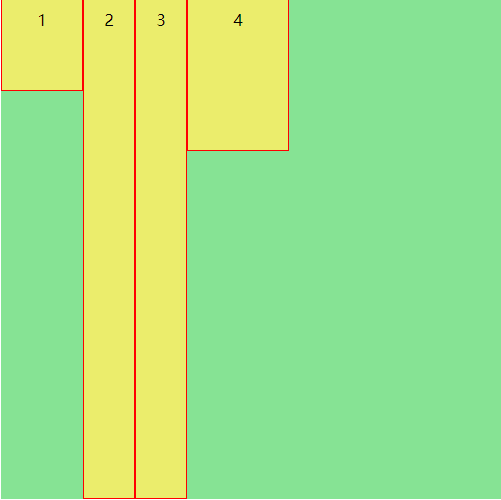
主轴为row时,未设置height或者设置height为aotu的项目会被拉升至容器边框,此处2和3项目height为auto
主轴为column时,未设置width或者设置width为aotu的项目会被拉升至容器边框,此处1项目width为auto
baseline
没对齐前
对齐后
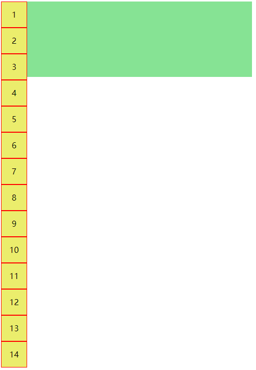
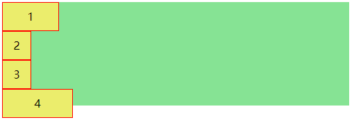
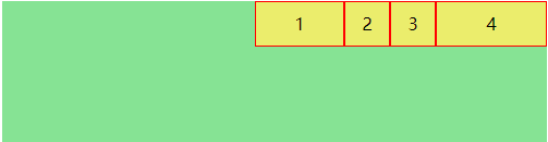
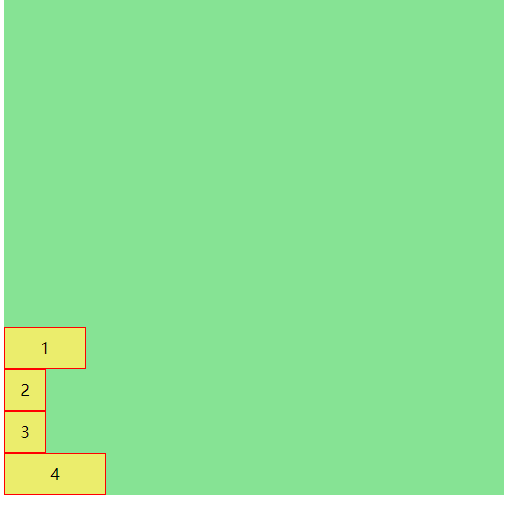
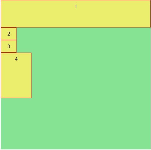
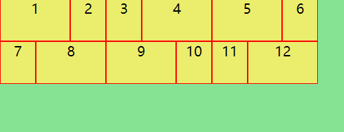
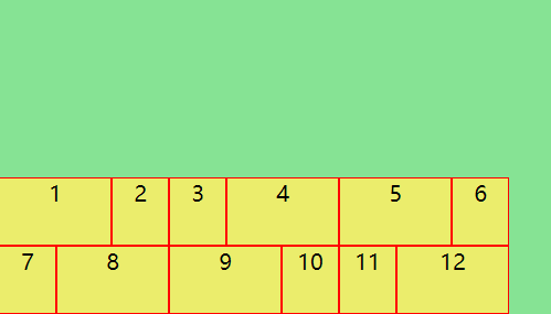
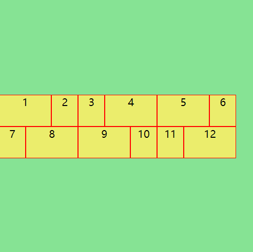
align-content
align-content 定义了多跟轴线的对齐方式,如果只有一根轴线则属性不起作用
.box {
    align-content:flex-start | flex-end | center | stretch | space-between | space-around
}
flex-start:交叉轴起点对齐
flex-end:交叉轴终点对齐
center: 交叉轴轴居中
stretch(默认值):如果被排列的项目未设置高度(宽度)或设置为auto,项目将占满整个容器的高度(宽度)
space-between:两端对齐
space-around:均匀分布项目
flex-start
flex-end
center
stretch

height设置为auto的4,8,12号盒子拉伸
space-between

space-around
