flex-direction
属性决定主轴的方向(即项目的排列方向)。
语法
.box {
  flex-direction: row | row-reverse | column | column-reverse;
}
它可能有4个值。
-
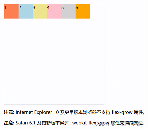
row
(默认值):主轴为水平方向,起点在左端。 -
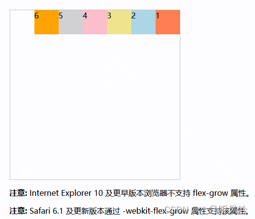
row-reverse
:主轴为水平方向,起点在右端。 -
column
:主轴为垂直方向,起点在上沿。 -
column-reverse
:主轴为垂直方向,起点在下沿。
属性
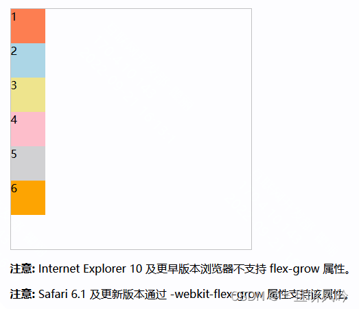
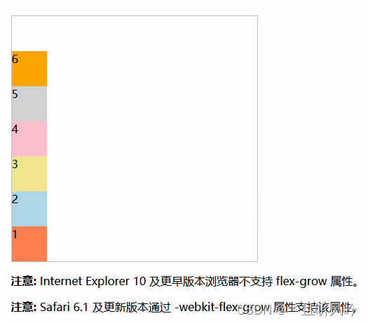
多个 div 不特殊设置样式,实例:
<!DOCTYPE html>
<html>
<head>
<style>
.container {
  width: 350px;
  height: 350px;
  border: 1px solid #c3c3c3;
}
.container div { width:50px;height:50px; }
.container div:nth-of-type(1) {background-color:coral;}
.container div:nth-of-type(2) {background-color:lightblue;}
.container div:nth-of-type(3) {background-color:khaki;}
.container div:nth-of-type(4) {background-color:pink;}
.container div:nth-of-type(5) {background-color:lightgrey;}
.container div:nth-of-type(6) {background-color:orange;}

</style>
</head>
<body>

<div class="container">
  <div>1</div>
  <div>2</div>
  <div>3</div>
  <div>4</div>
  <div>5</div>
  <div>6</div>
</div>

<p><b>注意:</b> Internet Explorer 10 及更早版本浏览器不支持 flex-grow 属性。</p>
<p><b>注意:</b> Safari 6.1 及更新版本通过 -webkit-flex-grow 属性支持该属性。</p>

</body>
</html>
页面效果:
row
row
(默认值):主轴为水平方向,起点在左端。
实例:
<!DOCTYPE html>
<html>
<head>
<style>
.container {
  width: 350px;
  height: 350px;
  border: 1px solid #c3c3c3;
  display: flex;
  display: -webkit-flex; /* Safari */
  flex-direction: row;
}
.container div { width:50px;height:50px; }
.container div:nth-of-type(1) {background-color:coral;}
.container div:nth-of-type(2) {background-color:lightblue;}
.container div:nth-of-type(3) {background-color:khaki;}
.container div:nth-of-type(4) {background-color:pink;}
.container div:nth-of-type(5) {background-color:lightgrey;}
.container div:nth-of-type(6) {background-color:orange;}

</style>
</head>
<body>

<div class="container">
  <div>1</div>
  <div>2</div>
  <div>3</div>
  <div>4</div>
  <div>5</div>
  <div>6</div>
</div>

<p><b>注意:</b> Internet Explorer 10 及更早版本浏览器不支持 flex-grow 属性。</p>
<p><b>注意:</b> Safari 6.1 及更新版本通过 -webkit-flex-grow 属性支持该属性。</p>

</body>
</html>
页面效果:
row-reverse
row-reverse
:主轴为水平方向,起点在右端。
实例:
flex-direction: row-reverse;
页面效果:
column
column
:主轴为垂直方向,起点在上沿。
实例:
flex-direction: column;
页面效果:
column-reverse
column-reverse
:主轴为垂直方向,起点在下沿。
实例:
flex-direction: column-reverse;
页面效果:
版权声明:本文为HH18700418030原创文章,遵循 CC 4.0 BY-SA 版权协议,转载请附上原文出处链接和本声明。