方法一:使用定位,
父元素相对定位
position:relative;
,
子元素绝对定位
position:absolute;
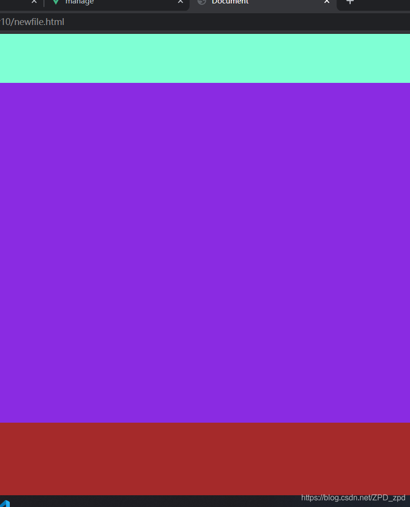
上下div固定高度,中间div的
top
和
bottom
偏移量为上下div的高度
<div id="wrap">
    <div id="head"></div>
    <div id="main"></div>
    <div id="foot"></div>
</div>
* {
    margin: 0px;
    padding: 0px;
}

html,
body {
    height: 100%;
}

#wrap {
    width: 100%;
    height: 100%;
    position: relative;
}

#head {
    width: 100%;
    height: 80px;
    background-color: aquamarine;
    position: absolute;
}

#main {
    width: 100%;
    background-color: blueviolet;
    position: absolute;
    top: 80px;
    bottom: 120px;
}

#foot {
    width: 100%;
    height: 120px;
    background-color: brown;
    position: absolute;
    bottom: 0px;
}
方法二:使用弹性盒子
父元素设置
display:flex; flex-direction: column;
,
(
flex-direction
属性决定主轴的方向
column
主轴为垂直方向,起点在上沿。)
上下div设置固定高度,中间div设置
flex: 1;
* {
    margin: 0px;
    padding: 0px;
}

html,
body {
    height: 100%;
}

#wrap {
    display: flex;
    flex-direction: column;
}

#head {
    width: 100%;
    height: 80px;
    background-color: aquamarine;
}

#main {
    width: 100%;
    height: 100%;
    flex: 1;
    background-color: blueviolet;
}

#foot {
    width: 100%;
    height: 120px;
    background-color: brown;
}
版权声明:本文为ZPD_zpd原创文章,遵循 CC 4.0 BY-SA 版权协议,转载请附上原文出处链接和本声明。