前言
最近看到了张鑫旭大神写的一篇关于hr的文章,感觉很有意思,在这里简单学习一下,大神的文章。
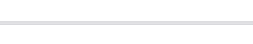
常见的分割线
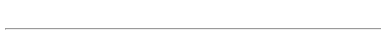
实线
<hr>
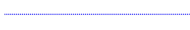
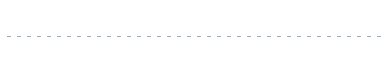
点线
<hr class="hr1">
.hr1{
   border: 0;
   border-top: 2px dotted blue;
}
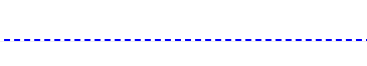
虚线
<hr class="hr2">
.hr2{
	 border: 0;
 	 border-top: 2px dashed blue;
}
双实线
<hr class="hr3" />
.hr3 {
	border: 0;
	border-top: 5px double #d0d0d5;
}
疏密可控的虚线
 <hr class="hr4" />
.hr4 {
	border: 0;
	padding-top: 1px;
	background: repeating-linear-gradient(
		to right,
		#a2a9b6 0px,
		#a2a9b6 4px,
		transparent 0px,
		transparent 10px
	);
}
这个就有点复杂了,是借助重复线性渐变实现的。主要是通过渐变模拟分割线,这里与
hr
就没啥关系了,换成个
div
也可以实现这个效果。
border: 0;
是为了让分割线不显示,
padding-top: 1px;
加上个
padding
是为了后面的渐变可以显示出来。
渐变的话使用的是重复线性渐变,渐变方向是从左到右,然后通过设置中心线的位置来控制虚线的间隔。
两头虚的分隔线
<hr class="hr5" />
.hr5{
    border: 0;
    padding-top: 2px;
    background: linear-gradient(to right, transparent, #d0d0d5, transparent);
}
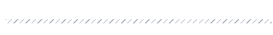
斜纹分隔线
<hr class="hr6" />
.hr6 {
  border: 0;
  padding: 3px;
  background: repeating-linear-gradient(
    135deg,
    #a2a9b6 0px,
    #a2a9b6 1px,
    transparent 1px,
    transparent 6px
  );
}
多彩斜纹分割线
 <hr class="hr7" />
 .hr7 {
  border: 0;
  padding: 3px;
  background: linear-gradient(135deg, red, orange, green, blue, purple);
  mask-image: repeating-linear-gradient(
    135deg,
    #000 0px,
    #000 1px,
    transparent 1px,
    transparent 6px
  );
}
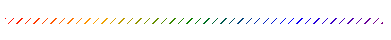
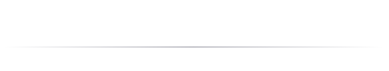
说一下这个,主要是通过遮罩来实现分隔的效果,如果不加遮罩就是一个单纯的线性渐变,如下图:

波浪线
  <hr class="hr8" />

  .hr8 {
	  border: 0;
	  color: #d0d0d5;
	  height: 0.5em;
	  //指定元素内的空白怎样处理。	文本不会换行,文本会在在同一行上继续,直到遇到 <br> 标签为止。
	  white-space: nowrap;
	  //字母间距
	  letter-spacing: 100vw;
	  padding-top: 0.5em;
	  &::before {
	    content: "\2000\2000";
	    // overline	定义文本上的一条线。
	    text-decoration: overline;
	    //线条的样式 线条将显示为波浪线。
	    text-decoration-style:wavy;
	  }
}
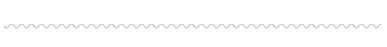
只知道通过径向渐变可以实现波浪线,上面这种方式没接触过,原理的话可以查看原文(主要是没查到
content: "\2000\2000";
代表什么东西)
阴影线
 <hr class="hr9" />
 .hr9 {
  border: 0;
  padding-top: 10px;
  color: #d0d0d5;
  border-top: 1px solid rgba(0, 0, 0, 0.1);
  box-shadow: inset 0 10px 10px -10px;
}
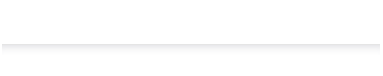
这个主要是在分割线下面加了个阴影,如果去掉
box-shadow
就是一条实线
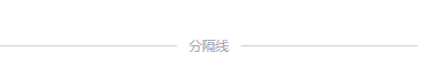
带文字内容的分隔线
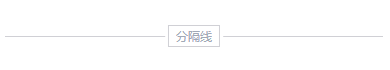
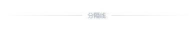
两端实线
<hr class="hr11" data-content="分隔线" />

.hr11 {
  color: #a2a9b6;
  border: 0;
  font-size: 12px;
  padding: 1em 0;
  position: relative;

  &::before {
    content: attr(data-content);
    position: absolute;
    padding: 0 10px;
    line-height: 1px;
    border: solid #d0d0d5;
    border-width: 0 99vw;
    //宽度自适应文字
    width: fit-content;
    //指定元素内的空白怎样处理。	文本不会换行,文本会在在同一行上继续,直到遇到 <br> 标签为止。
    white-space: nowrap;
    // 居中
    left: 50%;
    transform: translateX(-50%);
  }
}
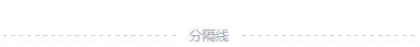
两端虚线
 <hr class="hr12" data-content="分隔线" />

.hr12 {
  color: #a2a9b6;
  border: 0;
  font-size: 12px;
  padding: 1em 0;
  position: relative;

  &::before {
    content: attr(data-content);
    position: absolute;
    padding: 0 10px;
    line-height: 1px;
    border: solid #d0d0d5;
    border-width: 0 99vw;
    //宽度自适应文字
    width: fit-content;
    //指定元素内的空白怎样处理。	文本不会换行,文本会在在同一行上继续,直到遇到 <br> 标签为止。
    white-space: nowrap;
    // 居中
    left: 50%;
    transform: translateX(-50%);
    // 通过重复线性渐变实现 border的分隔
    border-image: repeating-linear-gradient(
        90deg,
        #d0d0d5,
        #d0d0d5 1px,
        transparent 1px,
        transparent 2px
      )
      0 85%;
  }
}
两端淡出
  <hr class="hr13" data-content="分隔线" />

  .hr13 {
	  color: #a2a9b6;
	  border: 0;
	  font-size: 12px;
	  padding: 1em 0;
	  position: relative;
	  //遮罩
	  mask-image: linear-gradient(to right, transparent, black, transparent);

	  &::before {
	    content: attr(data-content);
	    position: absolute;
	    padding: 0 10px;
	    line-height: 1px;
	    border: solid #d0d0d5;
	    border-width: 0 99vw;
	    //宽度自适应文字
	    width: fit-content;
	    //指定元素内的空白怎样处理。	文本不会换行,文本会在在同一行上继续,直到遇到 <br> 标签为止。
	    white-space: nowrap;
	    // 居中
	    left: 50%;
	    transform: translateX(-50%);
	  }
}
在实线的基础上加上一个遮罩
内容装饰
  <hr class="hr14" data-content="分隔线" />

.hr14 {
  color: #a2a9b6;
  border: 0;
  font-size: 12px;
  padding: 1em 0;
  position: relative;

  &::before {
    content: attr(data-content);
    position: absolute;
    padding: 0 10px;
    line-height: 1px;
    border: solid #d0d0d5;
    border-width: 0 99vw;
    //宽度自适应文字
    width: fit-content;
    //指定元素内的空白怎样处理。	文本不会换行,文本会在在同一行上继续,直到遇到 <br> 标签为止。
    white-space: nowrap;
    // 居中
    left: 50%;
    transform: translateX(-50%);
  }

  &::after {
    content: attr(data-content);
    position: absolute;
    padding: 4px 1ch;
    top: 50%;
    left: 50%;
    transform: translate(-50%, -50%);
    color: transparent;
    border: 1px solid #d0d0d5;
  }
}